
Whilst not an actual word, the concept of hybography is that two separate typefaces can be merged together to create one, hybrid typeface – hence ‘hybrid typography’. As an example, one can take a serif typeface, cut out the serifs, and attach them to a sans serif typeface to create a new, hybrid typeface that is more interesting and dynamic; something that will stand out more to an audience and catch the eye.
The short workshop consisted of receiving a single word, and our goal was to visually convey its meaning through the way we presented it on the page – in a sense, using hybography to demonstrate meaning and ultimately creating an interesting piece of typography.
I received the word ‘vivacious’, and began by narrowing down its definition.

With the definition understood and some exploration into how best to represent the word, I began some quick preliminary sketches.
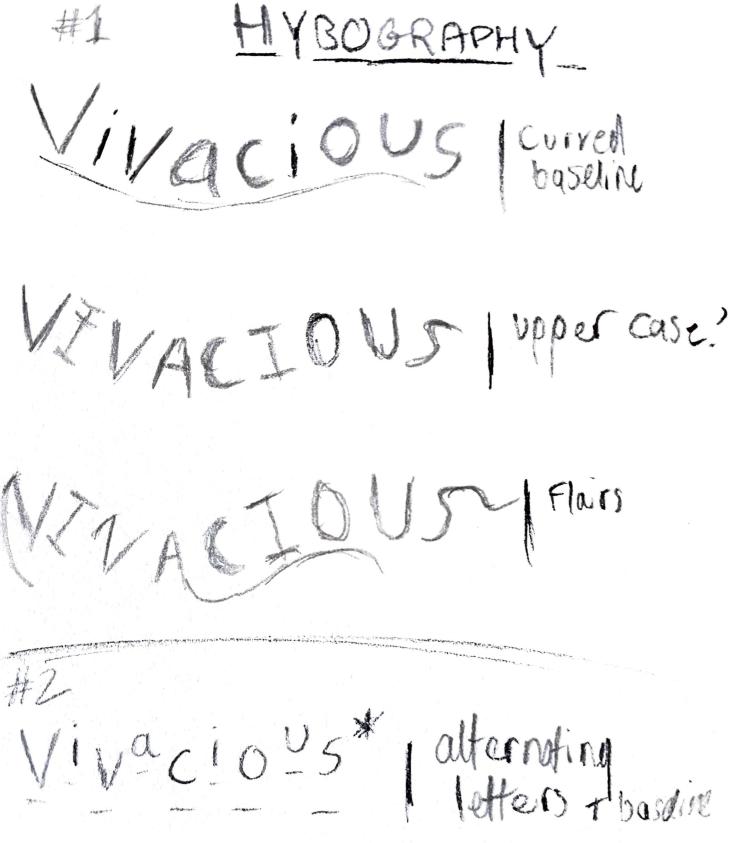
With these complete, and a general idea of the final design visualised, I constructed the final piece on A3:
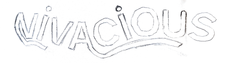
I mostly drew from the style of my first three sketches, developing them into a typeface and adding a few hybographic features such as the flairs. Upon reflection, I would perhaps add serifs to some individual letterforms, such as the V and S, in order to convey the meaning of the word further whilst adhering to the rules of hybography. Overall though, I’m happy with the first attempt at experimentation, and will take the practices I have learnt into the development of our next project – the ‘Six Word Story’ poster.
