
![]()
With a good sense of the direction I wanted to take my ideological movement in, I started researching visual elements of punk culture, and how I could incorporate that within my piece of movement. I began by examining the work of Jamie Reid, a graphic artist associated with punk culture who developed pieces for English punk band The Sex Pistols amongst other works.

Jamie Reid. Sex Pistols, Anarchy in the UK. 1976.
© 2018 Jamie Reid Courtesy Isis Gallery, UK
Jamie Reid uses a technique known as décollage, which is a method of cutting out existing graphics and sticking them together in a collage format. In the above poster for The Sex Pistols‘ first single, Anarchy in the U.K., Reid uses typographical elements that are sans serif yet varied in scale and weighting to emphasise the ransom-note effect, and Reid combines this with the torn U.K. flag and safety pin imagery to create a distorted, gritty image suitable for punk graphics. Reid’s use of décollage and its strong presence in punk graphics is a factor I’m taking into account when developing some ideas, and is something I’d ideally use within my digital piece of movement.


Jamie Reid, John Varnom. Sex Pistols, Never Mind The Bollocks, Here’s The Sex Pistols. 1977.
© 2018 Jamie Reid Courtesy Isis Gallery, UK
I experimented a little with the décollage technique and how I could incorporate it within my piece as a movement, perhaps best used as a title on an animated banner, or an annotation within a video clip.


Examining posters that advertised punk-themed music events also proved to be a valuable insight to punk graphics. These posters feature a very limited and washed out colour palette, incorporating a similar décollage technique that Reid uses, and overall, the composition is very D.I.Y in style. These features are something I’m going to consider when developing my piece of movement, perhaps by using colour correction to wash out saturated colours, and using overlays to add grit and texture to the piece.
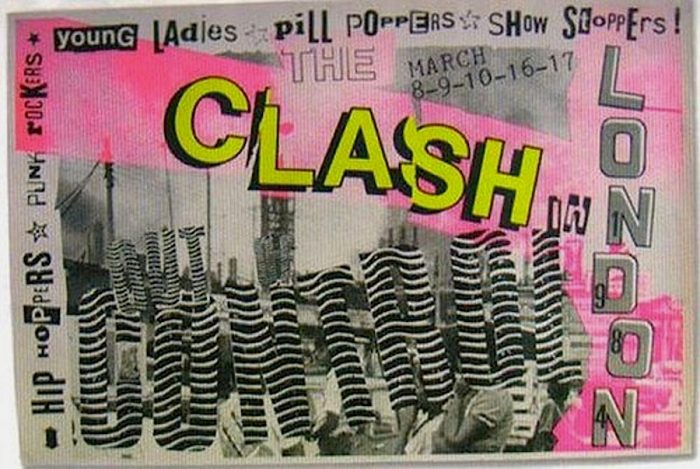

Source: 2015. CVLT Nation. [Online]. [Accessed 8 November 2018]. Available from: https://www.cvltnation.com/diy-dadaism-when-80s-punk-posters-and-flyers-ruled/
Before moving on to develop some ideas, I decided to take a look at some interviews with musicians and members of punk culture that spoke out against the pop music industry to get a sense of what others who share my views had to say on the topic. This was done primarily to get a sense of some slogans or mottos I could use to advertise and promote my movement within my digital piece.
