
With a solid amount of initial research complete, I began working on the digital piece of promotional material that would be my response to the Movement brief. As a recap, the piece must promote, embody and explain ‘Punkism’, and it must move in some way.
I decided to begin some initial ideas with a moodboard – however, this quickly developed into a piece of work on its own, and turned into a poster format. The goal of this moodboard was to visualise the punk elements I had uncovered within my research so far, as well as experiment with some slogans and typography.
I began by creating an A3 Portrait document in Adobe Photoshop, with a CMYK colour range and 300ppi suitable for print.


Using a paper texture background, I began by inserting an image of a pop musician as the main focus of the composition.


Copying and shrinking the paper texture, I changed its blending mode to multiply and filled it with a different colour to create a more distinct background texture. I added two more pop musicians here and gave them a white stroke outline and created a noise effect to reflect the gritty aesthetics of punk. Furthermore, using Photoshop brushes, I added some punk-style overlays to the popstars to embody the nature of the movement, reminiscent of D.I.Y lo-fi posters.


I began working with some typographical elements here, looking at several different typefaces that I could use – but eventually settled with the handwritten-style typeface Permanent Marker. This choice, I feel, best represents the nature of the movement, thus embodying it. I used this font for both the main title/slogan – Death To Pop – and the subtitular text, the call to action – Save Music, Be More Punk.


To further embody the movement, I added a couple of anarchy symbols to the piece. These symbols feature heavily within punk culture and are instantly recognisable within the context of the poster. Furthermore, I began working with some slogans here – settling with slogans such as “Support Smaller Artists” and “Creativity Is Being Suffocated”. These were inspired by the interviews I watched within my initial research, and explain the core ideas of my ideological movement.

The finishing touch to the poster was an overlay – using the same paper texture as the background, changing its blending mode to multiply and lowering the opacity rendered an even more lo-fi, gritty aesthetic that would be attributed to punk-themed posters.
Overall, I feel as though this moodboard/poster is successful in promoting, embodying and explaining my movement through its overall composition, use of slogans and its context as a poster. Whilst not an animated piece, this has served to inspire me further within idea generation and development, and has given me a strong sense of which direction I should take my digital piece of movement in.
My next goal was to decide on which medium to use for the digital piece. I was considering creating a web banner based around my poster, an animated .gif that would rest on a webpage advertising the movement, but eventually decided to challenge myself by creating a full video advert that would play on social media platforms or music channels. Ideally, I was aiming for it to be 30 seconds to a minute in length.
I generated ideas for this concept by creating two storyboards.
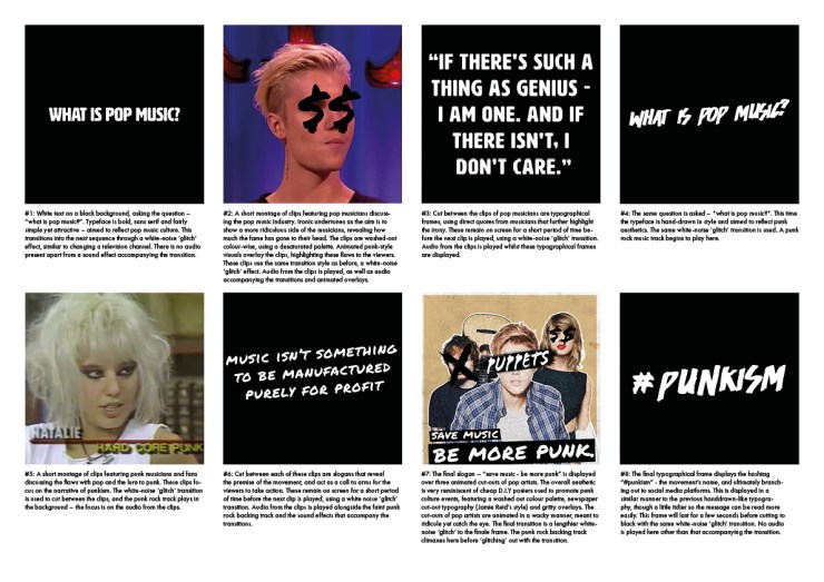
Reflecting back upon this storyboard, I wasn’t too happy with the contrast between titular frames and the video clips I was using. Whilst this video advert would promote and explain the ideology, it would not embody it because of a lack of consistency with the use of punk graphics. It was these thoughts that led me onto creating my second and final storyboard:
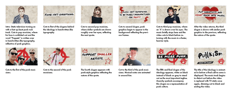
I feel as though this storyboard embodies the nature of the ideology far better through its consistent use of punk graphics, as well as making room for more slogans and call-to-arms. The ‘logo’ of the ideology is also further improved through its use of décollage, reflective of early punk graphics.
With this storyboard complete, I moved onto developing the video advert.
