
With a solid foundation for our protest campaign established, we decided to research a little more into the visual identity of two other campaigns. I’ve already discussed a few key strengths within the poster adverts of the campaign run by Family Centre, but I’m going to compare those with two other campaigns to attain a broader understanding of the sensitive subject we’re tackling.


To kick the further research stage off, we examined two posters created by the Dubai Foundation for Women and Children in protest of child neglect. Similar to the posters used in the Family Centre campaign, these posters feature child actors who are framed so, in the visual hierarchy, the viewer’s eye is immediately drawn to them. Both actors have similar upset facial expressions which induce sympathy, which immediately fulfils one of the campaign’s goals: to make the viewer care. The viewer is then drawn to the other objects in the frame; in the first poster, the hands of parents holding mobile phones. The viewer can assume that, judging by the child’s expression, the parents are ignoring her, which demonstrates child neglect in action – fulfilling another goal of the campaign, making the viewer aware of the signs of neglect. The second poster also does this in a different way; the viewer sees the boxing gloves and the punching bag with the child framed in-between, revealing the violent side of child neglect and abuse. Following this, in both posters the viewer’s eye is drawn to the mantra and call to arms, as well as how to get involved with the campaign and fight against child neglect – fulfilling the third goal of the campaign, showing people how to take action, and encouraging them to. The use of hashtags is also effective within the context of the posters, which are presumably displayed on social media, as this entices the viewer to take immediate action. Other strengths of these posters include the desaturated colour palette, which frames the posters as being quite serious in nature, and the choice of typeface – using childlike writing for the mantra, and easy-to-read sans serif for the contact information. I would argue that a weakness of these posters are their grid systems – a lot of the typography present is spread out, which draws the viewers eye around quite a lot and perhaps doesn’t make the poster as impactful as it could be if the typography were aligned in one column.
In hindsight, it was absolutely crucial to our development stage that these strengths and weaknesses were identified – they definitely helped shape our own outcomes for the better.
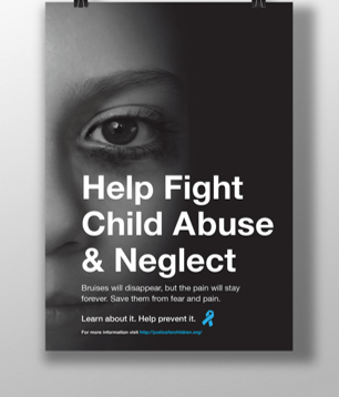
The poster above, used in a campaign by Justice for Children, uses similar techniques used by the Dubai Foundation for Women and Children in their posters: a desaturated colour palette, use of a child actor and a strong visual hierarchy. Whilst it doesn’t use any other objects in the photograph or feature childlike typography, I find this poster to be more effective because of its strong grid system and scaling of text. The text is all aligned and scaled effectively so the viewer immediately sees a call-to-arms followed by how they can get involved, and as the eye isn’t drawn all over the frame, the visual hierarchy is stronger. I would argue that the poster’s weakness its lack of a logo, which I noticed the organisation had after looking at their website. Whilst it doesn’t necessarily lower the effectiveness of the poster, it doesn’t create a strong or memorable identity for the organisation after the viewer has seen it, which I feel is quite important when it comes to larger campaigns.
![]()
After examining these three posters, its clear what strengths they have in common and what we can do to ensure our outcomes are just as effective. Whilst we probably won’t be able to use a child actor, we can identify other objects that relate to children, such as toys, and use them instead. A desaturated colour palette appears to be very effective, so that’s also something we’ll work into our outcomes.
In the next stage of our development process, we’re going to examine visual metaphors and how we can work them into our outcomes to create a strong and impactful protest, before moving onto developing our manifesto.
Sources:
Dubai Foundation for Women and Children: https://www.dfwac.ae/
Justice for Children: https://justiceforchildren.org/
Family Centre PR Campaign: https://www.scribd.com/document/323635324/Family-Centre-PR-Campaign
