
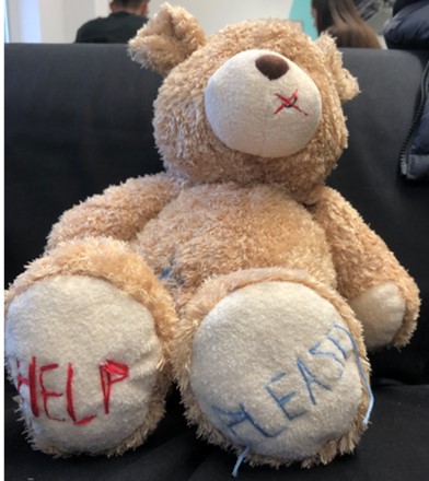
With a sound understanding on our chosen topic and some appropriate research taken, our group began to work towards the first of our outcomes – a manifesto that serves as a call-to-arms for our protest. Within the manifesto, we need to feature the visual metaphor we created, shown below:
We agreed that in order to have the highest impact, the visual metaphor should be relatively large scale within the frames of our outcome and dominate the space available. This would immediately draw the eye and create a strong visual hierarchy.
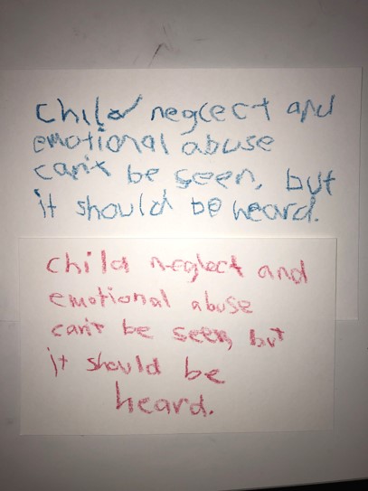
We decided to create a small sign with child-like writing featuring our mantra, which would ideally be the second thing people are drawn to within the visual hierarchy. The use of child-like handwriting proved to be successful in some posters we researched, and combined with our visual metaphor, invokes sympathy more effectively than a regular typeface.
We then followed up these decisions by desaturating the image, which creates a serious tone around the entire image. However, we noticed that the stitching on the bear doesn’t look quite as effective when desaturated – so we made the decision to leave the blue and red parts of the image saturated, whilst greying out the rest of it.
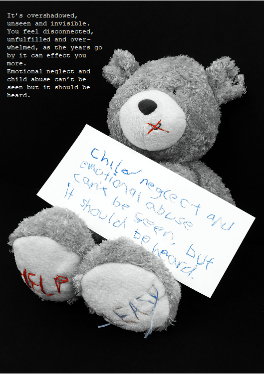
Our final manifesto took shape with this change. We centred the bear within the frame of the image and scaled it up so create the largest impact possible, something that would immediately draw the eye and connote the messages we’re attempting to put across. We decided to use a simple typeface to expand on our mantra and placed it in the remaining space available in the upper left of the frame, which ideally would be the last object the viewer is drawn to.
Upon reflection of this manifesto, I’d argue that despite being quite moving and successful in promoting the message our campaign stands for, our lack of a logo or contact information lets it down. This is something we implement in later outcomes, but its absence here is notable and could improve the overall quality of the manifesto.
