
In today’s session we examined key principles of editorial design and how a piece of editorial can be successful through its use of clear communication and story-telling that’s made possible with secure grid systems, consistent design, contextual pacing and a strong visual hierarchy. We took part in a one-day workshop where, in groups of 4, we were given a topic and had to create four double-page spreads using the editorial skills we had learnt so far, considering the above principles. This workshop was done in preparation for our Changing Faces brief that would ask us each to design three double-page editorial spreads.
The topic my group was given was the relevancy of wallpaper, and whether it was still a common feature within modern interior design. The article I visualised was courtesy of The Washington Post. This task was completed using InDesign.
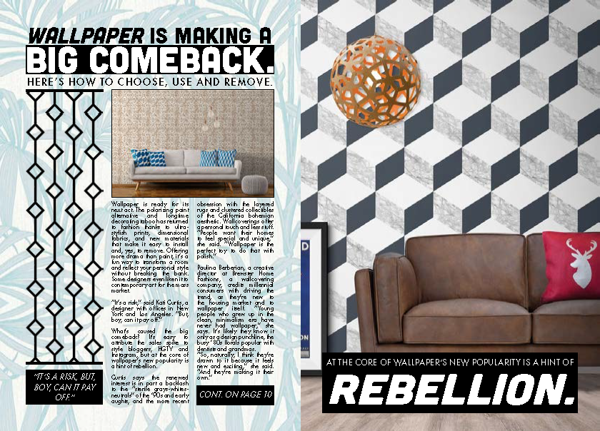
My first step to approach this design task was to create a grid system. Due to the rough nature of the task and time constraints I settled with a simple three-column system on both pages, resulting in six columns across the spread.
Following this, I began working on some type detailing. I displayed the headline and subheading across all three columns with a larger pt. size (31 and 51) to draw attention to it, contrasting white against black to make it stand out further. The subheading also dominated these spaces but used a smaller pt size (15). The body text, which was a segment from the article, used a sensible 9 pt. size. I decided to experiment a bit here and instead of displaying the text across all three columns, I left room for some imagery on the first column and displayed the text across the next two. I justified the text here to reduce rags, making the text more uniform with the columns yet still perfectly readable. I decided the second page should be more visual and opted to not include any body text whatsoever, instead using imagery and headline text in the form of a quote which I feel was simple yet effective. Upon reflection, I think a drop cap at the start of this body text would have added flair to the design and improved its overall look, and some of the paragraph and line spacing could have been altered to increase the ease of readability. Tracking could have also been used to spread the text a little more in favour of the overall article, but all of these things are things I will take into consideration when working on my Changing Faces piece.
Above are all four pages from our group displayed in a printed format. What was immediate upon first glance was the lack of consistency in our designs which was an important principle of editorial design. We agreed that this was probably due to the nature of four different people working on the piece, all of us with different design styles, and agreed that in future we would need to work harder on communication. We felt our pacing within these pieces was quite strong, however, and reading from page to page felt enjoyable as opposed to a task. A few comments were made on my page about how busy it was, using minimal white space which overall reduced its effectiveness – which I completely agree with.
Reflecting on this workshop has proven very useful in preparing for my Changing Faces task, allowing me to identify my strengths and weaknesses within editorial design. I’m happy with my type detailing, but not so content with my overall visual hierarchy. I will need to focus more closely on the use of white space and aim to create a piece that is more balanced, perhaps by using more columns and experimenting with different grid systems.
SOURCE:
Buerger, M. 2017. Wallpaper is making a big comeback Here’s how to choose, use and remove. [Online]. [11 February 2019]. Available from: https://www.washingtonpost.com/lifestyle/home/wallpaper-is-making-a-big-comeback-heres-how-to-choose-use-and-remove/2017/02/28/c9b2eb40-f88a-11e6-9845-576c69081518
