
Following the deconstruction of the article I’m visually representing and the identification of my primary target audience – the upper class – I decided to focus on identifying what editorial design actually is, and examine some techniques used within successful pieces so I can incorporate them within my own practices. At this early stage in the design process, it was crucial to identify strengths and weaknesses to maintain a high level of quality throughout my development.
I began by looking at a website focused on visual communication named Design Your Way, in particular, an article that unpacks editorial design and shows off some strong examples whilst providing tips for designers aiming to create their own piece.
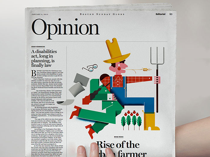
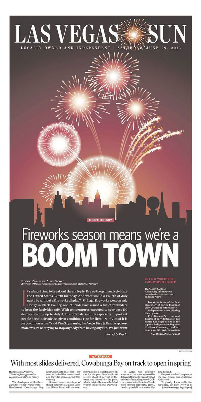
At its basics, editorial design is the combination of layout, composition, imagery and typography to create a strong page (or often a double-page spread) for use within a magazine, newspaper or article. It’s also worth mentioning that editorial design is becoming increasingly challenging due to the rising digital market – as my brief is focused on editorial design for print, this is an obstacle I will need to keep in mind, and can perhaps identify successful features of digital editorial design that would also work well in print. The first step of creating a successful editorial piece is to understand who exactly will be reading the editorial and to design for them. I covered this step earlier in the development cycle – I know I’m aiming to design for the upper class and have to design my editorial around that market. Creating a strong visual identity for the piece is extremely important, as the design needs to catch the eye and keep a reader engaged with its contents. Designing the cover (or in my case, the first double page spread) before anything else is a good way to create a strong identity and ensure it captivates attention, so the following pages can be at the peak of their visual strength. Using a strong grid system is crucial, and the way the grid system is set up can entirely affect the overall feeling of the editorial piece. As my focus is on the upper class, I’m aiming to use a symmetrical layout for a more formal composition, but I will experiment with different grid systems after I’ve created a few initial concepts. Typographical hierarchy is a make-or-break within an editorial piece such as this, and the choice of typeface and scaling within the piece will determine how well it appeals to my target market and the overall quality of composition. It’s also worth noting that sometimes less is more – the use of white space can make a piece a lot stronger, and this something I intend to experiment with considering my target market. Finally, pacing is crucial to keeping a reader engaged. I’m designing six pages – three double page spreads – and my initial plan is to create an eye-catching opener spread, then give the readers a little room to breathe within the middle spread, before closing the piece with a memorable final spread.
Source: Bogdan Sandu. 2018. Editorial design: definition, tips, and examples. [ONLINE] Available at: https://www.designyourway.net/blog/design/editorial-design/. [Accessed 14 February 2019].
