
Following some sufficient research, I began working on some initial concepts for my editorial piece. Within these concepts, I aimed to pin down the direction in which to take my piece – whether it would be typographical, illustrative or photographic in nature (or a mix), what grid systems to use, and what relevant type and image to include. I decided to focus only on the first double page spread within these concepts so I could work out where I was taking the editorial piece before designing the other two spreads.
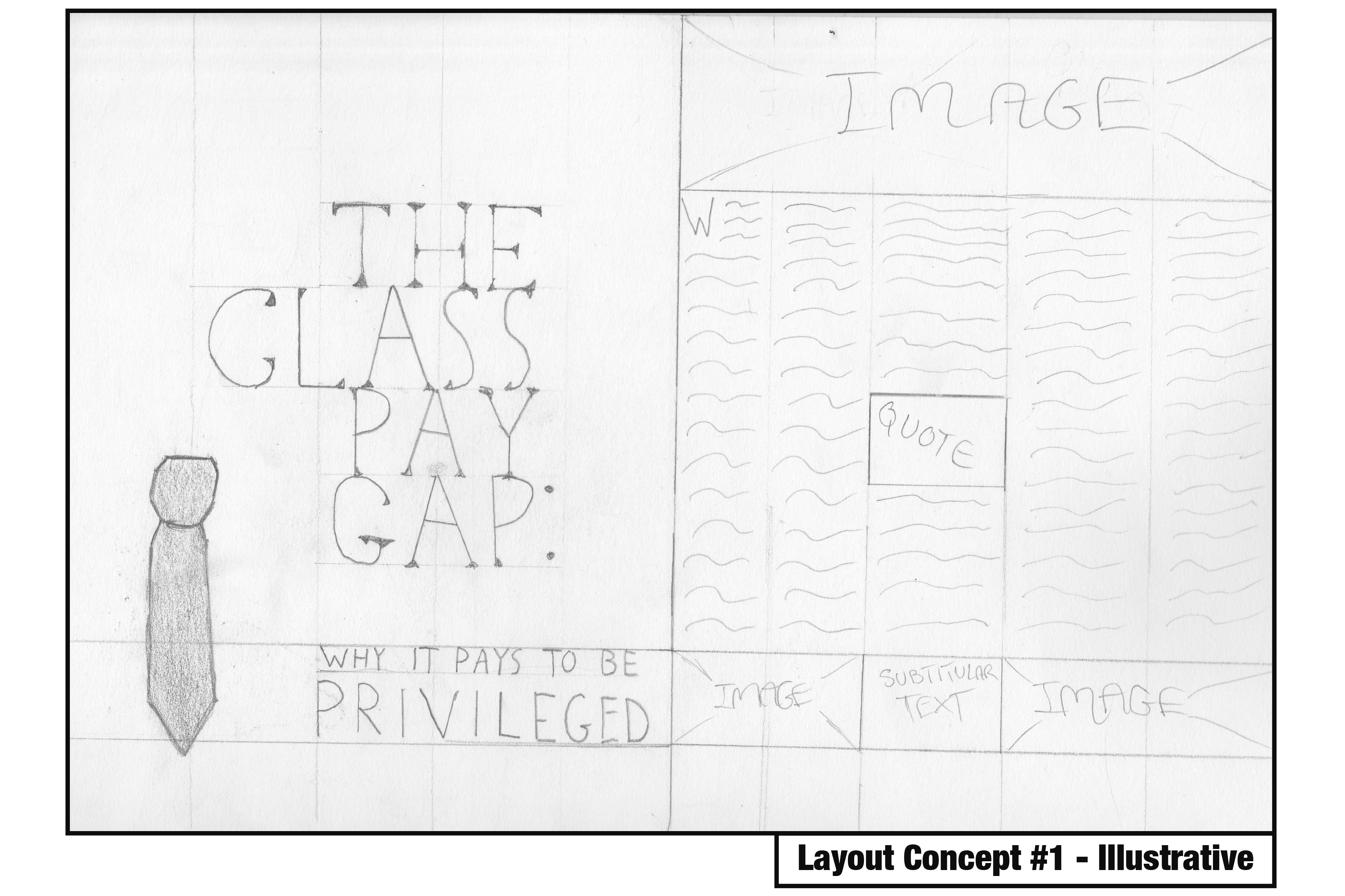
Within this concept, I focused on an illustrative approach, using a grid system of 5 columns per page. Within the front page, I decided to include the headline and subheading scaled appropriately around an illustrative image of a tie to leave some effective white space. I felt as though this was a strong design decision as it’s quite tidy, reflective of the nature of the article, and follows good editorial design principles. The second page is where the true article begins, and where I feel the concept loses its effectiveness. The distribution of body text with images and subtitles is messy and overcrowds the page, leaving minimal room for white space.
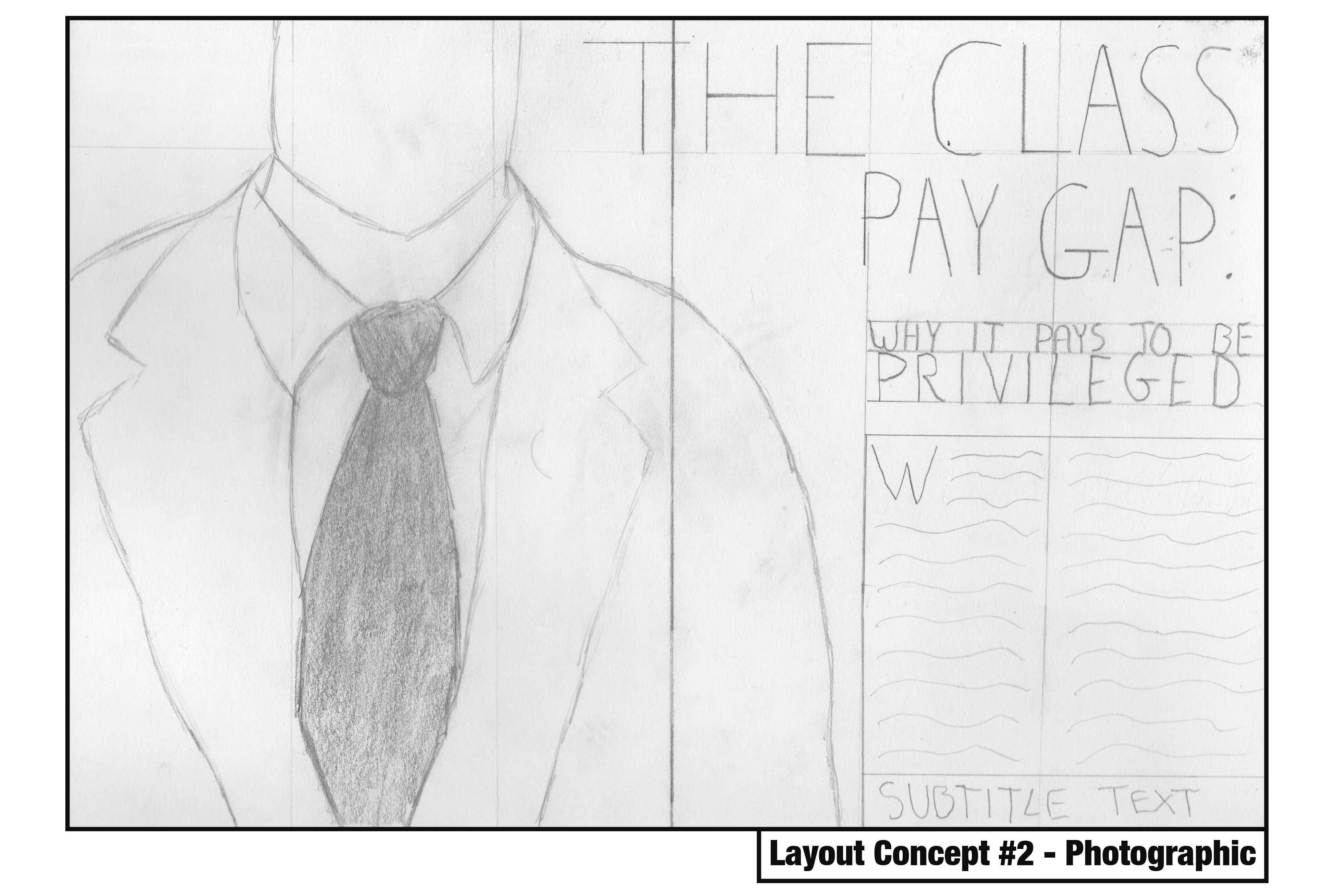
This concept focuses on a photographic approach with a simple three-column grid system per page. This spread would be dominated with a photograph of an individual in a suit, leaving very little white space in favour of catching the eye. The headline would also spread across both pages and be the second element within the path of the eye, before moving onto the subheading and body text respectively. The visual hierarchy within this concept is quite strong, but its simplicity with three columns may be hard to spread a nearly three-thousand word article across without ruining the pacing. I would also need to consider photographing my own image which may prove more challenging than illustrative and typographic approaches.
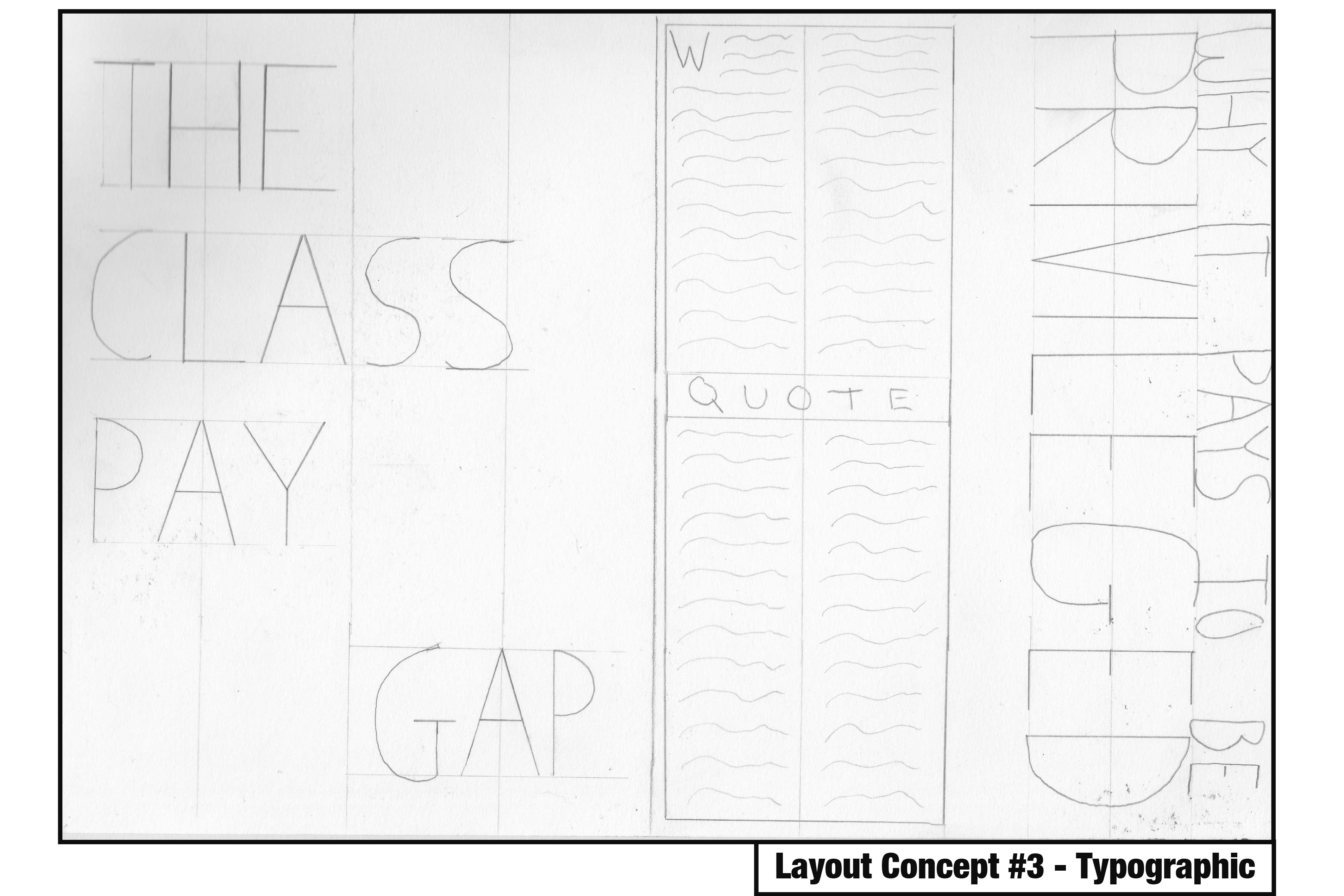
The final concept focuses on a typographical approach with a four-column grid system per page. What’s immediately noticeable here is the use of white space on the first page which draws attention to the typographical elements. The subheading is almost as dominant as the headline on the second page, but its rotated orientation adds a bit of flavour to the concept and makes it a bit more enjoyable. The grid system allows for a reasonable amount of body text per page whilst leaving room for some interesting imagery or larger typographical elements, so the pacing wouldn’t suffer too much here.
Reflecting on these concepts, I am drawn in particular to the typographic approach, but I understand that there are elements from the illustrative and photographic approaches that work really well – such as the use of white space and positioning of certain elements. These concepts have created a strong foundation in which to build my editorial piece on, and I am sure as this project continues the design will continue to evolve and incorporate successful elements from all three of these.
