Following the establishment of my design direction in a visually strong first page spread, I began working on the next two spreads.
The Second Double Page Spread
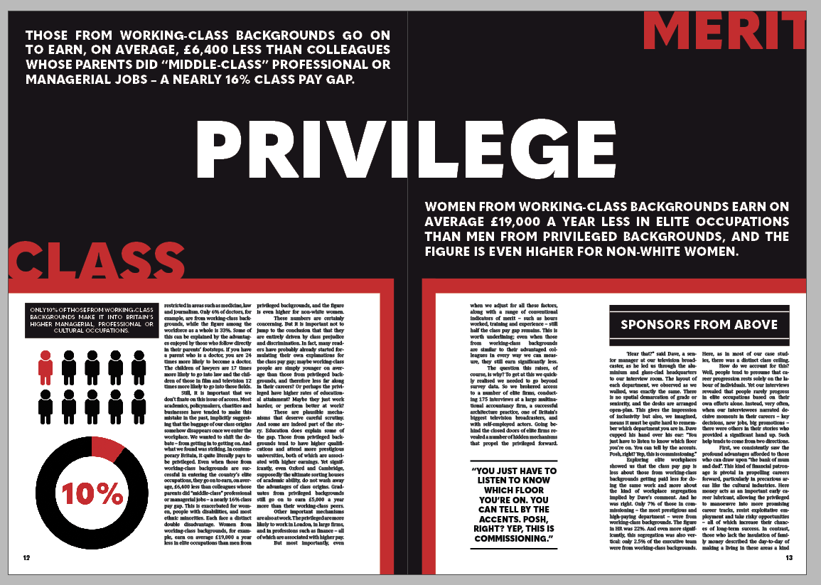
From the get go, I knew I wanted to contrast this double page spread against the other two to maintain a good pace and stick to the principles of good editorial design. To do this, I set the background of the page to be black with two smaller sections on each page suitable for paragraphs.
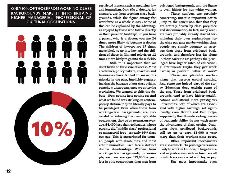
Following this, I aligned the text to columns and added an infographic to highlight and represent a statistic from within the article.
As the article drew into its latter few sections, I added another quote highlight in the same style as before and used a small section of white space to create a small gap and maintain good pacing.
With the remaining space, I knew I wanted to capitalise on the typographic strengths of the initial concept, and so put the ideas of class and merit battling against each other within the context of privilege – key themes of the article that I feel are represented well on this spread. I then added two quotes that highlighted crucial points of the article.
The Third Double Page Spread
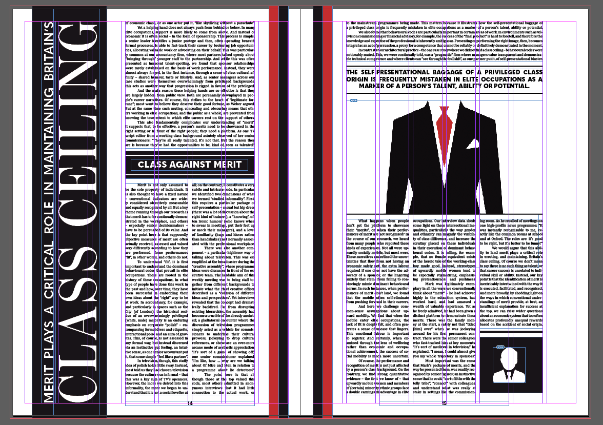
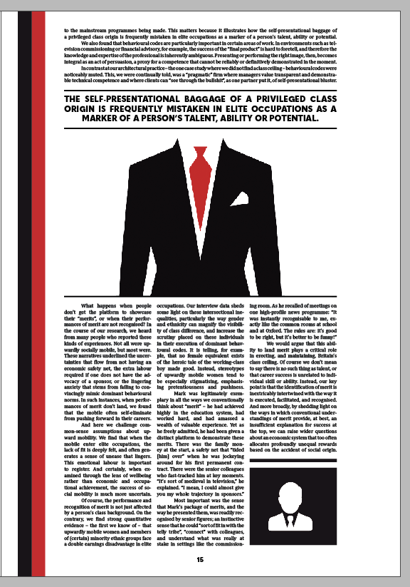
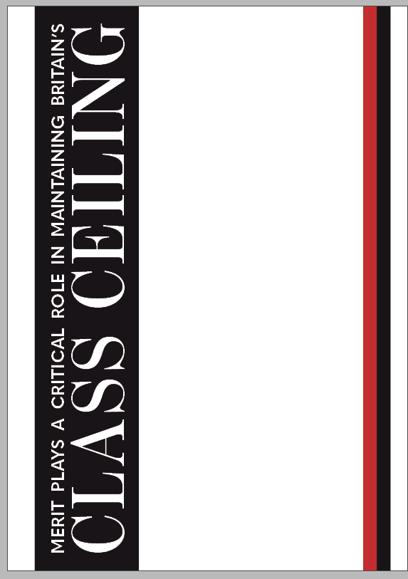
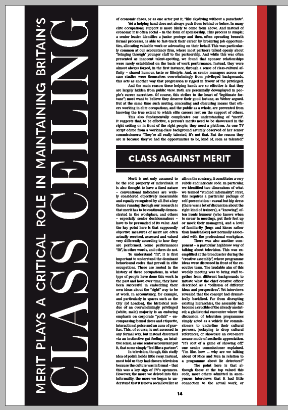
The last double page spread needed to maintain the good pace I had built up so far and taper it off as it was the last two pages of the article. I began by creating a composition similar to the first page with a vertically-aligned piece of text – a quote from the article. I also used the same stylised margins as before.
I then inserted the text and stylised it similar to the first page – first, in a block across four columns, and then in two blocks across four columns, with a heading split in the middle to maintain pace.
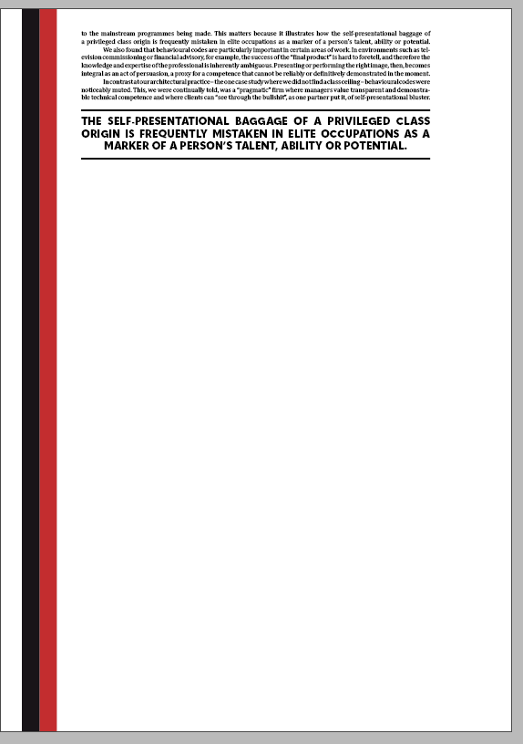
I wanted the last page to be a little different from the others as it was the final page of the article and had to utilise the space effectively. I decided to take a risk here and spread the text across six columns across the top of the page, following it with a quote from the text.
To ease out the final few paragraphs, I spread the text across six columns in three blocks, leaving a little room for the images I had created earlier to capitalise on the white space I had left.