
To begin the research stage of the APPlying APPtitude project, I deconstructed an existing app – Spotify – and created a wireframe to explore how it utilises user interface to create a strong user experience.
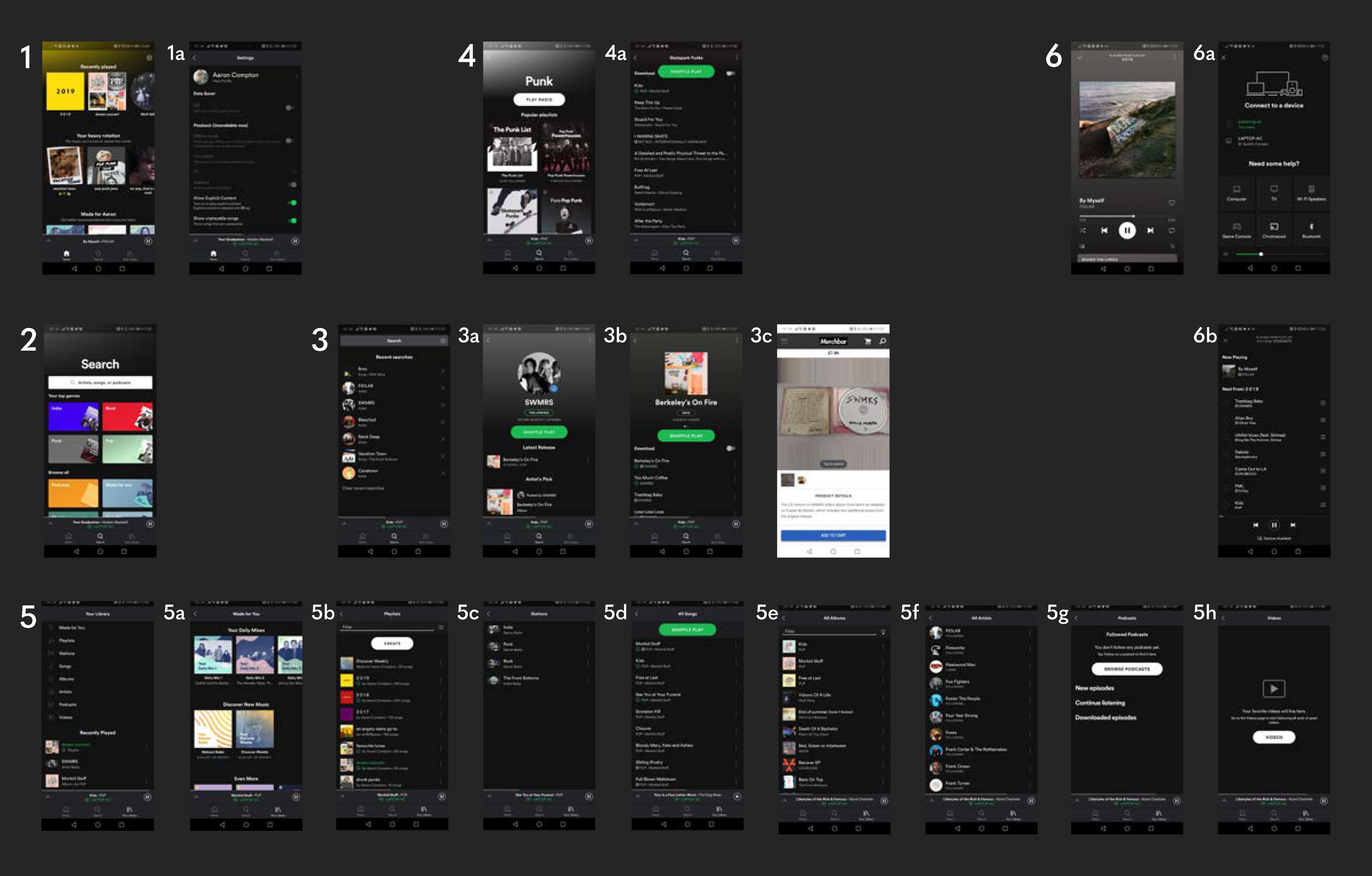
- 1 – Home – the first screen upon launching the app whilst logged in, this screen presents the user with quick links to music they may be interested in, such as the user’s recently played tracks, curated playlists based on the user’s music taste and other artist and album recommendations.
- 1a – Settings – currently only accessible from the home menu, allows the user to change their settings and preferences with ease.
- 2 – Search – allows the user to search for tracks, artists, albums and various other media based on an entered search term or from various genres.
- 3 – Search bar – shows the users recent searches and allows them to enter a search term.
- 3a – Artist screen – can be accessed from various points in the app such as the search menu, displays an artists most popular tracks, their latest releases, and their available discography, merchandise and events.
- 3b – Album screen – displays all the songs within an album and allows the user to listen to them, as well as the album art.
- 3c – Merchandise screen – Spotify pushes the user from the app to the web as most merchandise websites are ran by the artist rather than Spotify.
- 4 – Genre screen – displays popular Spotify-made playlists based on the selected genre, allowing the user to discover new songs and listen to old favourites.
- 4a – Playlist screen – displays all the songs within a playlists and allows the user to listen to them.
- 5 – Library – shows the user’s collection of music, such as their saved tracks, favourite artists and their created playlists as well as their recently played media.
- 5a – ‘Made For You’ – shows the user Spotify-curated playlists based on their music taste, recommending new songs and allowing them to rediscover old favourites.
- 5b – All playlists – displays the user’s created and saved playlists.
- 5c – Stations – displays radio stations based on the user’s listening preferences, creating a seamless and unique playlists each time it used.
- 5d – All songs – displays all of the user’s saved songs.
- 5e – All albums – displays all of the user’s saved albums.
- 5f – All artists – displays all of the user’s saved artists.
- 5g – All podcasts – displays all of the user’s saved podcasts.
- 5h – All videos – displays all of the user’s saved videos.
- 6 – Currently playing – displays the song the user is currently listening to, as well as it’s album art. Can be accessed from anywhere within the app, allowing an easy way to turn music on/off.
- 6a – Devices – allows the user to view all connected devices, such as a laptop, video game console or smart TV, and change which device to output their music to with a press of a button.
- 6b – Queue – shows the user their queued music, allowing them to control which music they wish to listen to after their current song.
Spotify maintains a consistent UI throughout the entirety of the app – a dark grey/black with green accents that perfectly accommodates for the huge variety of album art available on the application. The iconography is labelled and no confusing jargon is present, reducing any possible frustrations. There are seamless push/slide transitions between each screen that maintain a good flow for the user – the only negative here is when the app pushes the user to the web for merchandise, and as these sites aren’t created by Spotify, the overall design and layout is different which breaks the flow. However, the Spotify web and desktop applications maintain the same theming as the mobile app.
