
The first page I decided to develop was the ‘Discover’ page, as it is the main page within the app that users will use to engage with their connections and other content.
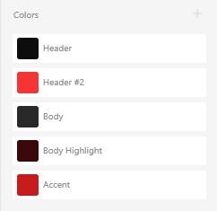
I began by narrowing down a colour scheme that I felt reflected the themes of the app. I decided against creating a light and dark mode due to time constraints. I decided against blue and yellow to stray away from other popular social media apps – such as Twitter, Facebook and Snapchat – and opted against green as it’s used dominantly by Spotify. I decided to go for a dark grey body colour with a near-black header, using a red for accents and highlights.
I set up an Adobe XD document with the Android Mobile preset (360x640px), allowing for easier testing as I use an Android phone.
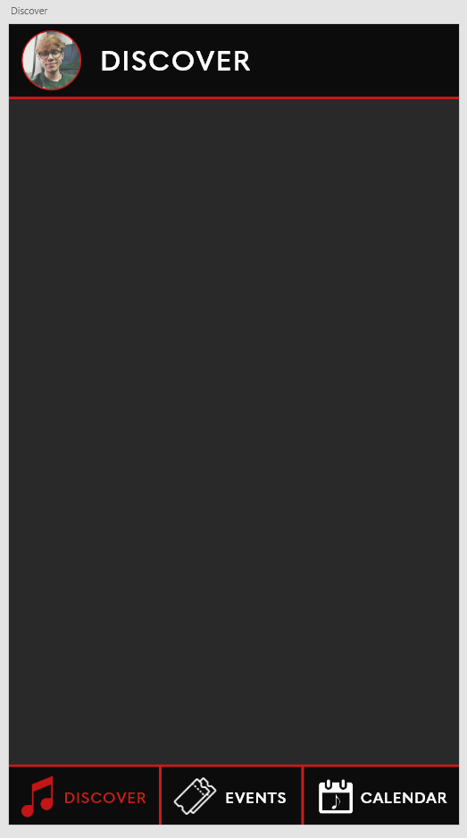
My first decisions and processes involved the fixed navigation bars. Based on the fundamentals and principles I previously discussed, I added the user’s profile photo alongside a label to the header of the page which would later be used to access the user’s profile. I used the bold, sans serif font Quasimoda to attain a modern look suitable for lists and menus. In the footer, I added the three main sections of the app – the discover, events and calendar pages – as well as labelled iconography to stay true to the principles of user interface/experience. These icons were first sketched then rendered in Photoshop, overlayed to white to match the colour scheme of the app.
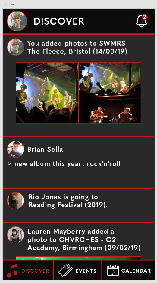
The next stage was to add some content to the Discover page. This information was based on my own gig history due to the nature of the app being a simple prototype. Twitter was my main inspiration for these choices, displaying photos for each user’s post as well as including a variety of media – a text post, two photographic posts and an ‘event’ post. I also added a notification bell to the header, which would later be used to open the notification sidebar.
I decided to highlight key information to add some colour balance to the page and reduce user confusion. To do this, I highlighted various elements in each post, such as event names, and added a small symbol next to the two musicians to denote their status as musicians as opposed to casual users.
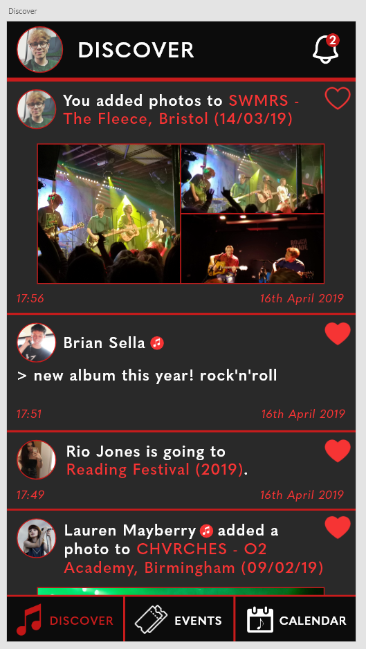
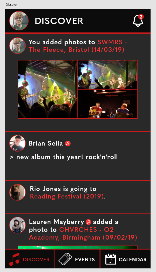
The final touches I added to the Discover page was additional elements that would allow the user to interact with posts – the ‘like’ hearts. In theory, a user would be able to tap on a heart to like or unlike a post (denoted by a full heart and an empty heart respectively). I also added timestamps to each post to reduce user confusion and remain true to the fundamentals.
