
At this stage, I had developed the user profile, discover, event and calendar screens and decided to test the app with a small handful of real-life users to get a sense of whether the user interface was working effectively, and whether the overall user experience was positive. Before testing, I had to prototype the app and create transitions for between the pages so far. I decided to use fade transitions with a quick transition time (0.3s), connecting the user profiles to the rest of the app via tapping on the respective profile pictures on the discovery screen.
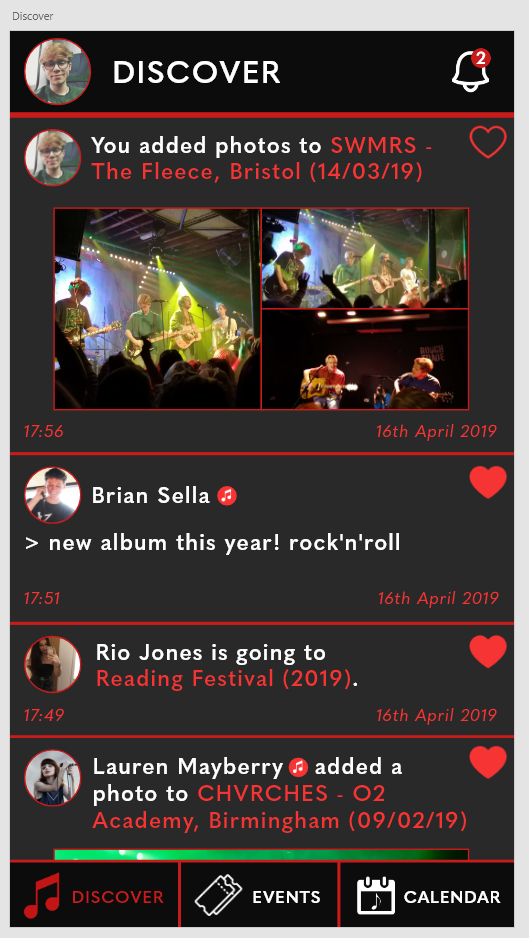
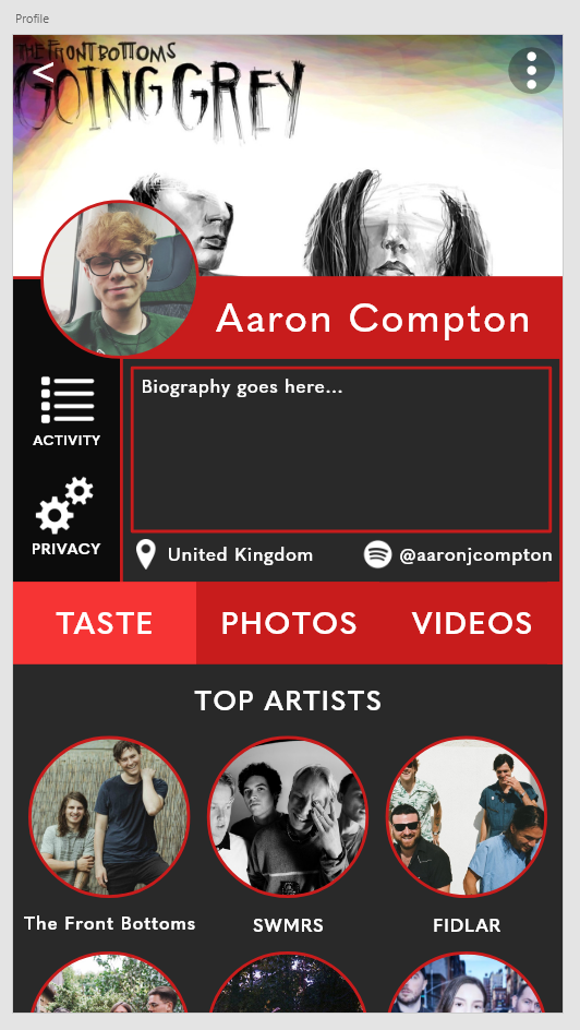
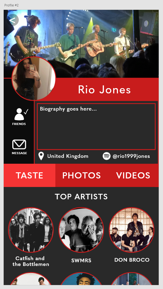
Before testing the app with users, I explained that the app was a prototype and a visual project made to examine user interface and experience as opposed to a functioning social media application. As I gathered feedback from the users, I noticed a common comment was the lack of flow between the user profiles and the rest of the app, as well as the longevity of going to a user profile to message a user. These two processes could be sped up effectively with the addition of a sidebar, creating a dedicated messaging hub and a quick link to your own profile. As I move onto creating these final few pages, I will incorporate these refinements into the prototype and test once again before finalising the app.
