
ITV Rebrand (Rudd Studio, 2012)
Rudd Studio set about the task of rebranding ITV in early 2012 with the idea of creating a brand new identity for the network – one that reflected ITV’s significance in British culture. They used a variety of strong visual language and techniques to pin ITV as the heart of popular culture within the UK.

The logo’s overall shape is based on handwriting, with each individual letterform lowercase and connecting to the next to create one larger piece. Rudd designed this specifically to reflect ITV as more friendly and human-like compared to their competition – the logo is one of the prime identifiers within branding (as put forward by Wally Olins in The Brand Handbook), and therefore must portray the nature of the brand itself. Symbols were also considered by Rudd to differentiate between each channel – each symbol creating a visual metaphor to represent the mood and tone of the contents within that channel.


Colour picking was used in conjunction with the logo in order to make the logo fuse with the imagery and create a whole ident, rather than just sit as a separate element and therefore weaken the brand. Dominant colours from the imagery would make up the colours of the logo and reflect the tonality of that scene, whilst what Rudd describes as ‘hero colours’ make up the base ITV logo when no other imagery is present. These colours come from opposing areas of the colour spectrum which help portray the brand as diverse and full of content.
BBC2 Rebrand (Superunion, 2018)
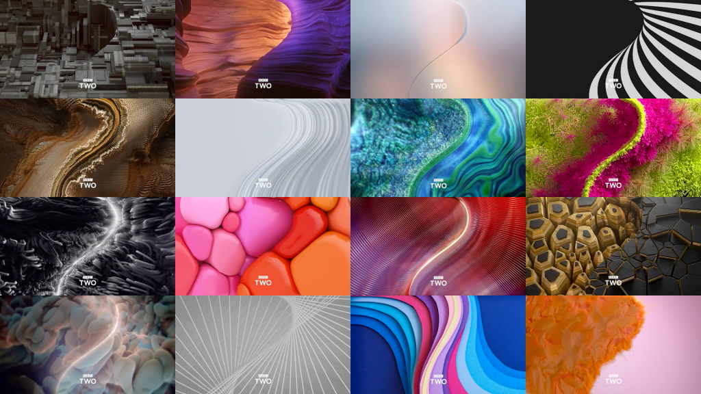
The branding agency Superunion rebranded BBC2 in 2018 for the first time in twenty years, in order to bring new life to the BBC2 identity. Knowing that BBC2 was a channel that offered a multitude of different moods, Superunion used strong visual language and metaphors to represent the consistently changing tones within the idents.
The key focus within this rebranding project is the curved ‘2’ shape that appears in every ident. This creates a strong consistency through its size and framing in the centre of the screen, reinforcing the BBC2 brand and creating a strong lasting impression on viewers, whilst acting as a point of expression for the different moods and tones that surround it in various different idents.

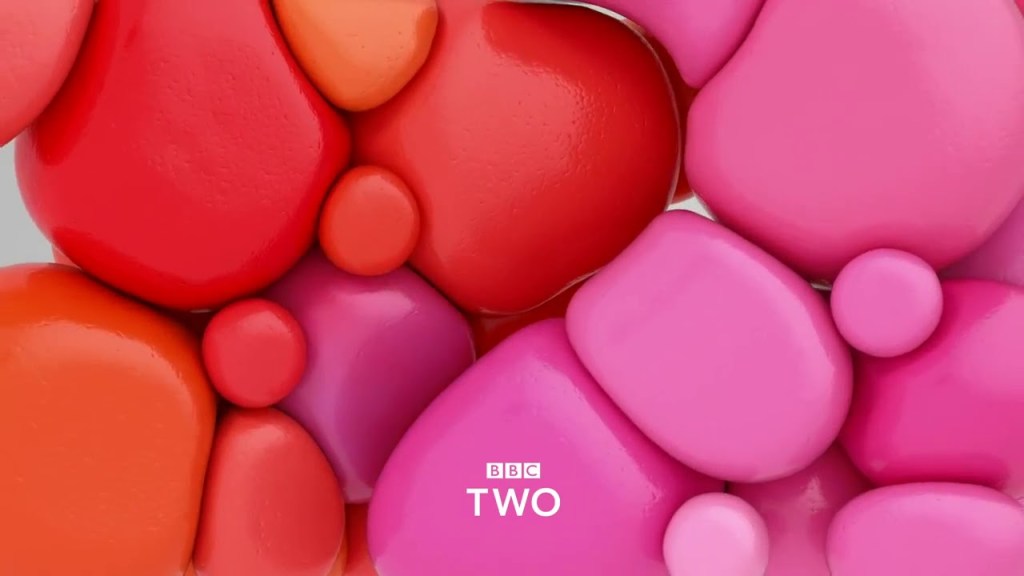
Superunion collaborated with other designers in the industry to create radically diverse idents, each with their own tone and essence. For example, in the idents below, there is a large range of different visual elements and messages to create different tones. Darker colour palettes are used to represent a more sombre tone for the channel’s more dramatic programmes, whilst cascades of colours weaved together with smooth animation represent a more comical and lighthearted side of the brand. Sound also plays a key part in reinforcing the brand’s identity – the composer, Alex Baranowski, uses simple two notes to reflect the atmosphere of the idents and blend them together seamlessly, whilst remaining memorable for viewers.
Sources:
Olins, W., 2008. The Brand Handbook. 1st ed. London: Thames & Hudson. (p30)
http://ruddstudio.com/project/itv-rebrand/
https://www.superunion.com/work/bbc-two/
