
Following a workshop on design systems and visual language, I began to focus on how I might make my outcomes consistent with each other to maintain the brand image I’m aiming to create. A design system is a set of elements that contribute to a specific purpose – for instance, a branding campaign. In this example, the elements would consist of the typeface(s) used, the colour scheme, the use of imagery, formatting, tone of voice and the type of information amongst other characteristics. These elements must share stylistic, syntactic and semantic values in order to be true to a design system.
Within the workshop, we examined how design systems work in finer detail. As a smaller group we examined the Casa da Musica, a music hall in Lisbon, and created a short presentation on its design system.

The brand of the Casa da Musica was designed by Sagmeister Inc, involving Stefan Sagmeister (Art Direction), Matthias Ernstberger (Designer), Quentin Walesh (Designer) and Ralph Ammer (Logo Generator).
Logo/Marque –
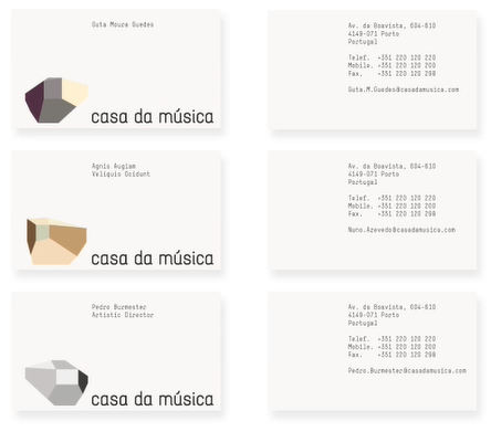
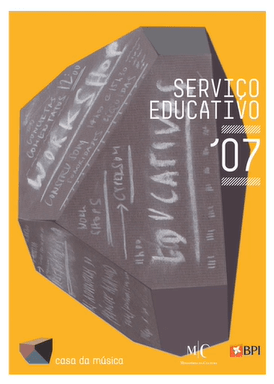
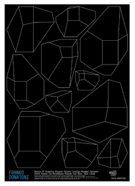
The identity of the Casa da Musica heavily incorporates the architecture of its building. Above are six logo variants that Casa da Musica use as a marque for their brand, showcasing the building’s unique shape across different angles. This is effective as it can allow the brand to translate across multiple formats depending on the tone and style of each medium.
Colour Schemes –
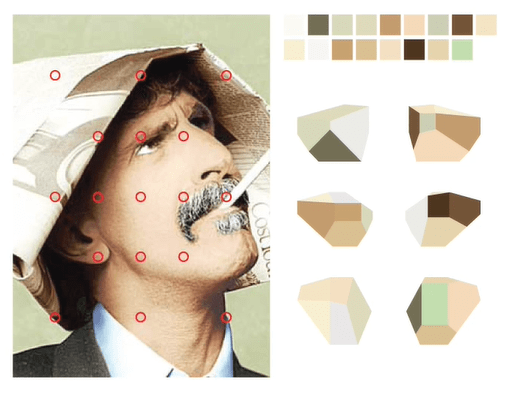
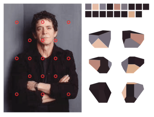
As demonstrated in the Sagmeister Inc. – Casa Da Musica Identity video, and as mentioned above, the colour schemes used within the Casa da Musica’s identity change depending on the media the identity is present in. Above, colour picking is demonstrated, similar to that of the ITV2 rebrand from Rudd Studio, in that the logo picks dominant colours from an image and composes itself of those colours. This again is effective as it allows the brand to clearly translate across a multitude of media and remain effective.
Typographic Systems –
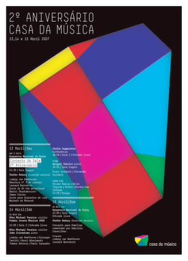
The typographic systems used within Casa da Musica’s identity is, again, dependant on the media surrounding it. In the posters above, for example, the typeface used is sans serif, capitalised and uses thin strokes for an edge of modernity and grace. However, within the building itself, looking at the signage and wayfinding systems, the typography used is scaled massively, using bolder strokes alongside capitalised sans serif letterforms. This design choice reflects the architecture of the building and inhabits the space by manifesting itself as it.

Wayfinding & Signage –
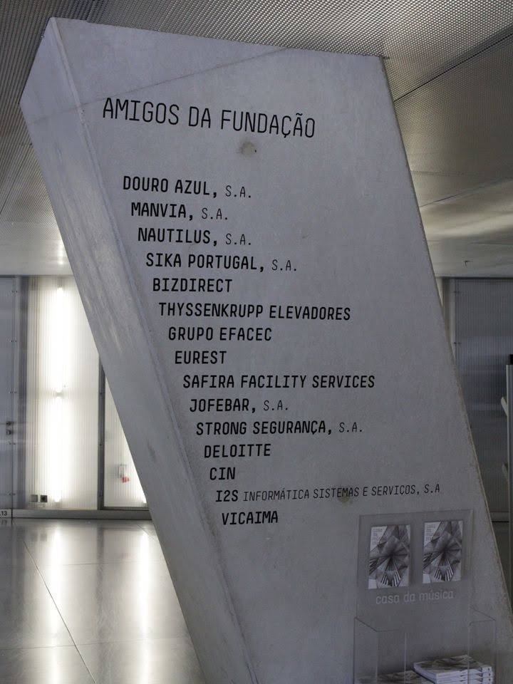

The wayfinding and signage systems within Casa da Musica stick true to the design system by reflecting the building they reside within. Using the aforementioned typographic systems, the signage sticks out through its huge scale and presence within elements of the building, such as being printed and engraved on pillars and walls. This is effective because of its continuous representation of the identity of the building, strengthening the brand and remaining memorable.
Sources:
Developing a Visual Language, Systems and Ephemera Presentation, David Wrenne, Design Systems Workshop (Thurs 10th October 2019)
https://www.casadamusica.com/ (Accessed 10th October 2019)
Casa Da Musica Identity – Sagmeister Inc. (November 30, 2010) (Accessed 10th October 2019)
