
At this stage, I decided to reflect on some of my prior research into protest graphics due to the nature of my concept being an act of protest and rebellion. This research was done as part of my response to a brief focused on movement, during Level 4.

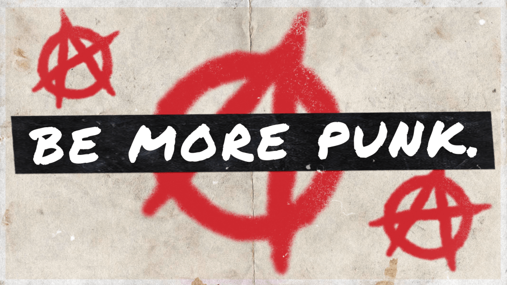
Protest graphics often consist of a strong D.I.Y aesthetic that can be put together by anyone, often a blend of physical and digital material. Simplicity and scale are used to reinforce points without distraction, and typographical elements are usually favoured over imagery. These graphics were particularly associated with the punk ideology in the 1970s, which my prior work was based on. In the above image, to demonstrate this D.I.Y aesthetic, I used individual letterforms of differing typefaces and scale to create a ransom note effect (popularised by Jamie Reid) as well as a washed out colour palette and the aesthetic of spray paint. I intend to use similar techniques within this project, focusing on typographical elements with simple accompanying imagery to forward my brand’s mantra.
