
With a concept settled on, I began to work on establishing my design system. This section of development will focus on generating a logo based on my initial ideas and concept, as well as establishing a colour palette.
Following some peer review and crit, I took the upside-down anarchy symbol idea forward, with the frame of the A now resembling a V – for VIRUS.
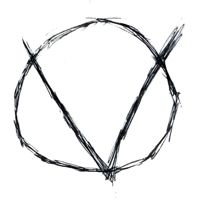
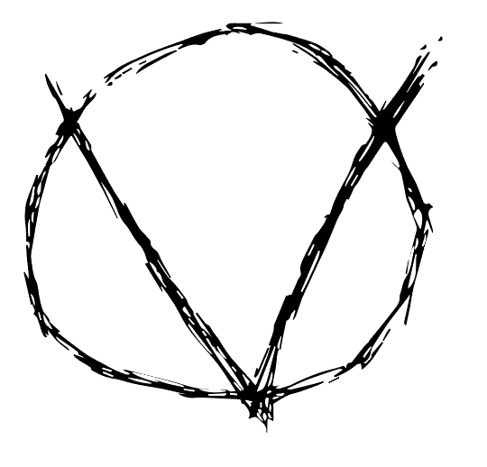
To continue development, I brought the initial concept into a digital workspace and begin to think about how I could refine it into a marque that could both look aesthetically strong and reflect the nature of my brand. I experimented a bit with stroke thickness and shape.
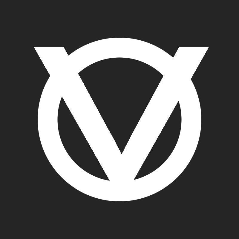
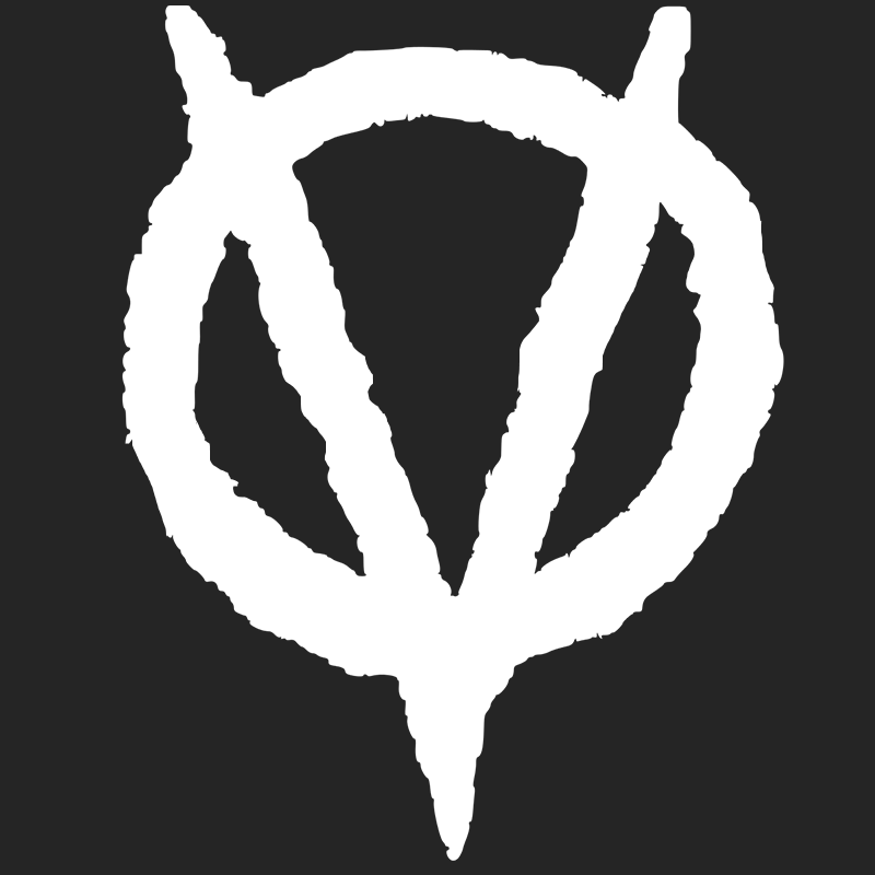
I decided to take the second development forward, as its stylisation better reflected the nature of my brand – rebellious and anarchist, and less corporate. I began to think about a colour scheme, and what colours would work well together to promote this idea of revolution against an inactive government. This basis of anger led me to my first decision – a strong red.
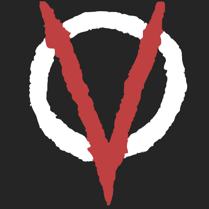
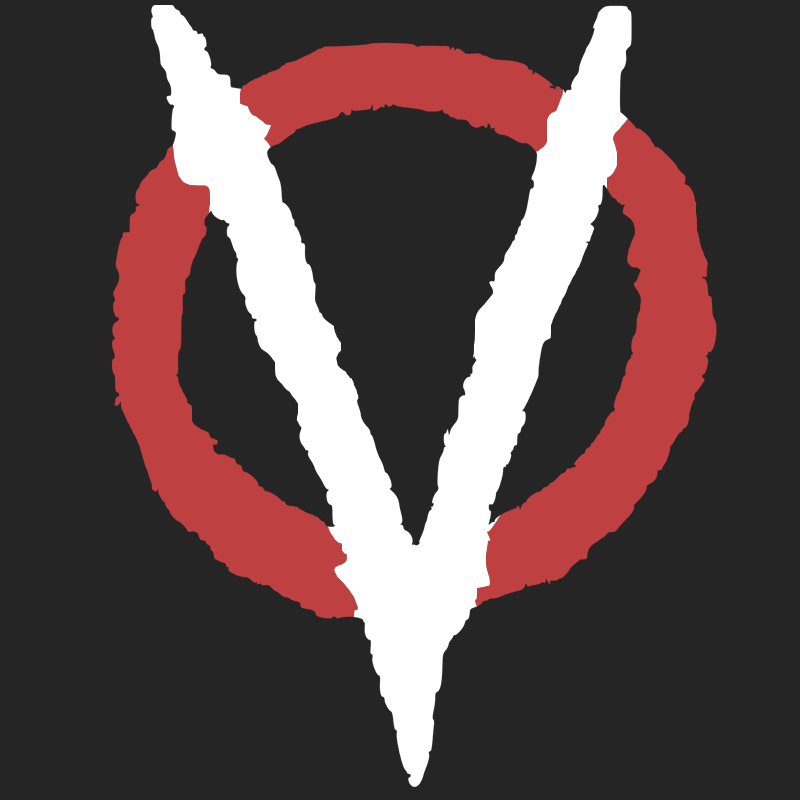
I decided that the V shape being red was more effective than the circle around it, as the V was the initial for VIRUS and therefore reinforced the brand more.
