
At this stage, I had a fairly good idea of the colour palette and logo to use, so I took my ideas to a peer-reviewed crit and presented them. Alongside the above logo, I also showed off some mock-ups to emulate my logo within the real world:
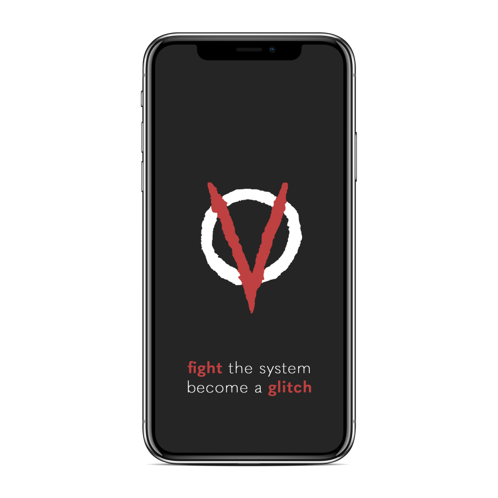

With these mock-ups, I wanted to show off some further ideas I had for the design system of this brand – in particular, the tonality and stylisation of text that would appear within my deliverables, and some sense of signage in the form of a QR code. The tonality I intended to use at this stage was quite casual yet persuasive, appealing to a more contemporary audience with lower-case text stylisation. The QR code represented my exhibition inhabiting a digital space – my plan was to not feature traditional signage or a map, as the exhibition existed entirely online, but rather provide the general public with an easy way to access the exhibition by scanning QR codes around the world that are stamped onto exhibits from VIRUS. The critique proved to be useful as it reaffirmed my initial ideas were off to a good start, and what I had established so far definitely seemed to work.
