
To kick off, I started by taking a look at some of the covers for A Short History of Nearly Everything that already exist to get a sense of the visual language and metaphors to avoid. I didn’t want to fall into the trap of my cover not standing out enough from existing variations.
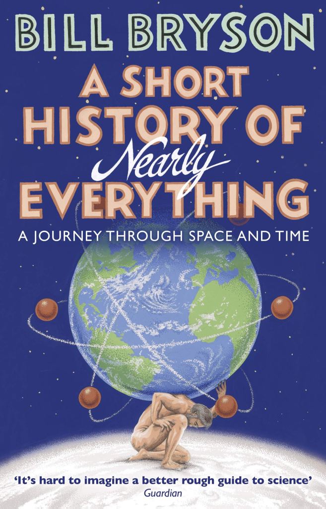
This cover has a strong visual hierarchy whilst using a visual metaphor of a globe (something that will pop up again and again through many different variations of this cover), as well as space and planets. This is a really effective design and a great way of showcasing the themes of the book whilst remaining true to the light-hearted tone of the book through playful typographic elements.

The globe is used again here, alongside the visual metaphor of parts to paint the book as informative (showing how things are put together and subsequently work.) However, this cover isn’t as playful and lighthearted as the one above – the typography is simplistic and the colours are quite dull – and therefore this design doesn’t effectively communicate one of the best selling points of the book: its light-hearted tone.
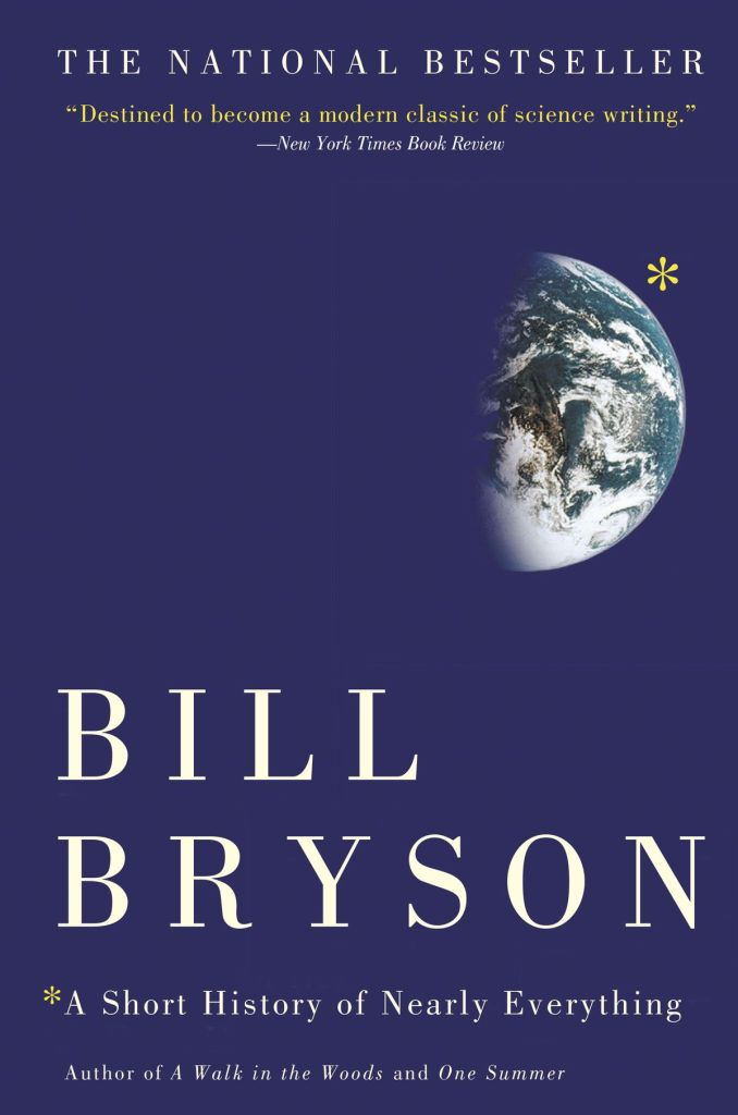
The globe returns in this simplistic cover, alongside the visual metaphor of the asterisk connecting the image to the title of the book – signifying that there is more to see to the planet and that it will be explored in the book. This is a great metaphor, but its let down by the serious nature of the cover – it looks a lot like a typical textbook thanks to its plain background, simple serif typography and visual hierarchy.
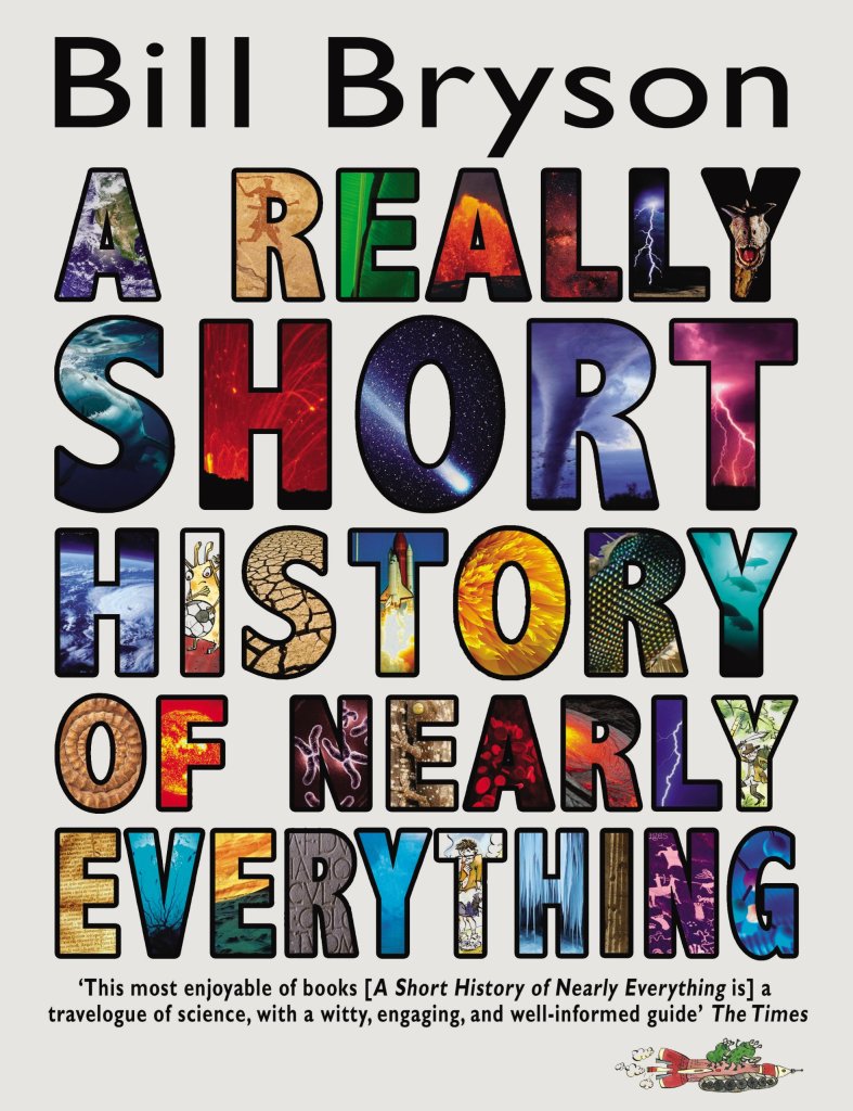
This design strays away from using a globe and instead fills each letterform with an image relating to the themes and topics from the book. Whilst it’s pleasant to see a design stray away from the cliche globe and opt for more typography, I’d argue it’s a little too busy and not as effective as it could be. However, the informative and light-hearted tone of the book can clearly be seen through the decisions made here.

This cover is for an audiobook version of the book that uses two new visual metaphors – the image of a puzzle piece fitting into place to create a whole piece, as well as the hands referencing the Creation of Adam painting by Michelangelo. These metaphors work well together to display the themes of the book, showing that the book details major historical works as well as acting as the missing piece to understanding the complex history of science and humanity. The colours used are bright, the typography is varied and overall there is an aura of excitement, thus displaying the light-hearted nature of the book really well.
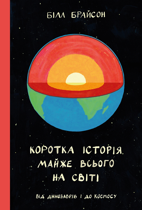
This Russian design utilises a globe but opts for a softer, pastel-like range of colours that appear hand-drawn. The light-hearted nature of the book is apparent in this design thanks to this design choice, as well as the friendly typeface used. The informative nature of the book is also apparent as the globe has a piece missing to reveal the different sections of its core, a nod to geographical and scientific illustration.

This cover plays on the globe by putting it into a bubble-wrap box, directly indicating that the book is a small package containing a lot of information. The colours and typeface used are friendly, denoting the light-hearted tone of the book well.
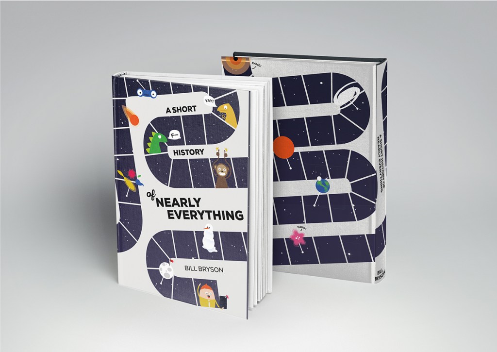
In this final cover varation, and my personal favourite, the artist Gabriela Cestari has played with the visual metaphor of a timeline turned into a gameboard, denoting the lighthearted nature of the book whilst cleverly visualising the themes and topics talked about in the book. The friendly illustrations and simple, bold sans serif typography also help deliver on the informal tonality of the book.
After examining these covers, I have a pretty good understanding of the sort of things that worked, as well as the things to avoid. Any globe or globe-related imagery will definitely not appear in my redesign, so I’ll need to think outside the box a little on how I can deliver a visual metaphor on the scientific yet informal nature of the book without resorting to cliche.
