In the last couple of weeks of the project, I started focussing on the bulk of my submission – creating my own work in a digital space and exploring its potential against a physical iteration. The research taken prior to this week has been in preparation for this – understanding how best to place my own work in the Metaverse, and how to successfully examine it and virtual branding as a whole in more detail in the supporting assessment.
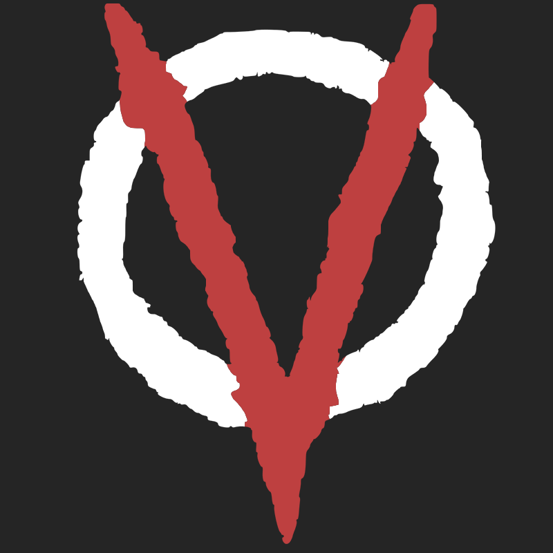
I decided quite early on to take the branding project I completed last year for my subject studies and take it into the Metaverse. This project tasked us with creating our own brand based on a given word – in my case, “glitch” – and create a variety of deliverables to exhibit and display the brand, such as creating a logo and visual language and then translating this to posters, leaflets, signage and more. I started by reflecting on this entire process and picking out the strongest parts of the brand identity, which I felt to be the logo:
Before moving on from this selection, I had a few things to consider first: how would I be able to digitally reconstruct this logo and translate it into a piece of branded media, what platform/software would I use to do it, and how could I use my specialist subject skills to do it?
I started by thinking about the platform used. I wanted something that offered complete freedom with little to no learning curve, and that would successfully make the logo pop – i.e fit in and visually support its surroundings whilst being the centrepiece of attention. Based on my deep experience and general love for video games, I chose the game Minecraft to be the medium for my virtual world as it offers an infinite amount of freedom in creation, using small blocks to create larger structures with some nice lighting features on top to really make the logo stand out. The game is also multiplayer and would allow for other people to enter this virtual space, which I felt was absolutely paramount to the idea of creating art in a digital world.
The next stage was thinking about how to digitally reconstruct the logo in this blocky format. What form would this logo take, and what would its surroundings be to really embellish the brand? I reflected on some of the different outcomes I made for the branding project to get a sense of this:
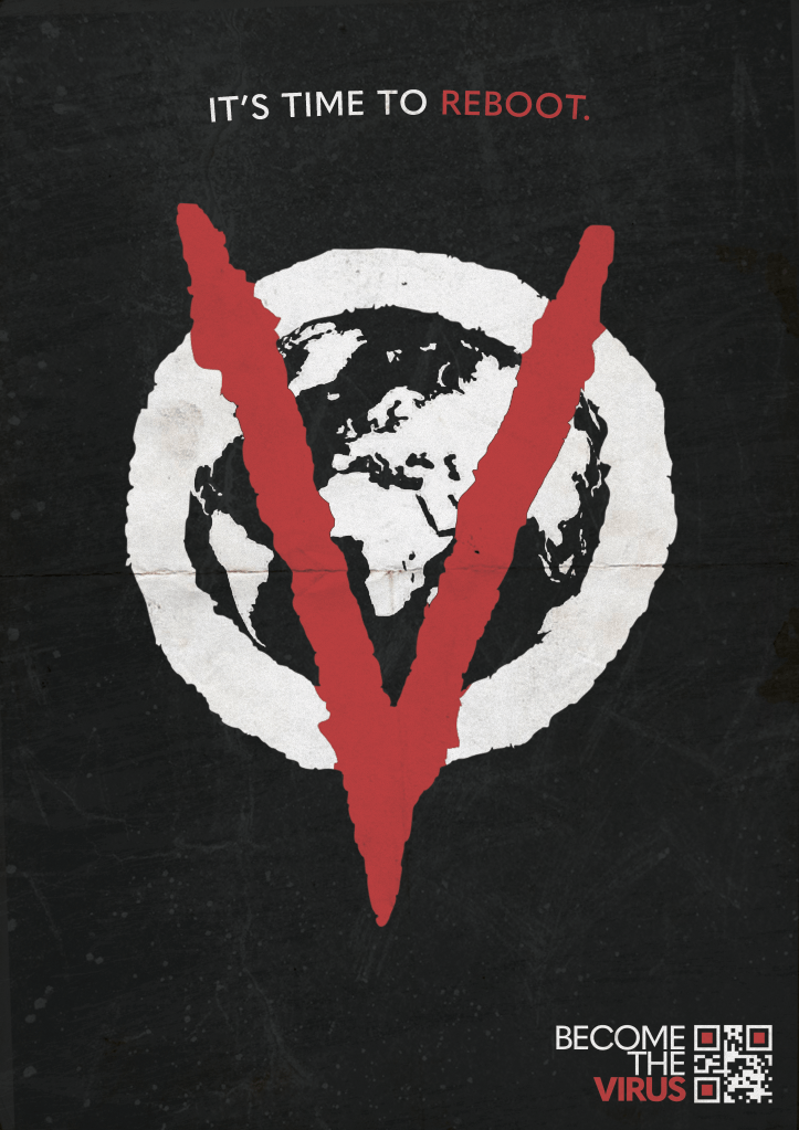
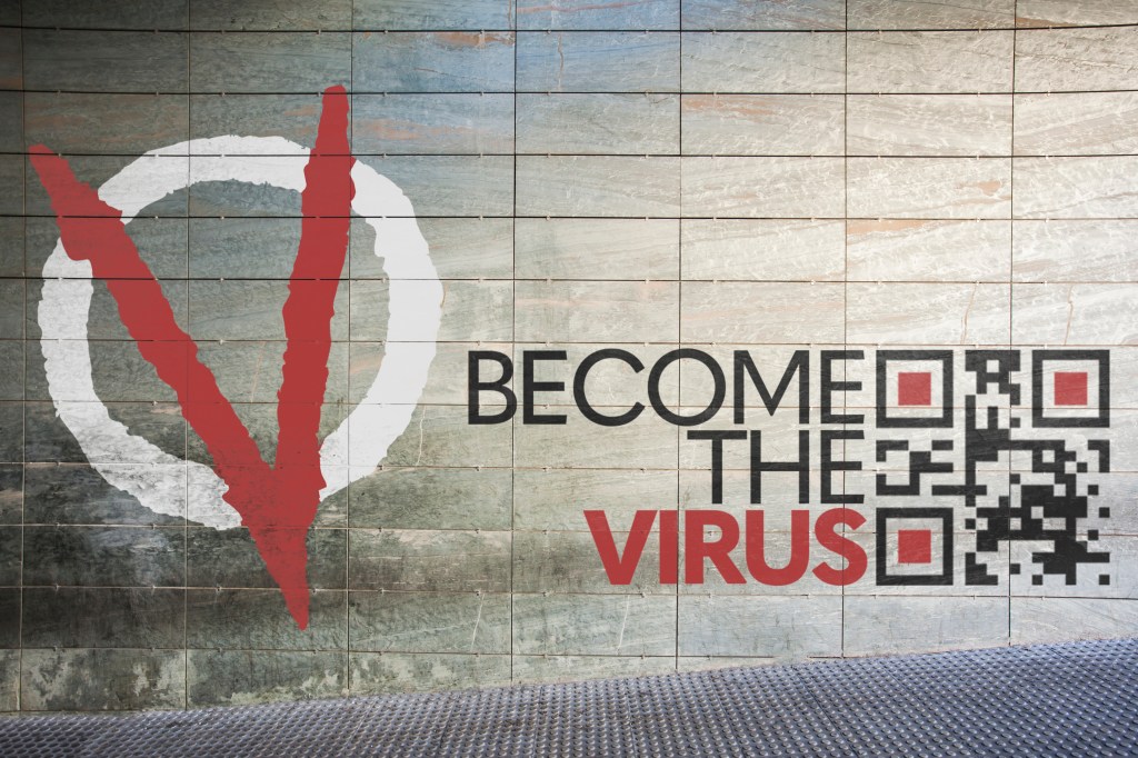
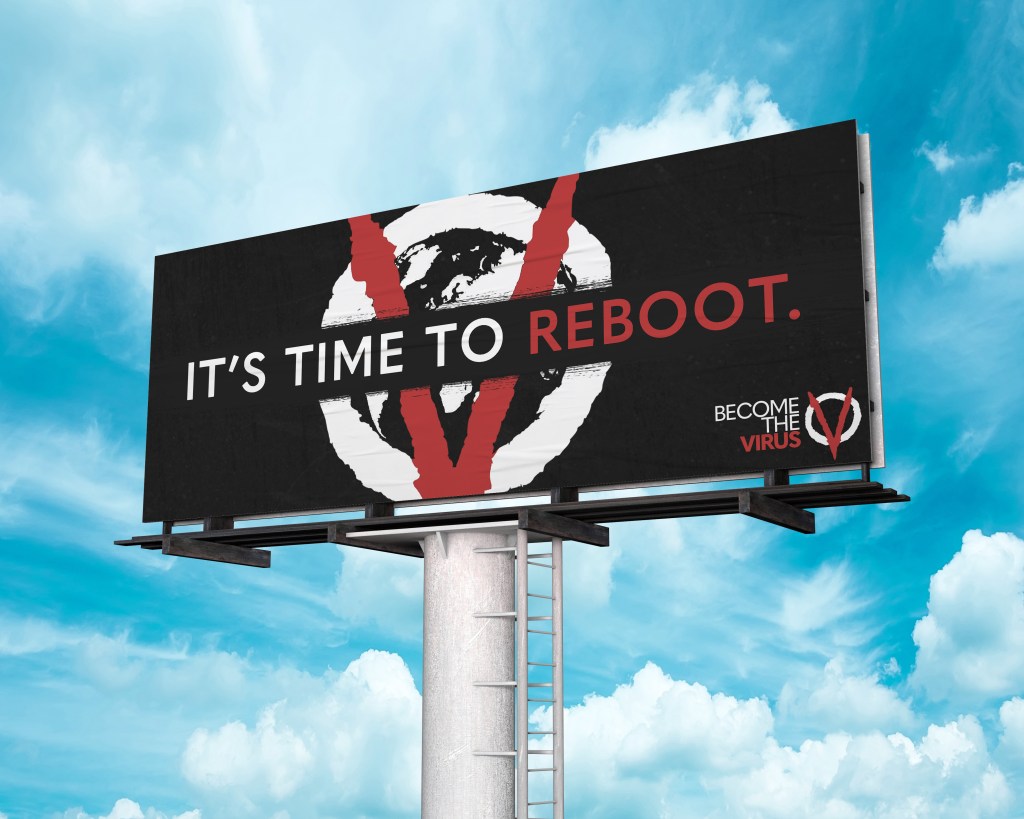
Creating a richly detailed poster like the ones above wouldn’t really be viable in the context of Minecraft, and so simplicity was something I was aiming for. I really liked the idea of a billboard strapped to the side of a building, and this would be something achievable in the context – there were plenty of free-to-use cityscape worlds I could create something in, and this setting would work really well with the theme of the brand – a technological-based exhibition that demands to be seen by as many as possible in an urban setting.
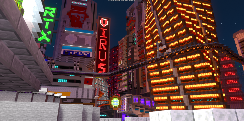
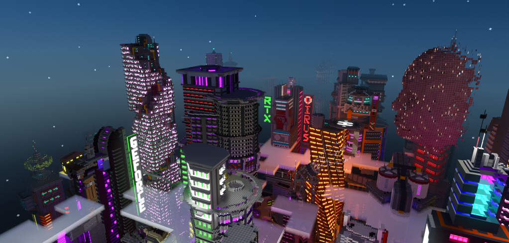
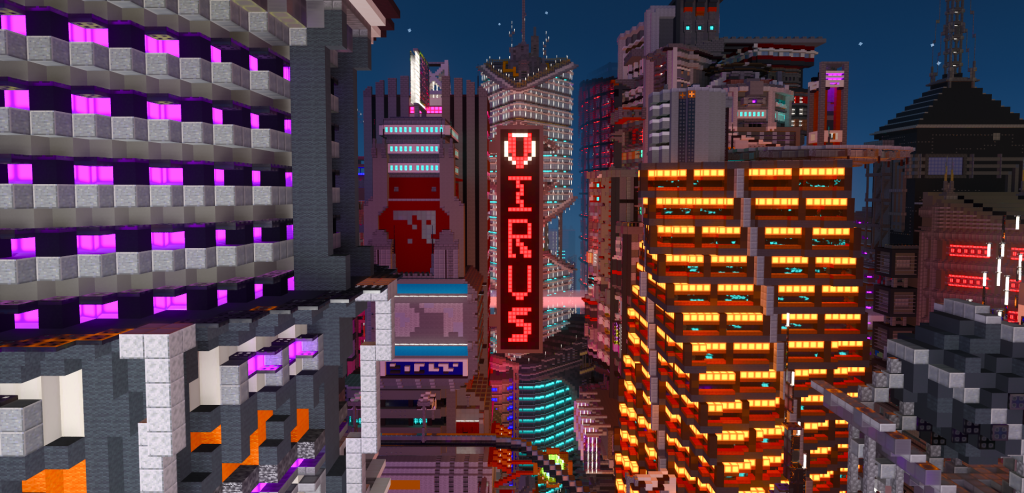
With the format, setting and platform decided, all that was left was to actually construct something. I loaded up the virtual world, selecting a city scape world created by Nvidia that was richly detailed and perfect for what I had in mind.
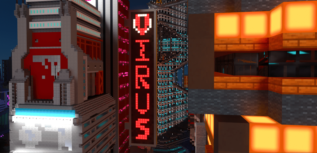
I had some initial concerns regarding typeface, as the logo I created is vector-based and by its nature not blocky in the way a pixel-based design would be. I experimented a little with different types of letterforms, changing the thickness of strokes from one block to two, but in the end felt that the style that would work for one letterform didn’t work for another. I then decided to have each letterform be slightly different, as if selected from a different typeface altogether – this really worked well within the theme of ‘glitch’.
Scale was another thing to consider, as I had to leave enough room to give enough detail on each letterform whilst avoiding creating a sign that was overly large or unsettling to the eye. For reference, I followed a similar style to that of another sign created by the developer of the map that was placed on the other side of the building I had picked. This provided me with a general width of 12 blocks (1 block being 1 virtual metre) and a height of 70 blocks, with a depth of 3. This left me with the following area: x=12 y=70 z=3. Whilst real world billboards don’t tend to be this large, the same rules luckily don’t have to apply in the Metaverse!
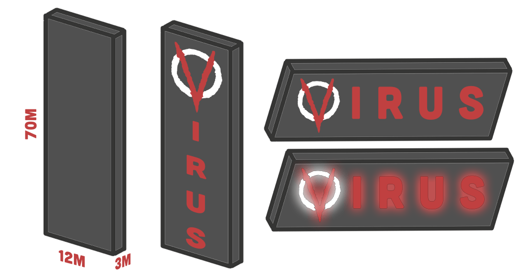
The final concern was colours and the types of blocks I would use, though this came quite easily. I wanted the billboard to be vibrant and pop out against the well-lit city, so used blocks that had similar lighting effects. The colours were simple – I stuck with the red, white and black I had established in the visual scheme for the brand.
With a solution for these concerns ironed out, I constructed the billboard with little issue, and created the following fly-by video and screenshots to showcase the work in its virtual setting: