Social Branding, Week One: Responding to the Brief

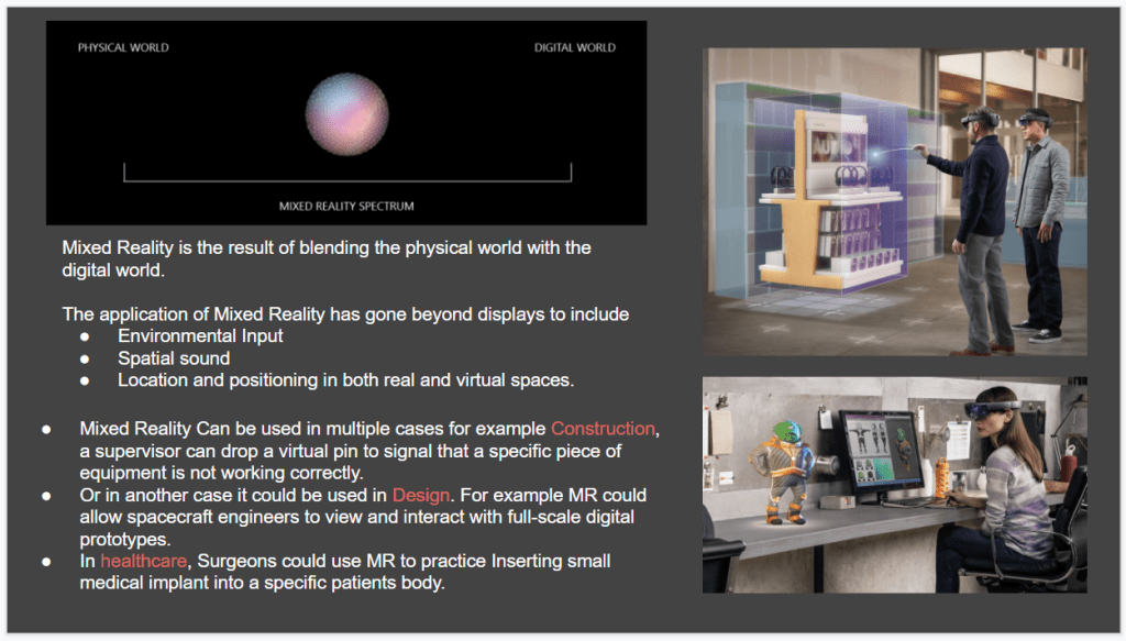
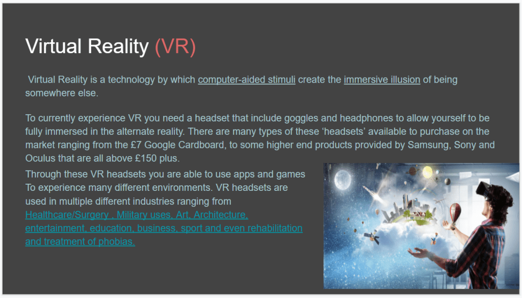
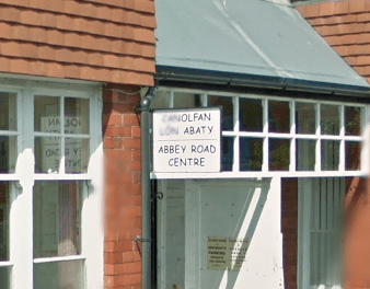
The collaborative Social Branding project consists of completing a live brief for the Abbey Road Centre, a client in three terraced and interlinked houses on Abbey Road in Bangor, Wales. The client is a centre primarily focussed on providing mental health support, services and resources to people by promoting good and healthy practices, as well as offering meeting rooms and office space to external clients for additional income. They run a drop in day service for adults who may be experiencing trouble with their mental health and function on a Monday-Friday basis. However, the client revealed that their brand is heavily outdated, having only changed once since their opening in 1985. There was no real logo present, instead signage using Comic Sans (which of course at the time wasn’t as infamous as it is now!) and a recently updated website that the client would like to be improved on. Before looking at deliverables, however, we looked at the centre itself.

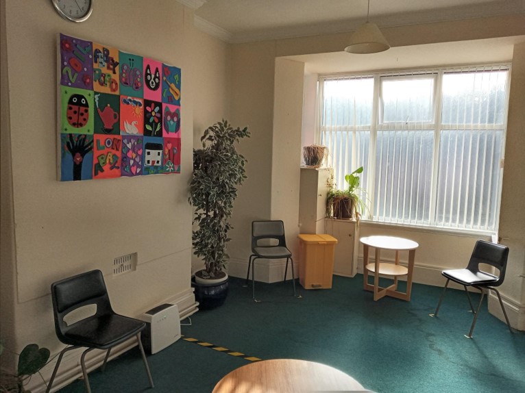
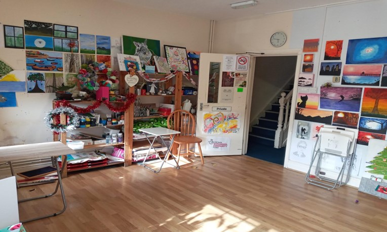
We were provided with a tour of the centre by the client and given an insight into what was in place already. The building itself had a good range of mid-century furnishings in various rooms that were used for different purposes – for example, there were four working rooms for counselling and office work, a reception, a craft room and an art room, as well as an outdoor garden space with a mural. There was a notable presence of a good variety of home-made arts and crafts throughout the building that the client wanted to retain in the rebrand.

To re-invent the Abbey Road Centre, we were put into small groups of ‘agencies’ and presented with the communication challenges and a list of deliverables. These challenges included:

  • Changing how the client offers services and support and how the centre is utilised to earn new income streams and more fundraising – the client wants to expand their online support, whether that is over the phone or digitally, and working with the people they help outside of their centre by sending activities home.
  • Bi-lingual – the Centre and its rebrand must be available to access fully for both Welsh and English speakers.
  • “Rhowch Bwyth/Give a Stitch” – a handmade crafting project where the Centre provides supplies and resources to volunteers, who can then pass back crafted goods to the Centre to sell on an online shop – as part of their website. This hasn’t been branded or launched yet.
  • Beekeeping – the Centre plans to house bees, selling their honey and using the beeswax to make candles and natural beauty products for an additional source of income.
  • Soapmaking – whilst still an idea, the Centre has the resources in place for this to happen as an additional source of income.
  • “Food Friday” – when the Centre is able to return to inhouse meals, Food Friday offers home-cooked two-course meals for those who want to drop in.
  • Seasonal items – such as cards and decorations for birthdays, Christmas and other holidays. The client is very keen to get this going as the rebrand will be able to boost this as a great source of income.

My take-away from these challenges are to create a flexible brand that will be able to be approachable as both a mental health service and room letting service, as well as being able to be sold commercially on hand-crafted goods such as tote bags, cards, apparel and the aforementioned honey & candle ideas. The Centre wants to move away from being “a place that someone comes to resolve their mental health problems” to a place that anyone can bond with and see as an organisation to improve your wellbeing. The most important thing to show with this rebrand is that actively supporting your mental wellbeing doesn’t hold stigma, and can be done in any way that suits you.

The deliverables that the client is looking for are as follows:

  • Brand Strategy – creating a strategy before anything else to work out how the brand will solve the aforementioned challenges, as well as how our own agency will operate together and who will tackle which challenge. This initial strategy is one that must be taken by all of us to ensure we’re all on the same page and are able to retain consistency.
  • Branding – working out which typefaces, colours, images, metaphors and more can be used together to create a strong brand, initially a logomark that can then be adapted and translated across the following deliverables without losing its effectiveness.
  • Wayfinding & Environment – signage systems for both the exterior and interior, how the Centre’s many facilities can all be linked together in a unified way and allow the Centre’s own clients to access it with ease.
  • Website Design – improving upon the aforementioned updated website to encompass all of the above planned facilities and services whilst retaining the Centre’s physical brand
  • Promotion – videos, social media campaigns and posters that can be used to promote the rebrand and reach out to new clients who may be interested in the Centre’s services.
  • Printed Matter – packaging, labelling, bags, stamps and cards to used around the Centre.
  • Budget – a real-world cost-effective budget, looking at quality materials with an efficient cost to help realise the rebrand.

At the end of this first session, I took some time to digest the brief – rewriting it here in my own words to help better realise what is being asked of our agency and ensure a full understanding of what the client is after. My plans from now are to dive into some research within my agency, looking at how we can establish a system for this brand and identify what typefaces, colours, images etc. to use, whilst examining some existing successful mental health charities and services and how their brands operate – or even how they may struggle. We’ve established a working strategy within our agency, arranging meetings and sessions where we can collaborate and share ideas before working on our own pieces. We also identified our own strengths and weaknesses – from past projects I can identify my strength as digital presence, so I’m quite keen to get stuck into the website and perhaps some digital promotional material once we’ve established a good system for the rebrand.

Crossing the Metaverse, Week Four: Designing in a Digital Space

In the last couple of weeks of the project, I started focussing on the bulk of my submission – creating my own work in a digital space and exploring its potential against a physical iteration. The research taken prior to this week has been in preparation for this – understanding how best to place my own work in the Metaverse, and how to successfully examine it and virtual branding as a whole in more detail in the supporting assessment.

I decided quite early on to take the branding project I completed last year for my subject studies and take it into the Metaverse. This project tasked us with creating our own brand based on a given word – in my case, “glitch” – and create a variety of deliverables to exhibit and display the brand, such as creating a logo and visual language and then translating this to posters, leaflets, signage and more. I started by reflecting on this entire process and picking out the strongest parts of the brand identity, which I felt to be the logo:

Before moving on from this selection, I had a few things to consider first: how would I be able to digitally reconstruct this logo and translate it into a piece of branded media, what platform/software would I use to do it, and how could I use my specialist subject skills to do it?

I started by thinking about the platform used. I wanted something that offered complete freedom with little to no learning curve, and that would successfully make the logo pop – i.e fit in and visually support its surroundings whilst being the centrepiece of attention. Based on my deep experience and general love for video games, I chose the game Minecraft to be the medium for my virtual world as it offers an infinite amount of freedom in creation, using small blocks to create larger structures with some nice lighting features on top to really make the logo stand out. The game is also multiplayer and would allow for other people to enter this virtual space, which I felt was absolutely paramount to the idea of creating art in a digital world.

The next stage was thinking about how to digitally reconstruct the logo in this blocky format. What form would this logo take, and what would its surroundings be to really embellish the brand? I reflected on some of the different outcomes I made for the branding project to get a sense of this:

Creating a richly detailed poster like the ones above wouldn’t really be viable in the context of Minecraft, and so simplicity was something I was aiming for. I really liked the idea of a billboard strapped to the side of a building, and this would be something achievable in the context – there were plenty of free-to-use cityscape worlds I could create something in, and this setting would work really well with the theme of the brand – a technological-based exhibition that demands to be seen by as many as possible in an urban setting.

With the format, setting and platform decided, all that was left was to actually construct something. I loaded up the virtual world, selecting a city scape world created by Nvidia that was richly detailed and perfect for what I had in mind.

I had some initial concerns regarding typeface, as the logo I created is vector-based and by its nature not blocky in the way a pixel-based design would be. I experimented a little with different types of letterforms, changing the thickness of strokes from one block to two, but in the end felt that the style that would work for one letterform didn’t work for another. I then decided to have each letterform be slightly different, as if selected from a different typeface altogether – this really worked well within the theme of ‘glitch’.

Scale was another thing to consider, as I had to leave enough room to give enough detail on each letterform whilst avoiding creating a sign that was overly large or unsettling to the eye. For reference, I followed a similar style to that of another sign created by the developer of the map that was placed on the other side of the building I had picked. This provided me with a general width of 12 blocks (1 block being 1 virtual metre) and a height of 70 blocks, with a depth of 3. This left me with the following area: x=12 y=70 z=3. Whilst real world billboards don’t tend to be this large, the same rules luckily don’t have to apply in the Metaverse!

The final concern was colours and the types of blocks I would use, though this came quite easily. I wanted the billboard to be vibrant and pop out against the well-lit city, so used blocks that had similar lighting effects. The colours were simple – I stuck with the red, white and black I had established in the visual scheme for the brand.

With a solution for these concerns ironed out, I constructed the billboard with little issue, and created the following fly-by video and screenshots to showcase the work in its virtual setting:

Crossing the Metaverse, Week One: Exploring Virtuality

The Level 5 Field project I chose was Crossing The Metaverse – a five week project that explored the idea of the Metaverse and how art and design can exist in virtual spaces. Before the first session, I wanted to do a little bit of prior research in order to prepare myself, and took the time to look at the word ‘Metaverse’ and think about my own experiences with virtuality.

The term Metaverse was coined by Neal Stephenson in his 1992 novel Snow Crash, and is used as a term to collectively describe the near-infinite number of worlds and spaces that exist in the virtual realm. These worlds can range from the immense social media platforms, such as Facebook, Instagram and Twitter, player-created worlds in video games such as The Sims and Second Life, and even virtual classrooms over Zoom and Microsoft Teams that has emerged in the age of the pandemic. These worlds all serve different purposes – to engage the user in recreational activities, such as socialising or playing games, or teaching and educating students, or even showcasing and promoting works of art and music to the world. To my understanding, it is this last facet of virtuality that we are going to be focussing on within Crossing the Metaverse.

The first session provided us with a good overview of the five weeks and our assessment, which involves discussing virtuality and applying it to our own practice, perhaps showcasing a piece of work in the digital world or using the digital world as an element of our work. We took a look at different types of virtuality, such as virtual reality, augmented reality and mixed reality, and completed a small presentation as a group on these different terms to attain a better understanding of virtuality.

We were also introduced to the online virtual world Second Life, which we then explored further in our second session. Second Life is a massive online virtual world (some may consider it a video game, though whilst a recreational world, Second Life really is so much more) in which players can create an avatar, chat with others and create their own virtual spaces. What’s unique about this world, however, is that everything you see upon loading the client is player-made (with the exception of some developer-made starting areas to introduce the user). In effect, Second Life is probably the most popular and largest virtual world that exists, offering complete freedom to its users by allowing them to create an avatar that either reflects their real-world self or an entirely made up identity, create rooms, areas and even pieces of art to showcase to other inhabitants. We spent an hour or so getting to grips with the basics, then were asked to go out and explore before regrouping and having a discussion about the things we got up to.

In the three or so hours I played Second Life, I had a few different encounters with the world as a whole and other players. I spoke to a long-term inhabitant of the world who explained how the world differs from our own, and how they came to be more comfortable living in their virtual identity in Second Life as it was a safe haven from some of the issues they had going on in their real world life. I also took the time to explore some different areas and tried to think about how my field area, graphic communication, may be represented. My most notable encounter with the world was visiting one of the many art museums present, which featured work from many different players and had quite a few genuine people wandering around! I found this to be really interesting – my idea of recreational gaming doesn’t quite involve exploring a player-made art museum on a game from 2003, but I think that’s the point – Second Life isn’t meant to be played as a game, it’s meant to be lived in as a world completely separate to ours. After taking some screenshots and finishing any conversations I had with the other inhabitants, I closed the application for the time being.

Back as a group, we had some brief discussions about our experiences in the world and what we had found. This was really useful in the reflective process, as it allowed me to apply the views of different designers to my own experiences and think about how the different pieces of art I saw were interpreted differently by students in different fields – for example, I was able to appreciate the type setting and layout of one piece, but an illustrator provided a great specialist insight as to how the image worked in conjunction with this.

So far, so good! My initial interpretations on the five week project have had me thinking differently about virtual worlds, reflecting on my own experiences when playing video games and how those worlds – created either by developers or by myself when allowed to do so – function and differ from each other. Next week I believe we are looking closely at sound and how that adds to the virtual experience, and potentially how to utilise sound within our own outcomes for the assessment.

Level 5 Summative Reflection [OTHR1]

Following the completion of my WRIT1 Research Proposal, Iโ€™ve taken some time to reflect on the assessment as well as the Constellation experience to date. In particular, Iโ€™m looking at the ideas, methods and critical positions I have uncovered through constellation studies and my own research, discussing them in conjunction with what I have learnt from them in an attempt to iron them out, so they can be laid flat and unloaded from my (now slightly cluttered) mind to within this document – closing the Level 5 Constellation chapter and preparing the way for my Level 6 dissertation work.

My research proposal consisted of a 5,000-word assessment that would serve as the foundation for my dissertation โ€“ acting as a document to select key literature, artists and work and discuss them in conjunction with each other and my thesis. It took some time to iron out the thesis I submitted for my research proposal, and it very well may change again when it comes to writing the dissertation, but I settled on the following:

Examining the Visual Language of Punk and its Influence on Graphic Communication – Then and Now

The subculture of punk has been something that has consistently been an interest of mine but I found when it came to this proposal I had only really scratched the surface of punk. My knowledge prior to this assessment consisted of the years I grew up listening to punk artists, ranging from the late 70s to now, as well as some punk ephemera and books that I had acquired. However, I was given the chance to expand my knowledge by doing some of my own research during constellation at Level 4.

During Level 4, my knowledge of the culture expanded when writing a 3,000-word assessment based on the constellation studies I had. I learnt about postmodernist theories and Roland Barthes, which provided a new way of thinking about how we perceive things โ€“ and I was able to apply this knowledge within my research proposal, discussing how punk and punk art is postmodernist in nature, rejecting realities and normalities and demanding that it be critiqued. My Level 4 assessment had a different focus โ€“ I was picking apart the myths of punk subculture rather than focusing on its visual language, but I was able to reference back to my assessment and apply some of the material I had researched and discussed there to my research proposal, such as Ian Moranโ€™s essay on the D.I.Y. nature of punks, or Bestley and Oggโ€™s anthology of punk ephemera displayed in The Art of Punk. I was able to take this a step further in my research proposal by considering more material โ€“ notably another book that focussed on the foundations of the punk visual language. Oh So Pretty: Punk in Print 1976-80 by Toby Mott features a huge collection of printed punk ephemera, similar to that of Ogg and Bestley, but with Mottโ€™s collection I was able to identify another critical position on punkโ€™s relationship with graphic communication โ€“ the way Mott perceived it was entirely different to how I did, as his experiences as a punk living in 1976 are totally different to that of mine. This concept was put forward by Roland Barthesโ€™ in his Death of the Author theory โ€“ that all meaning and intention behind a piece of work is lost when the artist puts the work forward, and it is entirely up to the audience to create meaning depending on their own experiences โ€“ and this is something I briefly touched on within my research proposal.

At Level 5, I examined the philosophy of senses, and how our senses come into how we perceive, critique and create design work. These study groups consisted of discussing works of art beyond what we see at a physical level โ€“ considering how art is heard, felt, smelt and even tasted. This study group taught me that art is not two dimensional โ€“ art transcends the realm of physicality, existing as a thought, an emotion, even a muse. I took some of the concepts and ideas we discussed in this group and thought about them in relation to my research proposal, considering how the punk visual language can be interpreted beyond a physical level. The nature of punk appears through thought โ€“ an attitude to be had; through emotions โ€“ a culmination of anger and resentment against a larger system; and a muse โ€“ a means of escape and artistic expression for people who may not be equipped with the tools of the privileged.

After submitting my research proposal and reflecting on the nearly two(!) years of constellation studies, I find myself progressing. Where before I took punk for granted, enjoying the music and appreciating the art, I didnโ€™t look closely enough at the technicalities and mechanisms deliberately put in place. This research proposal combined with the concepts and lessons learnt from constellation has opened my eye to just how visual languages work, how one can convey entire messages and statements through graphics, music and clothing. I will now forever be mindful of this when designing my own work, realising that every piece of art I create and every brief I complete will not just exist as a physical solution to a problem โ€“ it will carry significant power outside the realms of physicality. I will always be appreciative of the many who have come before to define this visual language. Graphical communication is one of the most powerful tools in the world, and one only needs to look at the punks of 1976-80 to see just what art can do.

Hospital Based Recycling – What’s in place already?

To get a sense of the waste management systems already in place, our client provided us with a small presentation that outlined CTMUHB’s approach, as well as an insight into what legal requirements and guidelines are currently in place.

The bagged waste system currently in place is as follows:

  • ORANGE Bag – Infectious Waste ONLY (Blood Swabs, Dressings)
  • TIGER Bag – Hygiene Waste ONLY (Non-infectious medical waste)
  • BLACK Bag – Municipal Waste (Non-recyclable domestic waste)
  • CLEAR Bag – Recyclable Waste

Lidded bins are used to dispose of sharp objects. The system in place for those is as follows:

  • ORANGE Lidded Bin – Sharps not contaminated with medicines
  • YELLOW Lidded Bin – Sharps contaminated with medicines.
  • PURPLE Lidded Bin – Cytotoxic or Cytostatic drugs and medicine, as well as waste contaminated with these (drugs used to destroy cancer cells)
  • BLUE Lidded Bin – Out of date non-hazardous waste or pharmacy returns
  • RED Lidded Bin – Anatomical waste

As well as these bins, cardboard containers are used to dispose of sealed fluid units.

Fracture clinic casts and dental moulds also need to be separated as these can no longer be disposed into landfills due to dangerous chemical reactions. These are placed into gypsum waste containers.

The above information is vital as if it is not adhered to, legal enforcement can take place. However, it is definitely a lot to take in, especially for staff at CTMUHB who will be under a lot of stress and pressure. This is why a clear communication system is needed.

CTMUHB also provided us with some examples of the visual elements they use in order to enforce their waste management system. These are the labels placed on the bins:

At a first glance, these labels appear cluttered and confusing – it would take a lot of effort to distinguish what goes where, especially with those unaware or new to the system. The visual hierarchy and layout of text elements isn’t optimised, and there is a notable lack of iconography that would greatly reduce the effort needed into separating waste. These labels are one of the things I aim to redesign to be concise and easy to understand at a glance.

As well as these labels, we were also provided with an example of the waste segregation poster on display throughout CTMUHB. This poster’s goal is to instruct and remind staff on the waste management system in a clear and concise way.

Whilst the poster does demonstrate the correct information, it displays it in a way that is hard to visualise and remember. The poster is cluttered and fails to be visually stimulating, thus reducing its effectiveness. This would be another item I aim to redesign in order to be more effective at delivering the information needed.

Hospital Based Recycling – Creative Brief

In our Persuasion module, we were tasked with designing for a live client to create an outcome that would be used to persuade other people in some way. The brief I received was focused on Hospital Based Recycling, for the Cwm Taf Morgannwg University Health Board (CTMUHB.)

The brief, in short, is as follows:


Background/Overview

  • CTMUHB is responsible for providing reliable healthcare services for over 450,000 people living in Bridgend, Merthyr Tydfil and Rhondda Cynon Taf.
  • It employs approximately 13,000 staff.

Communication Challenge

  • There is a current significant interest in the impact of waste and how plastic material is used/recycled, and the Healthboard have started to consider this more and more.
  • The Cwm Taf University Healthboard hospital produces around 2,000 tonnes of waste annually in clinical, non-clinical and recyclable forms.
  • The different types of waste need to be managed and processed in a certain way to adhere to legal standards and optimise waste output.
  • Operating Theatres are a significant producer of waste due to the volume of consumables used per patient.
  • There is a general confusion and uncertainty from staff around what can and can’t be recycled, and how/where they can find the appropriate information.

Target Audience

  • Primary Healthboard Staff
  • Patients and carers
  • Members of public visiting the hospitals

What’s the challenge?

  • How can we better engage with staff to increase recycling rates?
  • What innovative materials or approaches can be used to help engage or educate staff?

In response to this brief, we put together a creative brief that directly addresses our client’s needs and outlines our objectives over the next few weeks.

Penguin – Examining Existing Covers

To kick off, I started by taking a look at some of the covers for A Short History of Nearly Everything that already exist to get a sense of the visual language and metaphors to avoid. I didn’t want to fall into the trap of my cover not standing out enough from existing variations.

This cover has a strong visual hierarchy whilst using a visual metaphor of a globe (something that will pop up again and again through many different variations of this cover), as well as space and planets. This is a really effective design and a great way of showcasing the themes of the book whilst remaining true to the light-hearted tone of the book through playful typographic elements.


The globe is used again here, alongside the visual metaphor of parts to paint the book as informative (showing how things are put together and subsequently work.) However, this cover isn’t as playful and lighthearted as the one above – the typography is simplistic and the colours are quite dull – and therefore this design doesn’t effectively communicate one of the best selling points of the book: its light-hearted tone.


The globe returns in this simplistic cover, alongside the visual metaphor of the asterisk connecting the image to the title of the book – signifying that there is more to see to the planet and that it will be explored in the book. This is a great metaphor, but its let down by the serious nature of the cover – it looks a lot like a typical textbook thanks to its plain background, simple serif typography and visual hierarchy.


This design strays away from using a globe and instead fills each letterform with an image relating to the themes and topics from the book. Whilst it’s pleasant to see a design stray away from the cliche globe and opt for more typography, I’d argue it’s a little too busy and not as effective as it could be. However, the informative and light-hearted tone of the book can clearly be seen through the decisions made here.


This cover is for an audiobook version of the book that uses two new visual metaphors – the image of a puzzle piece fitting into place to create a whole piece, as well as the hands referencing the Creation of Adam painting by Michelangelo. These metaphors work well together to display the themes of the book, showing that the book details major historical works as well as acting as the missing piece to understanding the complex history of science and humanity. The colours used are bright, the typography is varied and overall there is an aura of excitement, thus displaying the light-hearted nature of the book really well.


This Russian design utilises a globe but opts for a softer, pastel-like range of colours that appear hand-drawn. The light-hearted nature of the book is apparent in this design thanks to this design choice, as well as the friendly typeface used. The informative nature of the book is also apparent as the globe has a piece missing to reveal the different sections of its core, a nod to geographical and scientific illustration.


This cover plays on the globe by putting it into a bubble-wrap box, directly indicating that the book is a small package containing a lot of information. The colours and typeface used are friendly, denoting the light-hearted tone of the book well.


In this final cover varation, and my personal favourite, the artist Gabriela Cestari has played with the visual metaphor of a timeline turned into a gameboard, denoting the lighthearted nature of the book whilst cleverly visualising the themes and topics talked about in the book. The friendly illustrations and simple, bold sans serif typography also help deliver on the informal tonality of the book.


After examining these covers, I have a pretty good understanding of the sort of things that worked, as well as the things to avoid. Any globe or globe-related imagery will definitely not appear in my redesign, so I’ll need to think outside the box a little on how I can deliver a visual metaphor on the scientific yet informal nature of the book without resorting to cliche.

Design a site like this with WordPress.com
Get started