The first session of Disobedient Objects revolved around an introduction to the topic and a short workshop project involving the construction of an object. We examined what it means for an object to be disobedient and explored the two strands of disobedience:
To go against its own nature and behave differently than what is typically expected of that object – for example, a machine that does nothing but turn itself off
To take a stance against a higher authority as an act of rebellion, disobeying and protesting
We examined a few examples of real-life disobedient objects within a lecture:
TV-B-Gone (Mitch Altman)- a nearly-universal television remote designed to turn off televisions in places such as pubs or restaurants, where the noise isn’t necessarily appreciated by all. This object is disobedient as it disrupts the norm within the aforementioned environments.
Menstruation Machine (Sputniko) – a metal device that dispenses fake blood and sends electrodes to the lower abdomen to simulate a menstrual cycle for those who don’t experience them. This object is disobedient as it defies the nature of the human body, delivering an experience that would be physically impossible for some.
The Modular Body (Floris Kaayk) – a body split into multiple smaller parts that can be connected to each other in a modular sense. This object is disobedient as a body cannot really be attached and detached at will, it exists as a whole form and cannot have modules connected or disconnected.
Trinity Cube (Trevor Paglen) – A cube made of radioactive material from the first ever nuclear bomb to be detonated, locked away in a highly irradiated zone that will be safe for the public to view between three to thirty thousand years. This object is disobedient because of its nature as an art piece, being created for human consumption yet locked away for no one to see – certainly not in this life time, at least.
In the following workshop, we created a simple catapult out of cheap materials found within the university’s FabLab. The catapult we created exists as a disobedient object through it’s nature of being a handheld projectile device (though certainly not powerful enough to cause real harm!)
At
this stage, I had a fairly good idea of the colour palette and logo to use, so
I took my ideas to a peer-reviewed crit and presented them. Alongside the above
logo, I also showed off some mock-ups to emulate my logo within the real world:
With
these mock-ups, I wanted to show off some further ideas I had for the design
system of this brand – in particular, the tonality and stylisation of text that
would appear within my deliverables, and some sense of signage in the form of a
QR code. The tonality I intended to use at this stage was quite casual yet
persuasive, appealing to a more contemporary audience with lower-case text
stylisation. The QR code represented my exhibition inhabiting a digital space –
my plan was to not feature traditional signage or a map, as the exhibition
existed entirely online, but rather provide the general public with an easy way
to access the exhibition by scanning QR codes around the world that are stamped
onto exhibits from VIRUS. The critique proved to be useful as it reaffirmed my
initial ideas were off to a good start, and what I had established so far
definitely seemed to work.
With
a concept settled on, I began to work on establishing my design system. This
section of development will focus on generating a logo based on my initial
ideas and concept, as well as establishing a colour palette.
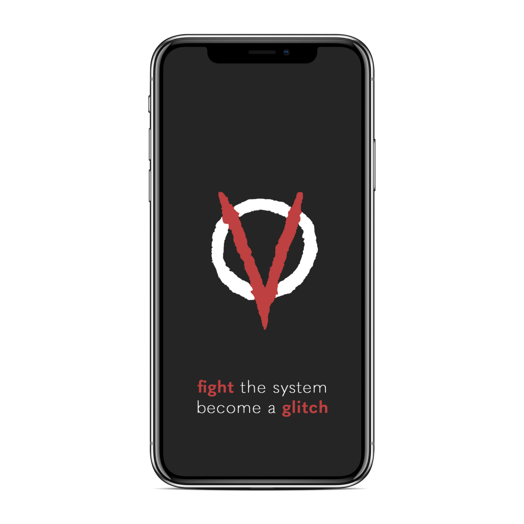
Following
some peer review and crit, I took the upside-down anarchy symbol idea forward,
with the frame of the A now resembling a V – for VIRUS.
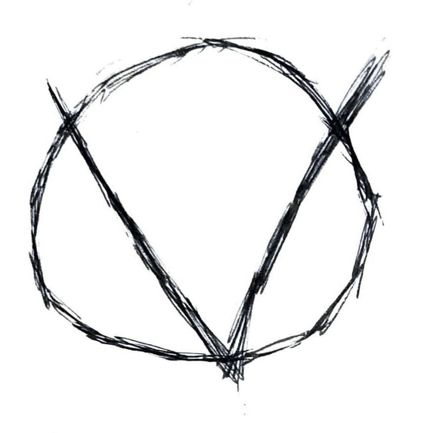
To
continue development, I brought the initial concept into a digital workspace
and begin to think about how I could refine it into a marque that could both
look aesthetically strong and reflect the nature of my brand. I experimented a
bit with stroke thickness and shape.
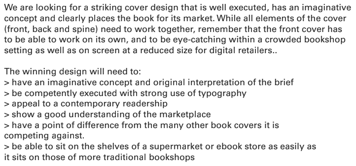
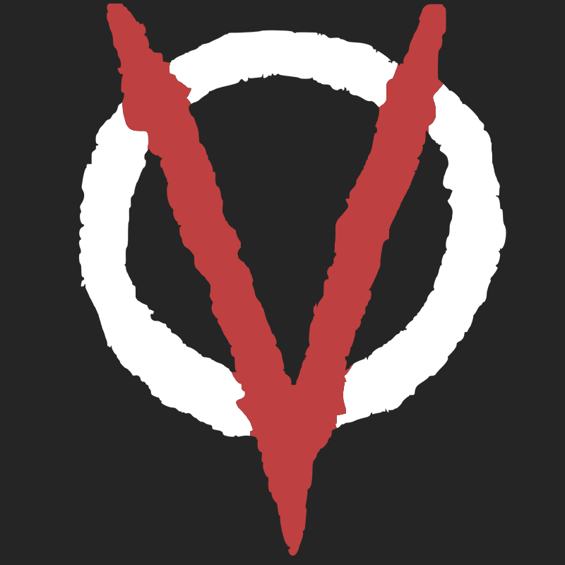
I decided to take the second development forward, as its stylisation better reflected the nature of my brand – rebellious and anarchist, and less corporate. I began to think about a colour scheme, and what colours would work well together to promote this idea of revolution against an inactive government. This basis of anger led me to my first decision – a strong red.
I decided that the V shape being red was more effective than the circle around it, as the V was the initial for VIRUS and therefore reinforced the brand more.
At
this stage, I decided to reflect on some of my prior research into protest
graphics due to the nature of my concept being an act of protest and rebellion.
This research was done as part of my response to a brief focused on movement,
during Level 4.
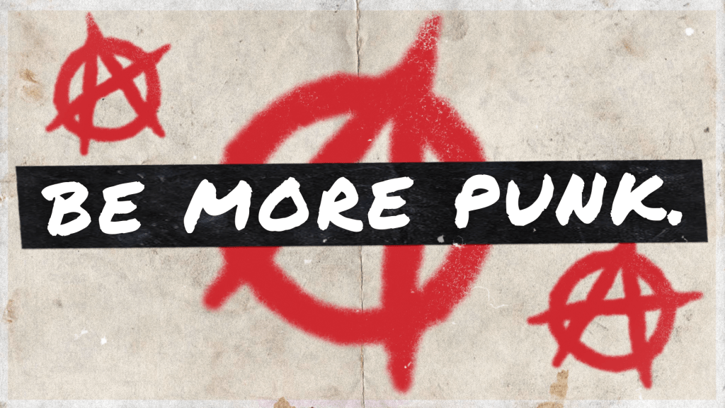
Protest graphics often consist of a strong D.I.Y aesthetic that can be put together by anyone, often a blend of physical and digital material. Simplicity and scale are used to reinforce points without distraction, and typographical elements are usually favoured over imagery. These graphics were particularly associated with the punk ideology in the 1970s, which my prior work was based on. In the above image, to demonstrate this D.I.Y aesthetic, I used individual letterforms of differing typefaces and scale to create a ransom note effect (popularised by Jamie Reid) as well as a washed out colour palette and the aesthetic of spray paint. I intend to use similar techniques within this project, focusing on typographical elements with simple accompanying imagery to forward my brand’s mantra.
To
get a sense of how I could visualise my chosen theme a little more, I decided
to research glitch art and take a look at some work from artists within the
style. I started by examining what glitch art meant – deliberately creating
errors and malfunctions on a piece of media for aesthetic purposes. This could
include both physical and digital alterations to a piece.
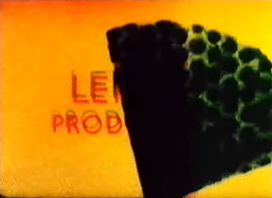
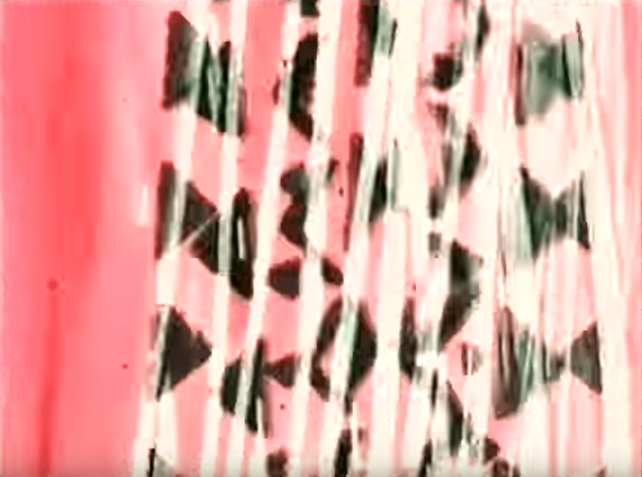
An
early example of glitch art is the short film
A Colour Box, created by British artist Len Lye in 1935. The short
animation is a series of visuals created by Lye painting patterns on the film
stock, creating a distorted yet visually pleasing series of images. The film
embraces the idea of finding beauty or aesthetic value in a deliberate
distortion, and this idea underpins the entire basis of glitch art. Playful
patterns and contrasting colours bounce around the image space to create a
visually pleasing and fun animation, a perfect example of how glitch art could
be used to incite joy.
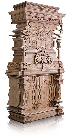
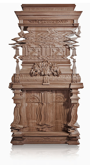
Ferrucio
Laviani’s work with glitch art exists in the medium of interior design, in a
series of designs called Good Vibrations.
Laviani demonstrates an example of glitch art by bending normal, intricate
furniture into chaotic distortion – contrasting the idea of intricacy with
simplicity to create humour.
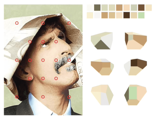
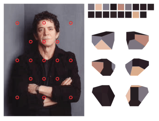
Soleil
Zumbrunn, in Coded Cards, uses glitch
art in a similar way by taking a normal object with an intricate design and
warping it with glitch effects. These glitch effects use an aesthetic that many
have come to associate with ‘glitches’ – dissected RGB tones with shifted sections
of the image to create a distorted look reminiscent of film.
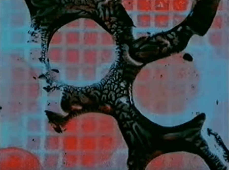
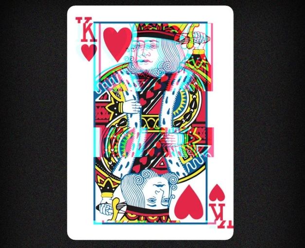
Whilst my conceptual response to the brief isn’t necessarily joyful, certain elements of glitch art could still be used within my deliverables to embrace the theme. I’m particularly fond of the classic glitch effect, using shifted RGB tones and distortion to create a modern aesthetic grounded in technological semantics. This would work really well with the idea of a digital exhibition space, which I intend my brand to inhabit.
Following a workshop on design systems and visual language, I began to focus on how I might make my outcomes consistent with each other to maintain the brand image I’m aiming to create. A design system is a set of elements that contribute to a specific purpose – for instance, a branding campaign. In this example, the elements would consist of the typeface(s) used, the colour scheme, the use of imagery, formatting, tone of voice and the type of information amongst other characteristics. These elements must share stylistic, syntactic and semantic values in order to be true to a design system.
Within the workshop, we examined how design systems work in finer detail. As a smaller group we examined the Casa da Musica, a music hall in Lisbon, and created a short presentation on its design system.
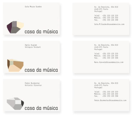
The brand of the Casa da Musica was designed by Sagmeister Inc, involving Stefan Sagmeister (Art Direction), Matthias Ernstberger (Designer), Quentin Walesh (Designer) and Ralph Ammer (Logo Generator).
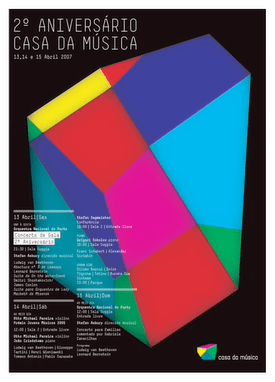
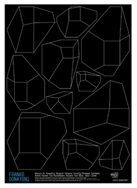
Logo/Marque –
The identity of the Casa da Musica heavily incorporates the architecture of its building. Above are six logo variants that Casa da Musica use as a marque for their brand, showcasing the building’s unique shape across different angles. This is effective as it can allow the brand to translate across multiple formats depending on the tone and style of each medium.
Colour Schemes –
As demonstrated in the Sagmeister Inc. – Casa Da Musica Identity video, and as mentioned above, the colour schemes used within the Casa da Musica’s identity change depending on the media the identity is present in. Above, colour picking is demonstrated, similar to that of the ITV2 rebrand from Rudd Studio, in that the logo picks dominant colours from an image and composes itself of those colours. This again is effective as it allows the brand to clearly translate across a multitude of media and remain effective.
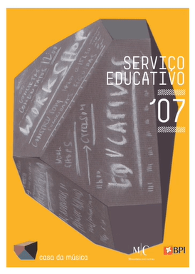
Typographic Systems –
The typographic systems used within Casa da Musica’s identity is, again, dependant on the media surrounding it. In the posters above, for example, the typeface used is sans serif, capitalised and uses thin strokes for an edge of modernity and grace. However, within the building itself, looking at the signage and wayfinding systems, the typography used is scaled massively, using bolder strokes alongside capitalised sans serif letterforms. This design choice reflects the architecture of the building and inhabits the space by manifesting itself as it.
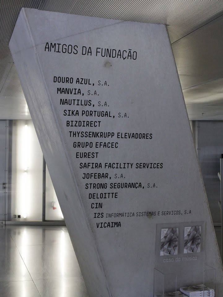
Wayfinding & Signage –
The wayfinding and signage systems within Casa da Musica stick true to the design system by reflecting the building they reside within. Using the aforementioned typographic systems, the signage sticks out through its huge scale and presence within elements of the building, such as being printed and engraved on pillars and walls. This is effective because of its continuous representation of the identity of the building, strengthening the brand and remaining memorable.
Sources:
Developing a Visual Language, Systems and Ephemera Presentation, David Wrenne, Design Systems Workshop (Thurs 10th October 2019)
I began the ideation process by mapping out some initial concepts and thoughts I had around the word glitch and its associated meanings, as well as how they may relate to branding and the exhibition space:
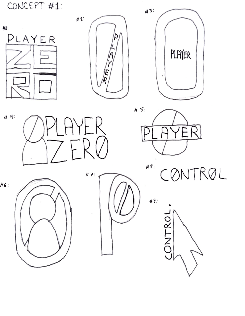
Concept #1 – Video Games
Premise: Exploring glitches within video games – how video games can glitch, how people abuse glitches for personal gain, how people unwillingly experience glitches that either better or worsen their experience. What are video games’ impact on culture – are video games causing a glitch? People are arguing they increase violence, but are they just looking for something to blame violence on? What power do video games hold?
Slogans: “Who has the power?”, “It’s not just a game anymore”
Brand names: Player Zero, P0, Control
Exhibition space: Gallery – a traditional area of exhibition
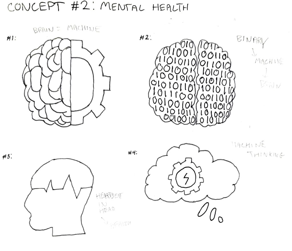
Concept #2 – Mental Health
Premise: A problem or malfunction in our minds that makes us believe things or feel things that we shouldn’t – for example, depression, anxiety, a lack of self-worth. Thinking abnormally – a flaw in our minds that causes us to malfunction. Are people like machines? Can they malfunction and is it necessarily their fault?
Slogans: “A mental malfunction”, “A flaw in our thoughts”
Brand names: Sane, Flaw, Flawed
Exhibition space: University, Library – targeted towards younger people but definitely open to all who may feel affected by the issue.
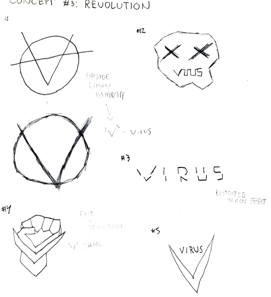
Concept #3 – Rebellion
Premise: A glitch in society – the glitch being a group of people going against the system – citizens rising against government inaction on a multitude of topics, such as climate change, inequality, poverty etc. How does humanity glitch? How do we react to a glitch? Are glitches necessarily bad, or can they be used for the greater good?
Slogans “We are the glitch”, “Join the glitch”, “A glitch of our time”,
Brand names: Unity, Virus, Trojan
Exhibition space: The digital world – a digital exhibition that anyone can access from anywhere using their phone, tablet or PC that directs users from one instalment to the next.
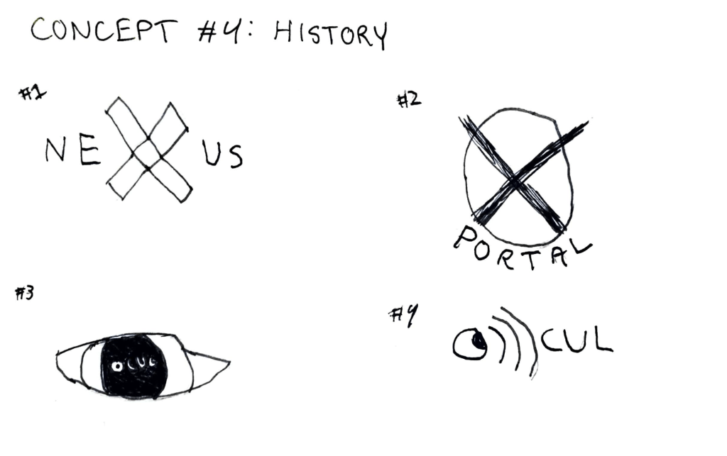
Concept #4 – History
Premise: A glitch in history – blending the past and the present together through augmented reality – objects of the future shown in the past. How might have history played out with modern technology? What would the world around us look like?
Slogans: “Past meets present”, “Back to the present”
Brand names: Nexus, Portal, Ocul
Exhibition space: A city, users use a wayfinding app to navigate around and view the pieces of the exhibition through augmented reality using their device’s camera.
After some thought and conversation with my peers, I decided that the first option didn’t quite click with me and I struggled to visualise any potential branding around the idea without being too cliche. The second concept was a little stronger, but again, I felt as though many of my ideas were a little cliche and didn’t capture the ambition I had for this project. The fourth concept struck with me a lot heavier – I loved the idea of having an augmented-reality window into the past available on your device, and the concept of an exhibition spanning an entire city felt really inspiring and provided a lot of inspiration. The potential this concept had for branding was high, too, but overall, the third concept was the one that really hit home, and the vast majority of my peers agreed. I felt really inspired by the idea of revolution and revolt against inaction, as these were topics I feel really strongly about, and the idea of a glitch in the system resonates this mentality well whilst providing strong visuals. I didn’t want to completely ignore concept four, however, as it had many ideas, so I began to ideate on how I could merge the two into one powerful idea.
What stood out to me the most from concept four was the idea of augmented reality, and how anyone with a smartphone can access the exhibition. This felt like a strong design feature that I could combine with the idea of the exhibition being digital, as mentioned in concept three. As such, I refined these concepts into one final proposal:
Final Concept – Virus
Virus is a collective of people around the globe; the downtrodden, the oppressed, the tired. Those who see and live in the blatant inequalities of the world, and are fed up with the systems of power facilitating them. In a world where money and status determine your right to live, Virus is a demand for change. It is a platform built for those who have realised the world has failed them.
This exhibition, curated by Virus, is a collection of these voices, a medium for revolution in the wake of oppression. It is an experience living in the digital world that anyone, anywhere can access using a device with an internet connection. It is a platform to showcase and put volume into the voices that have been forced into silence without choice. It is a demand to all governing bodies to do better. Anyone can contribute to the experience.By participating, you are acknowledging that the system has failed, and it is time to reboot. Become the glitch in the system.
Following the 100 Marques project, we were approached by clients within CSAD and briefed on a 48 hour branding task. The brief asked us to rebrand of Cardiff Met’s Student Voice, an area of the university that had previously been lacking a strong visual identity. In a group of five, we began to collaborate and pull some ideas together.
The brief set out some goals:
Give Student Voice a brand and identity
Increase awareness and engagement for students, staff and partners
Convey the messages of listening to students, making changes, friendliness and understanding
Our rebrand also had to follow some principles:
The brand must be relevant and appropriate to Cardiff Met staff and students
The brand must be engaging and eye-catching
The brand must be available to use across multiple formats
The brand must be able to be bilingual in English and Welsh
The brand must not look like previous campaigns
The brand must not include megaphones
The brand must not inappropriately influence students
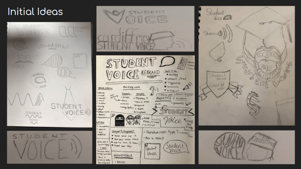
We began the ideation process for the logo – the centrepiece of the brand and what would ultimately become it’s main image.
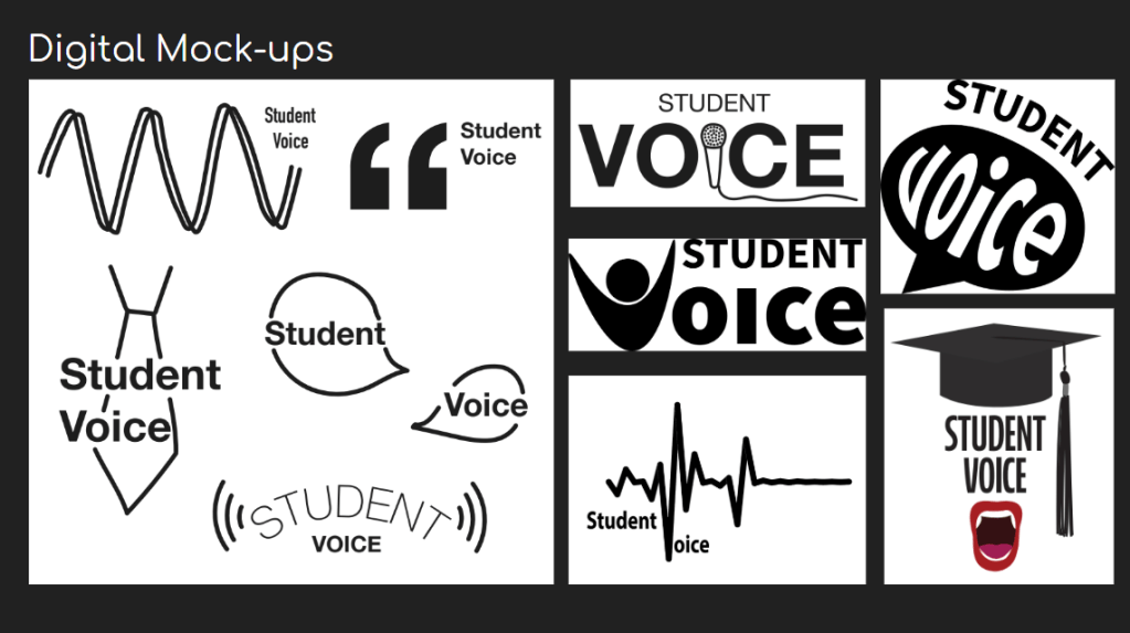
We then took some of these concepts into the digital space to get a sense of what the brand would look like in a more refined state.
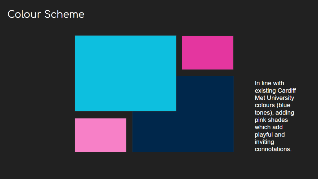
With these concepts nailed down, we began to experiment with the colour scheme. We decided to use the shades of blue used within Cardiff Met’s main logo and website identity to create consistency between Student Voice and the rest of the university, strengthening the brand. Alongside this, we decided to use a contrasting hot and pastel pink to add some more friendly connotations in an attempt to make the Student Voice appear less corporate.
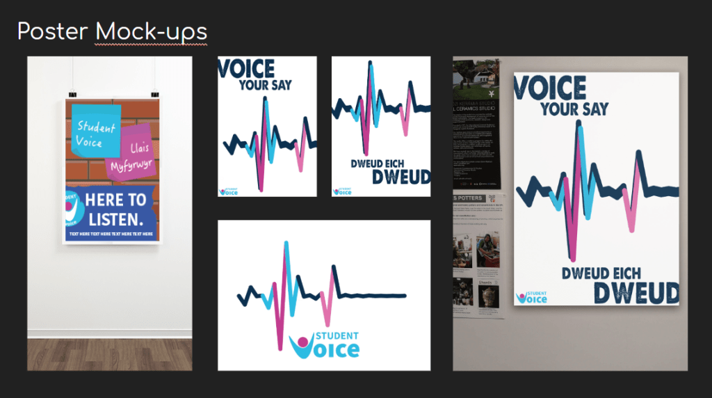
We then applied these colours to one of the digital logo mock-ups. We settled on this logo because of it’s simplicity and potential – the ‘V’ representing a happy student, this alone could be used as a symbol to represent the brand. This also promotes the friendliness that was required within the brief.
We then created a couple of poster mock-ups to demonstrate the brand in action. Using a voice recording of “student voice”, the digital sound was converted into a graphic format and used within the poster alongside a slogan and the logo. This demonstrated that the brand could be bilingual, as well as be engaging with a staff and student audience.
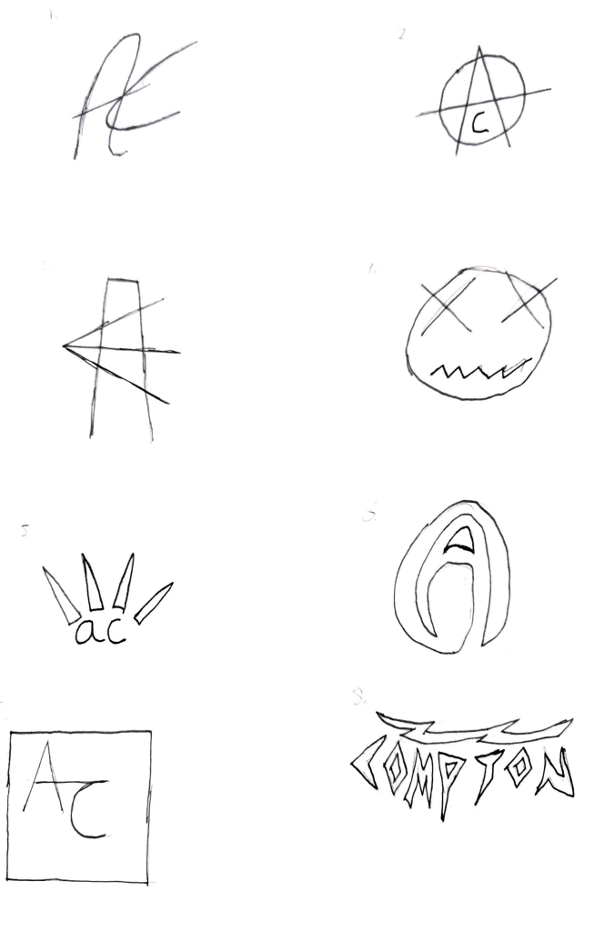
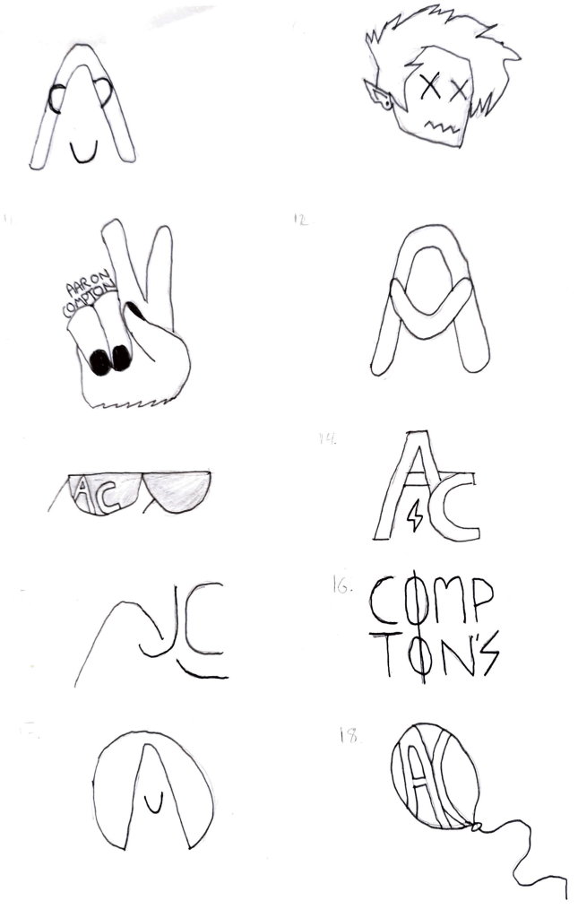
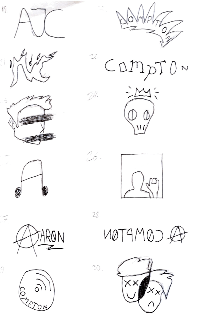
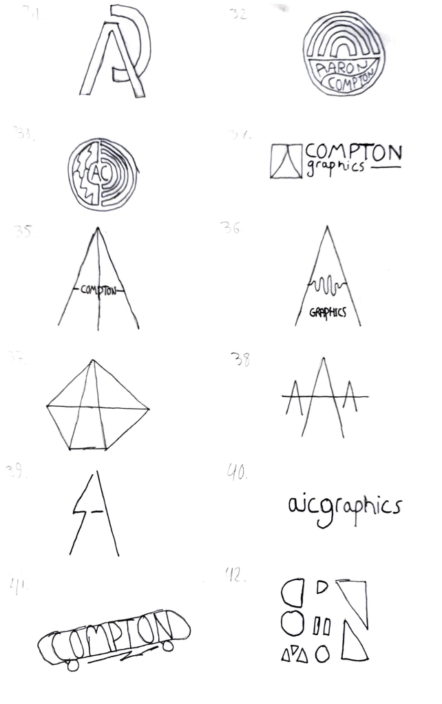
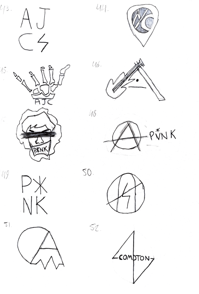
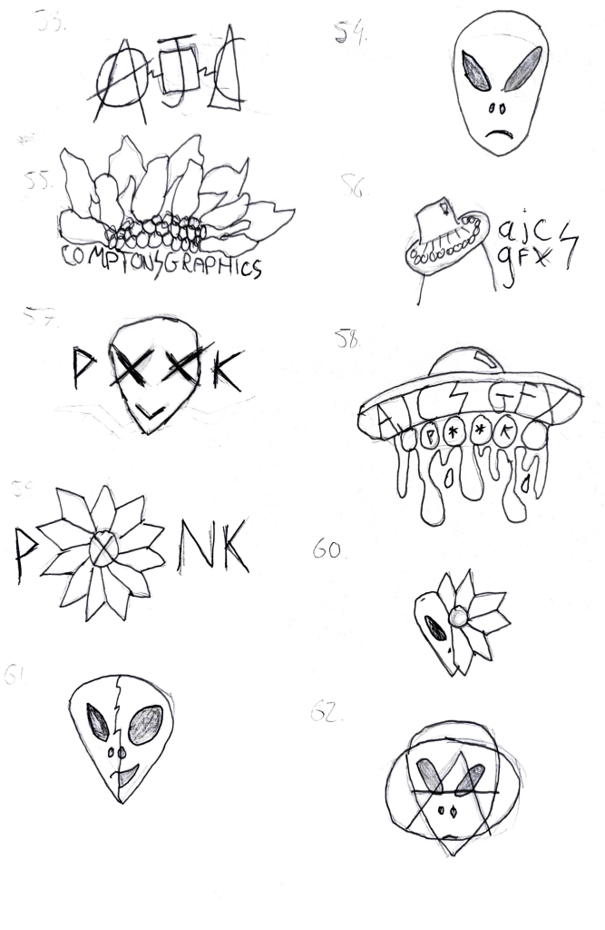
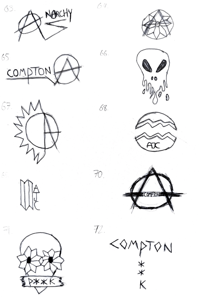
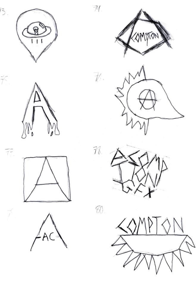
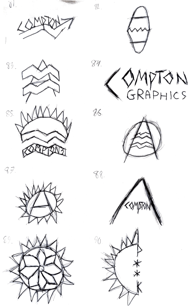
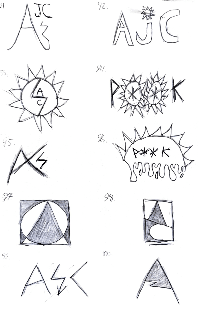
Alongside the On Display project briefing, we received a brief for a one-week project named ‘100 Marques’. This brief focused on the process of ideation, tasking us to rapidly create one hundred different logos/marquees that represented our design practices and ethos. The brief recognised that all too often a junior designer may settle on one idea too quickly for a variety of reasons and invited us to instead focus on creating a bank of potential ideas.
After some time away from graphic communication over summer, returning to my practices felt a little rusty and I struggled on a few occasions to create logos that properly represented my ethos and worked visually. That being said, I’m content with several of the designs that emerged from this task (notably marques 10, 39, 52, 57, 70, 71, 83 and 98) and I feel a lot more comfortable and experienced in ideation which will be crucial for my On Display designs and beyond.