APPlying APPtitude – Initial Concepts

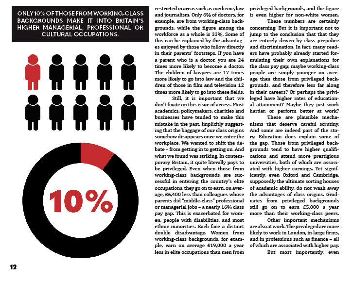
The APPlying APPtitude brief requires us to conceive of and create a new smartphone application that uses appropriate design methods – such as paper prototyping, user testing and design simulation. The development process will involve working with Adobe XD, an application I’m not all too familiar with at the moment, but an application I’m excited to learn that I’m sure will be useful for many projects to come. To begin approaching this brief, I looked at three initial concepts that could meet the brief’s requirements, outlining their goals and features.

Concept #1 – Drug safety

This concept would be focused on an app that taught the user about the effects, risks and laws surrounding drugs in order to ensure safety and deter potential use of illegal substances. The app would have an A-Z of common drugs, allowing the user to quickly search up a substance to view the effects, risks and laws surrounding it. There would be a built-in helpline to help potential users or those worried about a friend or family member.

Concept #2 – A social media app focused on music and concerts

This concept would consist of an app focused around concerts and music lovers, allowing them to connect with each other, share concert photos and videos, view upcoming and nearby events, and meet new people. The app would allow the user to create a profile, share their music taste, upload photos and videos and connect with artists and other music lovers.

Concept #3 – A digital photobook

This concept would involve an app that would allow a user to create and manage a photobook on their phone or laptop. The app would be in the form of a calendar, and the user would be able to select a day and upload photos, videos and notes to it. Towards the end of each day, the app would send a push notification asking the user if they would like to add today’s photos to the app (if the user had taken any), and the user would then be able to select which photos to upload. The user would be able to share their photobook with friends or keep it for memories.

APPlying APPtitude – Deconstructing An Existing App (Spotify Wireframe)

To begin the research stage of the APPlying APPtitude project, I deconstructed an existing app – Spotify – and created a wireframe to explore how it utilises user interface to create a strong user experience.

  • 1 – Home – the first screen upon launching the app whilst logged in, this screen presents the user with quick links to music they may be interested in, such as the user’s recently played tracks, curated playlists based on the user’s music taste and other artist and album recommendations.
  • 1a – Settings – currently only accessible from the home menu, allows the user to change their settings and preferences with ease.
  • 2 – Search – allows the user to search for tracks, artists, albums and various other media based on an entered search term or from various genres.
  • 3 – Search bar – shows the users recent searches and allows them to enter a search term.
  • 3a – Artist screen – can be accessed from various points in the app such as the search menu, displays an artists most popular tracks, their latest releases, and their available discography, merchandise and events.
  • 3b – Album screen – displays all the songs within an album and allows the user to listen to them, as well as the album art.
  • 3c – Merchandise screen – Spotify pushes the user from the app to the web as most merchandise websites are ran by the artist rather than Spotify.
  • 4 – Genre screen – displays popular Spotify-made playlists based on the selected genre, allowing the user to discover new songs and listen to old favourites.
  • 4a – Playlist screen – displays all the songs within a playlists and allows the user to listen to them.
  • 5 – Library – shows the user’s collection of music, such as their saved tracks, favourite artists and their created playlists as well as their recently played media.
  • 5a – ‘Made For You’ – shows the user Spotify-curated playlists based on their music taste, recommending new songs and allowing them to rediscover old favourites.
  • 5b – All playlists – displays the user’s created and saved playlists.
  • 5c – Stations – displays radio stations based on the user’s listening preferences, creating a seamless and unique playlists each time it used.
  • 5d – All songs – displays all of the user’s saved songs.
  • 5e – All albums – displays all of the user’s saved albums.
  • 5f – All artists – displays all of the user’s saved artists.
  • 5g – All podcasts – displays all of the user’s saved podcasts.
  • 5h – All videos – displays all of the user’s saved videos.
  • 6 – Currently playing – displays the song the user is currently listening to, as well as it’s album art. Can be accessed from anywhere within the app, allowing an easy way to turn music on/off.
  • 6a – Devices – allows the user to view all connected devices, such as a laptop, video game console or smart TV, and change which device to output their music to with a press of a button.
  • 6b – Queue – shows the user their queued music, allowing them to control which music they wish to listen to after their current song.

Spotify maintains a consistent UI throughout the entirety of the app – a dark grey/black with green accents that perfectly accommodates for the huge variety of album art available on the application. The iconography is labelled and no confusing jargon is present, reducing any possible frustrations. There are seamless push/slide transitions between each screen that maintain a good flow for the user – the only negative here is when the app pushes the user to the web for merchandise, and as these sites aren’t created by Spotify, the overall design and layout is different which breaks the flow. However, the Spotify web and desktop applications maintain the same theming as the mobile app.

APPlying APPtitude – The Principles of User Interface & User Experience

The user interface (UI) governs what the user sees – the series of screens, pages and other visual elements that allow the user to interact with an app. A user interface allows a user to work with a computer via visual elements as opposed to complex programming languages – first introduced in the early 1980s by computer scientists at Xerox PARC and brought to the user’s home by Apple with the Macintosh PC in 1984, the demand for personal computers with an accessible UI began, thus creating the role of a UI Designer. The UI Designer’s role has evolved as technology has grown, and now UI can be seen on smartphones, in virtual or augmented reality, and on voice, gesture and light applications (zero UI).

User experience (UX) governs how users feel during their interactions with applications, products and services, and how they feel afterwards. UX Designers need to ensure that a company’s product meets the needs of a customer in order to ensure they have a good experience and thus create a good public image for the company and increase potential sales. As user interface design has evolved, so has user experience design – UX and UI designers work closely together in order to ensure that a user can work an app with ease and have a good experience whilst doing so.

In order to successfully meet the APPlying APPtitude brief, I need to ensure my app follows the basic principles of UX/UI design:

  • Show the value of the app upfront – place calls to action up front, highlighting key features in context at an appropriate place within the UI so they are easy to find, resulting in a stronger user experience.
  • Allow users to “go back” in one step – users should be able to retrace their steps through the UI as opposed to starting over, which often results in lost data and a frustrated user experience.
  • Create frictionless transitions between mobile applications and the mobile website – frustrations can occur when the app forces a user to move to the web to complete an action, especially when the look and feel of a website is completely different to the app. A fast and frictionless transition and a similar web UI can help reduce these frustrations.
  • Speak the same language as the users – Unknown jargon creates a negative experience for a user as it will more than likely confuse them, so it is essential to use terminology that the user will understand.
  • Let the user control the level of zoom – Allow users to zoom in on certain media as they prefer as opposed to setting a level of magnification to ensure a better user experience.
  • Organise and label menu categories – Menu categories should be clear with no overlap, matching a user’s mental model.
  • Provide text labels and visual keys – The majority of iconography within applications require labels to ensure proper interpretation and to increase the likelihood of them being used.

Changing Faces – The Second and Third Double Page Spreads

Following the establishment of my design direction in a visually strong first page spread, I began working on the next two spreads.

The Second Double Page Spread

From the get go, I knew I wanted to contrast this double page spread against the other two to maintain a good pace and stick to the principles of good editorial design. To do this, I set the background of the page to be black with two smaller sections on each page suitable for paragraphs.

Following this, I aligned the text to columns and added an infographic to highlight and represent a statistic from within the article.

As the article drew into its latter few sections, I added another quote highlight in the same style as before and used a small section of white space to create a small gap and maintain good pacing.

With the remaining space, I knew I wanted to capitalise on the typographic strengths of the initial concept, and so put the ideas of class and merit battling against each other within the context of privilege – key themes of the article that I feel are represented well on this spread. I then added two quotes that highlighted crucial points of the article.

The Third Double Page Spread

The last double page spread needed to maintain the good pace I had built up so far and taper it off as it was the last two pages of the article. I began by creating a composition similar to the first page with a vertically-aligned piece of text – a quote from the article. I also used the same stylised margins as before.

I then inserted the text and stylised it similar to the first page – first, in a block across four columns, and then in two blocks across four columns, with a heading split in the middle to maintain pace.

I wanted the last page to be a little different from the others as it was the final page of the article and had to utilise the space effectively. I decided to take a risk here and spread the text across six columns across the top of the page, following it with a quote from the text.

To ease out the final few paragraphs, I spread the text across six columns in three blocks, leaving a little room for the images I had created earlier to capitalise on the white space I had left.

Changing Faces – The First Double Page Spread

I began setting up my editorial piece by creating an A3 document within Adobe InDesign. I made each page have a grid system with 8 columns to ensure a strong and consistent visual hierarchy across my editorial.

I began working on the first page heavily inspired by my typographical concept, opting to use the TypeKit font Benton Modern Display for a decorative, formal serif typeface. I also sketched a suit and tie graphic and rendered it in Photoshop then Illustrator to create a high quality 300DPI CMYK vector graphic for print.

I decided to experiment a little bit and fill up some of the white space by contrasting the word “GAP” against a black background. I also decided to add the article’s subheading here in the smaller, bold sans serif font Quasimodo, centre-aligned to add balance to the overall composition of the page.

I started the article by pasting in the body text, initially deciding to divide the text across two columns using the font Cambria in 9pt. I pasted the rest of the headline vertically down the latter three columns, contrasting white against black once again to replicate the formal composition. However, I felt this looked very bland to start with and I struggled to create development beyond this point. To fix this, I scaled the text up to 11pt, added a drop cap of four lines to the opening paragraph and spread the paragraph across four columns with no divide. I justified all of the text to reduce rags and tabbed in at the start of each new paragraph to add a clean finish to the text. I added the authors’ names in a small box above the text alongside a graphic to divide the white space further, and added more red to the page in the form of a decorative margin.

I then added a few extra editorial features to this page to finalise it. These features included a bold heading section, detailing the theme of the next section of the article, as well as a highlight from the extract. To add context to the piece, I finally added a page number at the bottom of the page, centred in alignment with the text.

Changing Faces – Initial Editorial Concepts

Following some sufficient research, I began working on some initial concepts for my editorial piece. Within these concepts, I aimed to pin down the direction in which to take my piece – whether it would be typographical, illustrative or photographic in nature (or a mix), what grid systems to use, and what relevant type and image to include. I decided to focus only on the first double page spread within these concepts so I could work out where I was taking the editorial piece before designing the other two spreads.

Within this concept, I focused on an illustrative approach, using a grid system of 5 columns per page. Within the front page, I decided to include the headline and subheading scaled appropriately around an illustrative image of a tie to leave some effective white space. I felt as though this was a strong design decision as it’s quite tidy, reflective of the nature of the article, and follows good editorial design principles. The second page is where the true article begins, and where I feel the concept loses its effectiveness. The distribution of body text with images and subtitles is messy and overcrowds the page, leaving minimal room for white space.

This concept focuses on a photographic approach with a simple three-column grid system per page. This spread would be dominated with a photograph of an individual in a suit, leaving very little white space in favour of catching the eye. The headline would also spread across both pages and be the second element within the path of the eye, before moving onto the subheading and body text respectively. The visual hierarchy within this concept is quite strong, but its simplicity with three columns may be hard to spread a nearly three-thousand word article across without ruining the pacing. I would also need to consider photographing my own image which may prove more challenging than illustrative and typographic approaches.

The final concept focuses on a typographical approach with a four-column grid system per page. What’s immediately noticeable here is the use of white space on the first page which draws attention to the typographical elements. The subheading is almost as dominant as the headline on the second page, but its rotated orientation adds a bit of flavour to the concept and makes it a bit more enjoyable. The grid system allows for a reasonable amount of body text per page whilst leaving room for some interesting imagery or larger typographical elements, so the pacing wouldn’t suffer too much here.

Reflecting on these concepts, I am drawn in particular to the typographic approach, but I understand that there are elements from the illustrative and photographic approaches that work really well – such as the use of white space and positioning of certain elements. These concepts have created a strong foundation in which to build my editorial piece on, and I am sure as this project continues the design will continue to evolve and incorporate successful elements from all three of these.

Changing Faces – The Principles of Editorial Design

Following the deconstruction of the article I’m visually representing and the identification of my primary target audience – the upper class – I decided to focus on identifying what editorial design actually is, and examine some techniques used within successful pieces so I can incorporate them within my own practices. At this early stage in the design process, it was crucial to identify strengths and weaknesses to maintain a high level of quality throughout my development.

bostondrib

I began by looking at a website focused on visual communication named Design Your Way, in particular, an article that unpacks editorial design and shows off some strong examples whilst providing tips for designers aiming to create their own piece.

At its basics, editorial design is the combination of layout, composition, imagery and typography to create a strong page (or often a double-page spread) for use within a magazine, newspaper or article. It’s also worth mentioning that editorial design is becoming increasingly challenging due to the rising digital market – as my brief is focused on editorial design for print, this is an obstacle I will need to keep in mind, and can perhaps identify successful features of digital editorial design that would also work well in print. The first step of creating a successful editorial piece is to understand who exactly will be reading the editorial and to design for them. I covered this step earlier in the development cycle – I know I’m aiming to design for the upper class and have to design my editorial around that market. Creating a strong visual identity for the piece is extremely important, as the design needs to catch the eye and keep a reader engaged with its contents. Designing the cover (or in my case, the first double page spread) before anything else is a good way to create a strong identity and ensure it captivates attention, so the following pages can be at the peak of their visual strength. Using a strong grid system is crucial, and the way the grid system is set up can entirely affect the overall feeling of the editorial piece. As my focus is on the upper class, I’m aiming to use a symmetrical layout for a more formal composition, but I will experiment with different grid systems after I’ve created a few initial concepts. Typographical hierarchy is a make-or-break within an editorial piece such as this, and the choice of typeface and scaling within the piece will determine how well it appeals to my target market and the overall quality of composition. It’s also worth noting that sometimes less is more – the use of white space can make a piece a lot stronger, and this something I intend to experiment with considering my target market. Finally, pacing is crucial to keeping a reader engaged. I’m designing six pages – three double page spreads – and my initial plan is to create an eye-catching opener spread, then give the readers a little room to breathe within the middle spread, before closing the piece with a memorable final spread.

Aim-For-A-Vibrant-Compositi.jpg

Source: Bogdan Sandu. 2018. Editorial design: definition, tips, and examples. [ONLINE] Available at: https://www.designyourway.net/blog/design/editorial-design/. [Accessed 14 February 2019].

Changing Faces – Deconstructing “The Class Pay Gap – Why It Pays To Be Privileged”

To kick off the Changing Faces brief, I deconstructed an article that resonated with my own interests and beliefs. Written by Sam Friedman and Daniel Laurison, the article examines the idea of the class ceiling, and how privilege can affect one’s progression through a career. The article argues that whilst privilege can act as a strong “following wind” for one’s progression within a career, it is often how one’s merits are received by sponsors from colleagues higher up in the career that determine their success – though ultimately, the acknowledgement of merit can highly depend on one’s privilege or similarity to their sponsor. It’s also worth noting that privilege’s effect on merit can be determined by the industry – the article examines several different careers and finds that privilege strongly aids an individual in accountancy, where higher class white men make up the majority, but not so much in television, which values a more informal and humorous individual.

A full annotation and deconstruction of the article can be read here: The Class Pay Gap – Why It Pays To Be Privileged

With a sound idea of the argument the article is putting forward, I took the opportunity to identify a target audience for my visual representation of this article before moving onto further research. I’d argue that the overall purpose of the article is to raise awareness of the class ceiling concept and how privilege affects success within a career, and thus, a primary target audience would be those ignorant to the concept (likely those who are affected by it without realising – the upper class). This gives me a general idea as to what direction I should take my later designs in – if designing to persuade the upper class, I should focus on a more formal approach, with a strong symmetrical layout and grid system and using serif text instead of sans serif.

Changing Faces – Type Detailing and Layout (Editorial Design Workshop)

In today’s session we examined key principles of editorial design and how a piece of editorial can be successful through its use of clear communication and story-telling that’s made possible with secure grid systems, consistent design, contextual pacing and a strong visual hierarchy. We took part in a one-day workshop where, in groups of 4, we were given a topic and had to create four double-page spreads using the editorial skills we had learnt so far, considering the above principles. This workshop was done in preparation for our Changing Faces brief that would ask us each to design three double-page editorial spreads.

The topic my group was given was the relevancy of wallpaper, and whether it was still a common feature within modern interior design. The article I visualised was courtesy of The Washington Post. This task was completed using InDesign.

My first step to approach this design task was to create a grid system. Due to the rough nature of the task and time constraints I settled with a simple three-column system on both pages, resulting in six columns across the spread.

Following this, I began working on some type detailing. I displayed the headline and subheading across all three columns with a larger pt. size (31 and 51) to draw attention to it, contrasting white against black to make it stand out further. The subheading also dominated these spaces but used a smaller pt size (15). The body text, which was a segment from the article, used a sensible 9 pt. size. I decided to experiment a bit here and instead of displaying the text across all three columns, I left room for some imagery on the first column and displayed the text across the next two. I justified the text here to reduce rags, making the text more uniform with the columns yet still perfectly readable. I decided the second page should be more visual and opted to not include any body text whatsoever, instead using imagery and headline text in the form of a quote which I feel was simple yet effective. Upon reflection, I think a drop cap at the start of this body text would have added flair to the design and improved its overall look, and some of the paragraph and line spacing could have been altered to increase the ease of readability. Tracking could have also been used to spread the text a little more in favour of the overall article, but all of these things are things I will take into consideration when working on my Changing Faces piece.

Above are all four pages from our group displayed in a printed format. What was immediate upon first glance was the lack of consistency in our designs which was an important principle of editorial design. We agreed that this was probably due to the nature of four different people working on the piece, all of us with different design styles, and agreed that in future we would need to work harder on communication. We felt our pacing within these pieces was quite strong, however, and reading from page to page felt enjoyable as opposed to a task. A few comments were made on my page about how busy it was, using minimal white space which overall reduced its effectiveness – which I completely agree with.

Reflecting on this workshop has proven very useful in preparing for my Changing Faces task, allowing me to identify my strengths and weaknesses within editorial design. I’m happy with my type detailing, but not so content with my overall visual hierarchy. I will need to focus more closely on the use of white space and aim to create a piece that is more balanced, perhaps by using more columns and experimenting with different grid systems.

SOURCE:

Buerger, M. 2017. Wallpaper is making a big comeback Here’s how to choose, use and remove. [Online]. [11 February 2019]. Available from: https://www.washingtonpost.com/lifestyle/home/wallpaper-is-making-a-big-comeback-heres-how-to-choose-use-and-remove/2017/02/28/c9b2eb40-f88a-11e6-9845-576c69081518

End of Field Lvl. 4 – Evaluation

With the conclusion of the live protest, our collaborative studies in level 4 have come to an end. The past four weeks have provided a good opportunity to combine the strengths of multiple fields – in our case, graphic communication and illustration – and have opened many new ways of approaching future projects. I feel as though I am now able to approach briefs and problems in multiple ways – through the mindset of a graphic communicator and an illustrator, as working alongside Illustration students has proven invaluable to developing a good skill set.

Upon reflection, I found that our collaboration was at its strongest during the visual metaphor stage as well as developing our manifesto, as I felt these two parts of the project invited us to use our graphic design and illustrative skills in a way that worked well together. These stages really allowed us to play to our strengths and as such, we all feel quite accomplished within those outcomes. There were a few moments where things didn’t go quite to plan within our development stages, but I’d argue that this was due to a lack of communication as we were still getting used to collaborating and sharing our work together.

During the next collaborative field projects, I’d like to expand my abilities by working with other fields and see the different ways we approach briefs based upon our own set of skills. Working alongside Illustration students was really interesting and I feel as though the way I can approach briefs in the future has been changed for the better now. I honestly feel as though my contribution to the projects could have been stronger at times, and this is something I’m taking on board throughout the rest of my studies as I have seen first-hand how important it is to be clear and communicate with the rest of the group, and I aim to rectify these mistakes through continued practice.

Overall, these field studies have left me feeling more comfortable with collaboration and ultimately, more comfortable with my own skills. There were a few times during the tasks where I did feel out of my comfort zone, but after pushing through them I feel I have developed my skills as a graphic communicator for the better. At the forefront of all of the set tasks, we kept our target audience and the tone of our work in mind, aiming to create outcomes that would reflect the sensitive topic we were handling with care, as well as invite anyone who witnessed the protest to get involved and care about the cause we were promoting. This part of the project really reiterated how important it is to keep the target audience and visual communication at the forefront of any solution to problems and briefs, and now that I have worked alongside other graphic communicators and illustrators, I feel as though my ability to work to a set audience and maintaining a consistent tone across several outcomes has really improved.

Design a site like this with WordPress.com
Get started