Collaborate – Developing Placards

Following the development of our oxymoron outcome, we moved onto developing placards for the final stage of our protest. One of these placards must be within the style of Stanley Green, a notable protestor within the latter half of the 20th century in London.

220px-Stanley_Green,_Oxford_Street,_1977

Green’s placard involves a notable lack of imagery and is incredibly type-heavy, contrasting a bold majuscule typeface against a black background. This format would make the foundation for our own placard in Green’s style.

Before we began our work on placards, we decided our campaign needed to be a little more expanded on, and we decided to create a name for the organisation and develop a logo that would represent us across all of our outcomes. We played around with a few ideas, including “Minor Abuse, Major Impact”, but ultimately went with “Intercept Neglect” (later changed to “Intercept The Neglect”) as our organisation’s name.

Logos

After talking to some peers, we felt that the strongest option for our logo was to stick with the teddy bear, as it was consistently used across our outcomes and acts as a strong visual image to create a lasting impression. I experimented a little with colour on the bear, but we ultimately decided that it was still very effective and worked without colour.

With a name and logo for the organisation decided upon, we then started creating a placard in the style of Stanley Green. We used a black painted background with bold white typography that dominated the space available to stay true to Green’s style, creating a striking impact in a simple manner.

14

We also decided to make several placards of our own featuring a mix of imagery and typography. I experimented with the silhouette of a child, as well as the logo we created earlier, to create four placards that incorporates the strengths we identified in earlier outcomes to make a strong lasting impression.

51791261_2278026882441355_8265638885837504512_n (1)

Collaborate – Oxymoron

Following our manifesto, we moved onto examining oxymorons, and how we can represent them visually in the context of our campaign. An oxymoron is, according to yourdictionary.com, a figure of speech containing words that seem to contradict each other. To kick off our own work with oxymorons, we examined two separate ones and sketched some initial concepts based around them:

Oxymoron Ideas

Quiet STorm

After examining these concepts, we felt that the idea that best represented our campaign was the third idea for ‘Tough Love’, using a teddy bear (as we did in our manifesto) to represent the idea of tough love by contrasting an object commonly associated with children with an object that insinuates violence.

51097599_423554295136487_967955744412401664_n

We decided to further this idea by creating a short stop-motion animation that would ideally be shown on television. From the start, we all agreed that no sound should be present in this animation, as if it were an advert on television, the lack of sound would draw attention more than a clip with sound. Within this stop-motion animation, we wanted to explore the relationship between an adult and a child who is neglected by said adult, and how they may often feel in a situation of neglect or abuse. With this in mind, we decided to alternate between colour and greyscale imagery to reflect the mindset of an adult, who believes they are helping the child (colour), and the mindset of a child who is a victim of neglect (greyscale).

51109428_1060237244187189_2008972284143861760_n.jpg

50799480_1245401292302017_2838138483963330560_n

Some of the difficulties we encountered when making this animation included the tripod legs being present in many of the frames. We worked around this by cropping each frame slightly, bringing attention back to the bear.

Capture

Collaborate – Developing Our Manifesto

With a sound understanding on our chosen topic and some appropriate research taken, our group began to work towards the first of our outcomes – a manifesto that serves as a call-to-arms for our protest. Within the manifesto, we need to feature the visual metaphor we created, shown below:

Picture3

We agreed that in order to have the highest impact, the visual metaphor should be relatively large scale within the frames of our outcome and dominate the space available. This would immediately draw the eye and create a strong visual hierarchy.

Picture2

We decided to create a small sign with child-like writing featuring our mantra, which would ideally be the second thing people are drawn to within the visual hierarchy. The use of child-like handwriting proved to be successful in some posters we researched, and combined with our visual metaphor, invokes sympathy more effectively than a regular typeface.

Picture5

We then followed up these decisions by desaturating the image, which creates a serious tone around the entire image. However, we noticed that the stitching on the bear doesn’t look quite as effective when desaturated – so we made the decision to leave the blue and red parts of the image saturated, whilst greying out the rest of it.

Picture1

Our final manifesto took shape with this change. We centred the bear within the frame of the image and scaled it up so create the largest impact possible, something that would immediately draw the eye and connote the messages we’re attempting to put across. We decided to use a simple typeface to expand on our mantra and placed it in the remaining space available in the upper left of the frame, which ideally would be the last object the viewer is drawn to.

Upon reflection of this manifesto, I’d argue that despite being quite moving and successful in promoting the message our campaign stands for, our lack of a logo or contact information lets it down. This is something we implement in later outcomes, but its absence here is notable and could improve the overall quality of the manifesto.

Collaborate – Creating a Visual Metaphor

In order to create an effective protest, we need to fulfil three goals within our outcomes – to make people sympathise with victims of child neglect, increase their overall awareness of the subject and offer them a way to get involved and make a change. In my previous post, I talked a bit about how organisations such as the Dubai Foundation for Women and Children used posters very effectively to fulfil those three goals and engage with people. Those posters featured the use of one or more child actors, however, which is something that we’ve discussed and unfortunately aren’t going to be able to use. The next best option is to use an object that symbolises children, invoking sympathy through the use of a visual metaphor.

A visual metaphor is a representation of an idea or a message that is presented through an image. Visual metaphors are frequently used within advertisement, inviting the viewer to think and take their own interpretation based on their understanding. I studied and examined several different visual metaphors within my Constellation studies, which in reflection, has proven invaluable in aiding this stage of the development process. One that has particularly retained my attention is a parody campaign run by Adbusters, who deconstructed posters created by Absolut Vodka.

Absolut Vodka frames their advertisements to create an image of their product that is high-end in nature, glorifying the consumption of their alcohol. This has its own implications, as over-consumption can be fatal. Adbusters took note of this and launched their own parody campaign, using visual metaphors to reveal the dangerous side of alcohol consumption.

Adbusters use the general shape of the bottle, framed in the centre of the image, with the same typeface and grid system as Absolut use in their posters to create an instant and effective visual metaphor that parodies Absolut’s posters. This is highly effective because it plays to the viewers favour, using their pre-existing knowledge to draw them into the metaphor before revealing the message of the posters – that over-consumption of alcohol isn’t great.

With these strong examples in mind, our group took to thinking about some visual metaphors we could create and use within our own campaign. Our first goal within our outcomes is to draw people in with an eye-catching visual metaphor. Based on the strengths of the existing examples we’ve looked at, we agreed that a object symbolising children would be a strong visual metaphor and a good place to start.

Some of my initial thoughts on what object to use involved building blocks, a children’s toy. These would have the potential to spell out messages, as each face of the block has a letter or a number. Using perspective, we could obscure some of the letters to create a sense of mystery, and the viewer would have to use their initiative to find the message. This entire process could represent how victims of neglect are often afraid to talk out about the problems they are facing, and it isn’t always clear to outsiders what is happening.

Picture1

After some peer-review, we agreed that the image of a teddy bear would be very effective as it holds clear connotations of childhood and represents the more innocent side of it, invoking sympathy in a much stronger way. We thought about creating an illustrative outcome to capitalise on the skills the Illustration students have, but in the end, we decided to use photography to create a more realistic outcome that would be more adequate and impactful for the sensitive subject we’re handling.

After purchasing the teddy bear, we decided to make some physical alterations to it that would represent our campaign better. This involved stitching the words “HELP” and “PLEASE” on each foot of the bear, as well as a small cross over the bear’s mouth. Initially, we were going to write “HELP ME” instead of “HELP PLEASE”, but felt that it wasn’t so clear in the context of our campaign what that message meant. The stitch across the bear’s mouth connotes a forced silence, which we intend to represent that victims of child neglect and abuse are often not heard or feel unable to speak up about the situation they are in.

Picture3

With a strong visual metaphor created forming the foundations of the rest of our outcomes, we moved onto developing our manifesto – a poster that clearly displays the message of our campaign and a call to arms, and ultimately an invitation to get involved with our protest.

Sources:

Visual Metaphor: https://www.thoughtco.com/visual-metaphor-1692595

Collaborate – Further Research

With a solid foundation for our protest campaign established, we decided to research a little more into the visual identity of two other campaigns. I’ve already discussed a few key strengths within the poster adverts of the campaign run by Family Centre, but I’m going to compare those with two other campaigns to attain a broader understanding of the sensitive subject we’re tackling.


To kick the further research stage off, we examined two posters created by the Dubai Foundation for Women and Children in protest of child neglect. Similar to the posters used in the Family Centre campaign, these posters feature child actors who are framed so, in the visual hierarchy, the viewer’s eye is immediately drawn to them. Both actors have similar upset facial expressions which induce sympathy, which immediately fulfils one of the campaign’s goals: to make the viewer care. The viewer is then drawn to the other objects in the frame; in the first poster, the hands of parents holding mobile phones. The viewer can assume that, judging by the child’s expression, the parents are ignoring her, which demonstrates child neglect in action – fulfilling another goal of the campaign, making the viewer aware of the signs of neglect. The second poster also does this in a different way; the viewer sees the boxing gloves and the punching bag with the child framed in-between, revealing the violent side of child neglect and abuse. Following this, in both posters the viewer’s eye is drawn to the mantra and call to arms, as well as how to get involved with the campaign and fight against child neglect – fulfilling the third goal of the campaign, showing people how to take action, and encouraging them to. The use of hashtags is also effective within the context of the posters, which are presumably displayed on social media, as this entices the viewer to take immediate action. Other strengths of these posters include the desaturated colour palette, which frames the posters as being quite serious in nature, and the choice of typeface – using childlike writing for the mantra, and easy-to-read sans serif for the contact information. I would argue that a weakness of these posters are their grid systems – a lot of the typography present is spread out, which draws the viewers eye around quite a lot and perhaps doesn’t make the poster as impactful as it could be if the typography were aligned in one column.

In hindsight, it was absolutely crucial to our development stage that these strengths and weaknesses were identified – they definitely helped shape our own outcomes for the better.


Picture2

The poster above, used in a campaign by Justice for Children, uses similar techniques used by the Dubai Foundation for Women and Children in their posters: a desaturated colour palette, use of a child actor and a strong visual hierarchy. Whilst it doesn’t use any other objects in the photograph or feature childlike typography, I find this poster to be more effective because of its strong grid system and scaling of text. The text is all aligned and scaled effectively so the viewer immediately sees a call-to-arms followed by how they can get involved, and as the eye isn’t drawn all over the frame, the visual hierarchy is stronger. I would argue that the poster’s weakness its lack of a logo, which I noticed the organisation had after looking at their website. Whilst it doesn’t necessarily lower the effectiveness of the poster, it doesn’t create a strong or memorable identity for the organisation after the viewer has seen it, which I feel is quite important when it comes to larger campaigns.

Justice for Children logo


After examining these three posters, its clear what strengths they have in common and what we can do to ensure our outcomes are just as effective. Whilst we probably won’t be able to use a child actor, we can identify other objects that relate to children, such as toys, and use them instead. A desaturated colour palette appears to be very effective, so that’s also something we’ll work into our outcomes.

In the next stage of our development process, we’re going to examine visual metaphors and how we can work them into our outcomes to create a strong and impactful protest, before moving onto developing our manifesto.

Sources:

Dubai Foundation for Women and Children: https://www.dfwac.ae/

Justice for Children: https://justiceforchildren.org/

Family Centre PR Campaign: https://www.scribd.com/document/323635324/Family-Centre-PR-Campaign

Collaborate – Establishing The Protest

Our collaborative module allowed CSAD students across multiple subject areas to come together and create outcomes that displayed the strengths of multiple fields. As graphic communicators, we were paired with illustrators to create several visual outcomes across a few weeks that would be part of a larger live protest, protesting for or against something that we, as a group of students, felt strongly about.

Within our group of five, we decided to tackle the issue of child neglect, as it was something we agreed was still a problem in today’s society and was worth protesting.

_97483752_mediaitem97483751

Our first task within the collaborative design process was to identify a target audience for our protest. Our goal with this campaign was to raise awareness of child neglect and help people to recognise the signs, and even encourage children affected by neglect to speak out to someone they trust. With this in mind, we decided to target both adults (with a focus on parents and teachers) and children, and we knew we had to create visual outcomes that would be suitable for these people.

Following the establishment of our target audience, our group then moved onto researching some statistics around child abuse and neglect, such as how many children are affected by it, where it occurs and what constitutes neglect – all important information that we would need to relay to our target audience if we are to truly make an impact.

CaptureCapture2Capture3

These statistics, sourced from the National Society for the Prevention of Cruelty to Children (NSPCC)’s website, gave us an immediate insight into the alarming facts of child neglect. These statistics would go on to underpin the rest of our protest, as well as give us some initial ideas of some strong visual metaphors and info-graphics we could potentially use within our outcomes.

At this early stage, I decided to take a look at existing campaigns to get an idea of the visual language and techniques used to raise awareness of child neglect. I examined some poster adverts used in an annual campaign run by Family Centre that advocates for the protection of children against neglect. Below are three adverts for the campaign that displays their effective use of visual language.

These images are incredibly moving and powerful through their simple visual communication of innocence – the use of child actors and child-like writing to tell a short yet alarming story that definitely punches you in the gut. The visual hierarchy is incredibly effective too, immediately drawing the eye to the narrative the children are telling then guiding the viewer over to the important information regarding neglect, including the numbers to call to report and support children affected by neglect, as well as a bold call to action through three short, simple sentences. It’s clear that these type of poster adverts work well to captivate and move a person into taking some action, so this medium is a strong contender for what our group could create for our own outcomes.

With our protest established, we will be moving onto doing some further research into our topic. I aim to examine and deconstruct some posters further as well as take a look at some visual metaphors which will prove incredibly valuable within later outcomes.


Sources:

Rise in child neglect reports to police by NSPCC Wales: https://www.bbc.co.uk/news/uk-wales-41015905

https://www.nspcc.org.uk/preventing-abuse/child-abuse-and-neglect/neglect/

https://www.nspcc.org.uk/preventing-abuse/child-abuse-and-neglect/neglect/child-neglect-facts-statistics/

http://bernews.com/2016/09/neglect-is-abuse-see-it-stop-it-campaign/

Constellation Level 4: Concept – Reflection [OTHR1]

The first and second terms of Constellation studies have opened many new ways of thinking when regarding design, and in particular, they have widened my perceptions on how my discipline, graphic communication, can affect and shape the world. I came into constellation with a mindset of design first, then think, but as the first year of my studies comes to a close, I can argue that assessing the implications and effects of what I design is often more important than the design itself. This concept was one that was rooted within Myth-making, where we were encouraged to explore designs and media that held ‘myths’ – meanings and perceptions purposely crafted by a designer to influence the way we think about a product or concept. Alongside these new methods of approaching design, we were given the opportunity to learn new skills and hone existing ones when considering essay practises, such as descriptive and critical writing, forming arguments and adding integrity to them, and referencing correctly.

Initially, we approached the sessions by taking on a post-structuralist mindset to understand that everything we view is constructed – that the meanings we take from a piece of media are often meanings that someone has deliberately wanted us to take, thus influencing us to think a particular way. It was quickly realised however that the meaning someone takes from a piece of work entirely depends on their social context – who they are, their situation in life – and that even though a designer can set out with a particular ‘myth’ in mind, it depends entirely on the end user to construct a meaning. We were introduced to this concept by examining the work of Roland Barthes’, who argued this concept to be true within his Death of the Author theory. This concept is incredibly important, and though it seems obvious upon reflection, it wasn’t something I always thought about when designing – though now I certainly will be.

It became increasingly clear as the weeks went on that to be a graphic communicator, one has to be post-structuralist and consider the narratives we construct when designing – not only in a social standpoint, but in a commercial too. We examined a case study involving Absolut Vodka, where an ad campaign launched in the 1980s through to the early 2000s greatly boosted the commercial success of the vodka thanks to the thoughtful construction of mythologies. These mythologies created a narrative that portrayed the vodka as a luxury, high-end market item that everyone should get their hands on – hiding the reality that the over-consumption of alcohol can lead to far deeper problems. Whilst socially unaware, this choice of narrative created an incredible commercial success for the brand. This case study in particular emphasised to me that a designer has to make crucial decisions in a commercial context – be socially aware and design in the best interests of the people but risk harming the sales, or sell a product to be magnificent yet hide the darker truths behind it?

The sessions continued to provide many new ways of approaching my discipline, and as such, were incredibly useful. There were a few difficulties within the sessions, mostly centred around my own abilities to construct essays and formulate arguments, but as the weeks continued, these issues began to improve after continued practice. There was a strong emphasis placed on the formative and summative assessments, where we were instructed to pick an object, concept or idea of our choosing and identify and deconstruct the myths around it within an essay. This task, despite not being my forte, was genuinely quite interesting and a refreshing change from the design-focused tasks within graphic communication. I chose to examine punk subculture and the mythologies surrounding it, looking at both punks in the 1970s and punks today to compare and analyse how the mythologies shaped the culture itself and wider society’s views on it. The formative assessment, which consisted of a thousand words, was a step in the right direction for the overall paper, which would consist of three thousand words and be the piece I would submit for my summative assessment. Having a chance to submit a general idea of what the essay would look like and receive genuine feedback certainly helped shape the bulk of the essay, and I am hoping that my summative feedback will follow in a similar fashion. The task encouraged research and examining a variety of sources, such as books, articles and peer-reviewed writing, and coming out of it, my ability to identify a strong source and correctly reference it within a piece of writing has significantly improved from before. This ability will be crucial when writing a dissertation in third year, so I’m thankful that this task has provided the opportunity to work on that skill in advance.

Constellation has proven to be a very useful addition to my studies. Upon starting it, I feared that it would hinder my subject and field studies as my attention would be split between them, but after completing the first and second terms, I’m comfortable to admit that I was wrong – constellation has already affected my approach to subject and field tasks. Over Christmas, I tackled a collaborative task that included designing for a campaign based around men’s mental health. Because of constellation, I recognised that whatever designs we created and used to represent the campaign had mythologies attached – it was our job to identify these, and we frequently asked ourselves if they were the narratives we intended to put out whilst we remained aware of our target audience, and how they may have interpreted our outcomes based on Barthes’ Death of the Author theory. I’ll be using this blog to record my future projects and design processes, and I will continue to mention how constellation has shaped a particular decision or how it has added integrity and depth to a piece that would otherwise be created just for the sake of completing a project. I’m very eager to see how constellation continues to shape my approach to my studies within my second year and beyond; what else I can learn and what skills I can refine and get better at before tackling my dissertation – and I have high hopes that it will continue to be an incredibly useful component of my studies.

‘Punkism’ – Developing the Video Advert

To create the video advert, I used Adobe Premiere Pro in conjunction with Photoshop and After Effects. Premiere Pro allowed me to collect all of my frames and clips together and put them on a timeline, Photoshop allowed me to create almost all of the frames and slogans featured within the video, and After Effects provided me with the tools to create the animated punk overlays within the video.

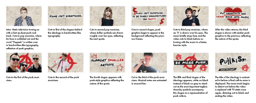
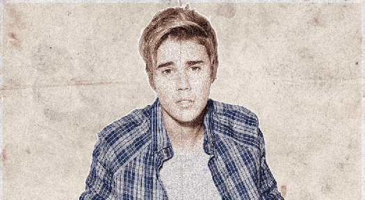
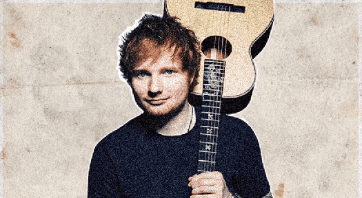
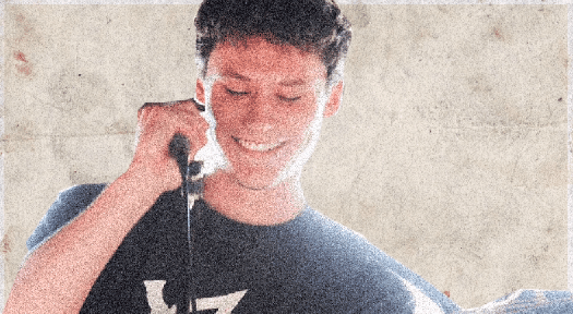
I began approaching the video advert by deciding to focus on the animated punk overlays. This process began with Photoshop, creating still frames of pop and punk musicians to be later animated in After Effects.

To create a lo-fi effect on these frames, I added a soft noise effect to each of the musicians and lowered their saturation, washing them out in order to be consistent with punk visuals. After these were created, I imported them each into their own composition within After Effects and set about animating overlays.

Bieb

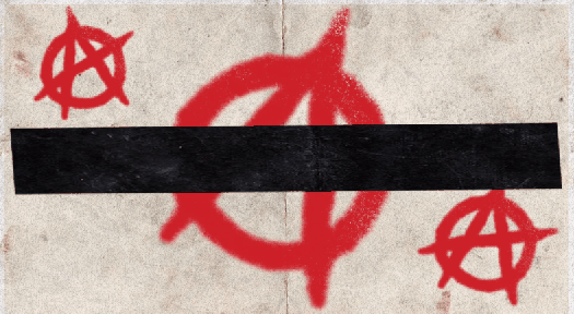
I used a similar Photoshop brush to the one used within my earlier poster design to create this effect. To animate it, I used After Effects’ pen tool to create a mask outside of the brush stroke, then keyframed it across the brushstroke to reveal it – in effect, creating a linear wipe transition. This process was used again on the following frames, though with slightly different graphics involved:

SwiftSheeranSella

I then began to work on the advert’s typographical pieces, namely the slogans that would be cut between each of the animated musicians. Using Photoshop, my goal was to create frames that would reflect the nature of the quotes whilst remaining consistent with the animated musicians:

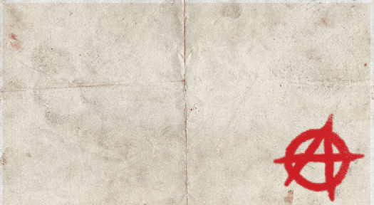
These slogans had to embody the movement as much as the animated musicians did, and so to do that, I knew I had to incorporate more punk graphics within them. Using the Permanent Marker typeface previously used that I felt pushed this visual style very well, I created the slogans and made a small background for them out of the paper material used in the background. Applying a drop shadow to these backgrounds created a nice three-dimensional effect that created the illusion these slogans had been cut out and stuck on top of an existing page. I aimed for consistency with colouration and style within the graphics present on these frames, settling for a bold red that contrasted nicely with the black and white typographical elements and the stained background. These graphics were crafted with a spray-paint Photoshop brush to appear graffiti-like, which emphasised that lo-fi style I was aiming for. I wanted the final slogan, “Be More Punk.”, to stand out from the rest as it was the one that underpinned the entirety of the movement, and ultimately, embodied it the most. I had a few ideas about how to do this, considering scale, typeface and colour, but eventually found that simply inverting the colours worked the best – changing black text to white and the white background to black.

I also decided to animate the final slogan in order to make it stand out more. This was done in After Effects, using a Typewriter effect preset on the text.

Be More Punk

For the final typographical piece, I wanted to create a final call-to-arms for the movement. This would also be animated and make up the final frames of the video. I approached this process by using the décollage technique of using a mix of typefaces, all different shapes and sizes, to create a ‘logo’ of sorts for the movement. This was to be accompanied by another small tagline that would act as a call-to-arms. To achieve this effect, I simply placed each letter in one by one, saving as I went along, before putting them all together within Premiere Pro at a rapid pace to create what is seen below:

Punkism Title

With all typographic and image frames complete, I began putting them together within Premiere Pro. I was aiming for a advert no longer than a minute, so I kept this in mind when selecting an audio track to accompany the piece. I was aiming for a fast, powerful punk rock track that would emphasise the punk elements within the piece. The search took some time but I eventually settled on the track ‘White On White’ by FIDLAR.

Premiere Timeline

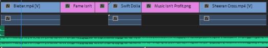
I cut the typographical frames in-between each of the animated musician frames and attempted to match it to the music track, which created a rapid pacing, suitable for a punk-themed video.

With the main body of the advert completed and set up accordingly, there were still a few more smaller effects I wanted to add to the piece to increase its lo-fi style and further embody the movement. I began these finishing touches by creating an opening and closing transition for the piece as planned within my storyboard – an effect that replicates that of a static television being turned on and off.

Static

This was created by adding the noise effect within Premiere Pro to a black background and animated using keyframes. The illusion of it turning on was created by adjusting the scale width and height properties, starting off small, and keyframing them to increase in size.

I also added a film-grain overlay to the advert to make the video look worn, further embodying punk graphics. This was done using free stock footage from #OurConnections. (https://www.youtube.com/watch?v=J_MZb7qTenE)

Finally, to complete the illusion of a worn video, I equalised the music track within Audacity to create a more muffled sound, similar to what you would hear on older TV adverts before sound quality was the quality it was today.

With all elements completed and ready, I exported the video as an .mp4 at 29.97fps in 1080p.


‘Punkism’ – Developing Initial Ideas

With a solid amount of initial research complete, I began working on the digital piece of promotional material that would be my response to the Movement brief. As a recap, the piece must promote, embody and explain ‘Punkism’, and it must move in some way.

I decided to begin some initial ideas with a moodboard – however, this quickly developed into a piece of work on its own, and turned into a poster format. The goal of this moodboard was to visualise the punk elements I had uncovered within my research so far, as well as experiment with some slogans and typography.

I began by creating an A3 Portrait document in Adobe Photoshop, with a CMYK colour range and 300ppi suitable for print.


Using a paper texture background, I began by inserting an image of a pop musician as the main focus of the composition.


Copying and shrinking the paper texture, I changed its blending mode to multiply and filled it with a different colour to create a more distinct background texture. I added two more pop musicians here and gave them a white stroke outline and created a noise effect to reflect the gritty aesthetics of punk. Furthermore, using Photoshop brushes, I added some punk-style overlays to the popstars to embody the nature of the movement, reminiscent of D.I.Y lo-fi posters.


I began working with some typographical elements here, looking at several different typefaces that I could use – but eventually settled with the handwritten-style typeface Permanent Marker. This choice, I feel, best represents the nature of the movement, thus embodying it. I used this font for both the main title/slogan – Death To Pop – and the subtitular text, the call to action – Save Music, Be More Punk.


To further embody the movement, I added a couple of anarchy symbols to the piece. These symbols feature heavily within punk culture and are instantly recognisable within the context of the poster. Furthermore, I began working with some slogans here – settling with slogans such as “Support Smaller Artists” and “Creativity Is Being Suffocated”. These were inspired by the interviews I watched within my initial research, and explain the core ideas of my ideological movement.

Death To Pop Poster

The finishing touch to the poster was an overlay – using the same paper texture as the background, changing its blending mode to multiply and lowering the opacity rendered an even more lo-fi, gritty aesthetic that would be attributed to punk-themed posters.

Overall, I feel as though this moodboard/poster is successful in promoting, embodying and explaining my movement through its overall composition, use of slogans and its context as a poster. Whilst not an animated piece, this has served to inspire me further within idea generation and development, and has given me a strong sense of which direction I should take my digital piece of movement in.

My next goal was to decide on which medium to use for the digital piece. I was considering creating a web banner based around my poster, an animated .gif that would rest on a webpage advertising the movement, but eventually decided to challenge myself by creating a full video advert that would play on social media platforms or music channels. Ideally, I was aiming for it to be 30 seconds to a minute in length.

I generated ideas for this concept by creating two storyboards.

Storyboard Landscape

Reflecting back upon this storyboard, I wasn’t too happy with the contrast between titular frames and the video clips I was using. Whilst this video advert would promote and explain the ideology, it would not embody it because of a lack of consistency with the use of punk graphics. It was these thoughts that led me onto creating my second and final storyboard:

Storyboard #2

I feel as though this storyboard embodies the nature of the ideology far better through its consistent use of punk graphics, as well as making room for more slogans and call-to-arms. The ‘logo’ of the ideology is also further improved through its use of décollage, reflective of early punk graphics.

With this storyboard complete, I moved onto developing the video advert.

‘Punkism’ – Examining Graphics Within Punk Culture

Punkism Logo

With a good sense of the direction I wanted to take my ideological movement in, I started researching visual elements of punk culture, and how I could incorporate that within my piece of movement. I began by examining the work of Jamie Reid, a graphic artist associated with punk culture who developed pieces for English punk band The Sex Pistols amongst other works.

Jamie Reid. Sex Pistols, Anarchy in the UK. 1976

Jamie Reid. Sex Pistols, Anarchy in the UK. 1976.
© 2018 Jamie Reid Courtesy Isis Gallery, UK

Jamie Reid uses a technique known as décollage, which is a method of cutting out existing graphics and sticking them together in a collage format. In the above poster for The Sex Pistols‘ first single, Anarchy in the U.K., Reid uses typographical elements that are sans serif yet varied in scale and weighting to emphasise the ransom-note effect, and Reid combines this with the torn U.K. flag and safety pin imagery to create a distorted, gritty image suitable for punk graphics. Reid’s use of décollage and its strong presence in punk graphics is a factor I’m taking into account when developing some ideas, and is something I’d ideally use within my digital piece of movement.

Jamie Reid, John Varnom. Sex Pistols, Never Mind The Bollocks, Here’s The Sex Pistols. 1977.
© 2018 Jamie Reid Courtesy Isis Gallery, UK


I experimented a little with the décollage technique and how I could incorporate it within my piece as a movement, perhaps best used as a title on an animated banner, or an annotation within a video clip.

Decollage Typography

Digital Decollage Typography


Examining posters that advertised punk-themed music events also proved to be a valuable insight to punk graphics. These posters feature a very limited and washed out colour palette, incorporating a similar décollage technique that Reid uses, and overall, the composition is very D.I.Y in style. These features are something I’m going to consider when developing my piece of movement, perhaps by using colour correction to wash out saturated colours, and using overlays to add grit and texture to the piece.

The Clash004deadkensoloman-700x475

Source: Reveron, S. 2015. CVLT Nation. [Online]. [Accessed 8 November 2018]. Available from: https://www.cvltnation.com/diy-dadaism-when-80s-punk-posters-and-flyers-ruled/

Before moving on to develop some ideas, I decided to take a look at some interviews with musicians and members of punk culture that spoke out against the pop music industry to get a sense of what others who share my views had to say on the topic. This was done primarily to get a sense of some slogans or mottos I could use to advertise and promote my movement within my digital piece.

Design a site like this with WordPress.com
Get started