End of Field Lvl. 4 – Evaluation

With the conclusion of the live protest, our collaborative studies in level 4 have come to an end. The past four weeks have provided a good opportunity to combine the strengths of multiple fields – in our case, graphic communication and illustration – and have opened many new ways of approaching future projects. I feel as though I am now able to approach briefs and problems in multiple ways – through the mindset of a graphic communicator and an illustrator, as working alongside Illustration students has proven invaluable to developing a good skill set.

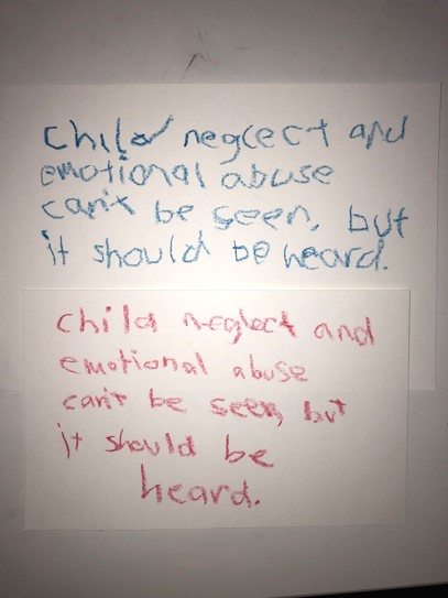
Upon reflection, I found that our collaboration was at its strongest during the visual metaphor stage as well as developing our manifesto, as I felt these two parts of the project invited us to use our graphic design and illustrative skills in a way that worked well together. These stages really allowed us to play to our strengths and as such, we all feel quite accomplished within those outcomes. There were a few moments where things didn’t go quite to plan within our development stages, but I’d argue that this was due to a lack of communication as we were still getting used to collaborating and sharing our work together.

During the next collaborative field projects, I’d like to expand my abilities by working with other fields and see the different ways we approach briefs based upon our own set of skills. Working alongside Illustration students was really interesting and I feel as though the way I can approach briefs in the future has been changed for the better now. I honestly feel as though my contribution to the projects could have been stronger at times, and this is something I’m taking on board throughout the rest of my studies as I have seen first-hand how important it is to be clear and communicate with the rest of the group, and I aim to rectify these mistakes through continued practice.

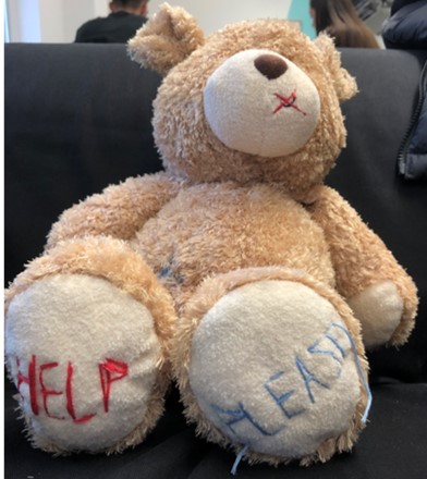
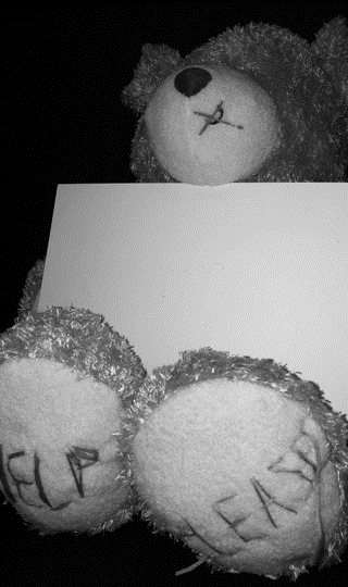
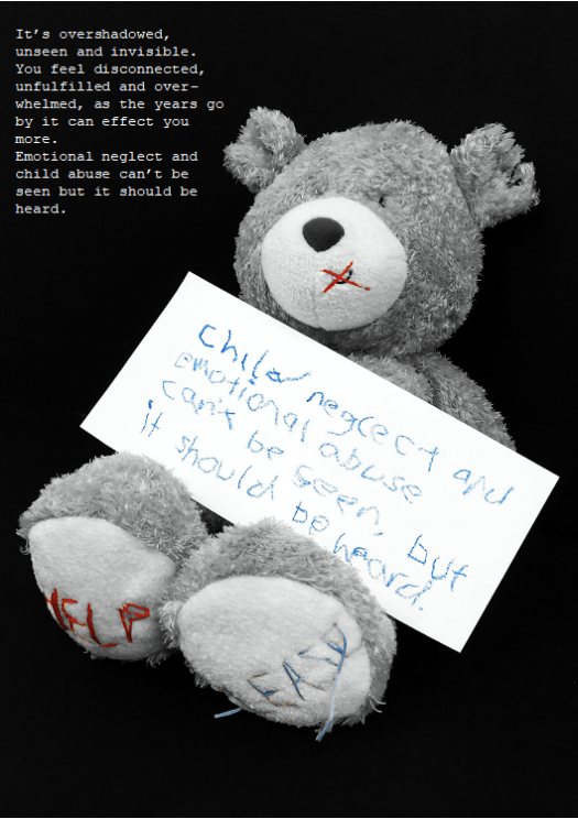
Overall, these field studies have left me feeling more comfortable with collaboration and ultimately, more comfortable with my own skills. There were a few times during the tasks where I did feel out of my comfort zone, but after pushing through them I feel I have developed my skills as a graphic communicator for the better. At the forefront of all of the set tasks, we kept our target audience and the tone of our work in mind, aiming to create outcomes that would reflect the sensitive topic we were handling with care, as well as invite anyone who witnessed the protest to get involved and care about the cause we were promoting. This part of the project really reiterated how important it is to keep the target audience and visual communication at the forefront of any solution to problems and briefs, and now that I have worked alongside other graphic communicators and illustrators, I feel as though my ability to work to a set audience and maintaining a consistent tone across several outcomes has really improved.

Collaborate – Developing Placards

Following the development of our oxymoron outcome, we moved onto developing placards for the final stage of our protest. One of these placards must be within the style of Stanley Green, a notable protestor within the latter half of the 20th century in London.

220px-Stanley_Green,_Oxford_Street,_1977

Green’s placard involves a notable lack of imagery and is incredibly type-heavy, contrasting a bold majuscule typeface against a black background. This format would make the foundation for our own placard in Green’s style.

Before we began our work on placards, we decided our campaign needed to be a little more expanded on, and we decided to create a name for the organisation and develop a logo that would represent us across all of our outcomes. We played around with a few ideas, including “Minor Abuse, Major Impact”, but ultimately went with “Intercept Neglect” (later changed to “Intercept The Neglect”) as our organisation’s name.

Logos

After talking to some peers, we felt that the strongest option for our logo was to stick with the teddy bear, as it was consistently used across our outcomes and acts as a strong visual image to create a lasting impression. I experimented a little with colour on the bear, but we ultimately decided that it was still very effective and worked without colour.

With a name and logo for the organisation decided upon, we then started creating a placard in the style of Stanley Green. We used a black painted background with bold white typography that dominated the space available to stay true to Green’s style, creating a striking impact in a simple manner.

14

We also decided to make several placards of our own featuring a mix of imagery and typography. I experimented with the silhouette of a child, as well as the logo we created earlier, to create four placards that incorporates the strengths we identified in earlier outcomes to make a strong lasting impression.

51791261_2278026882441355_8265638885837504512_n (1)

Collaborate – Oxymoron

Following our manifesto, we moved onto examining oxymorons, and how we can represent them visually in the context of our campaign. An oxymoron is, according to yourdictionary.com, a figure of speech containing words that seem to contradict each other. To kick off our own work with oxymorons, we examined two separate ones and sketched some initial concepts based around them:

Oxymoron Ideas

Quiet STorm

After examining these concepts, we felt that the idea that best represented our campaign was the third idea for ‘Tough Love’, using a teddy bear (as we did in our manifesto) to represent the idea of tough love by contrasting an object commonly associated with children with an object that insinuates violence.

51097599_423554295136487_967955744412401664_n

We decided to further this idea by creating a short stop-motion animation that would ideally be shown on television. From the start, we all agreed that no sound should be present in this animation, as if it were an advert on television, the lack of sound would draw attention more than a clip with sound. Within this stop-motion animation, we wanted to explore the relationship between an adult and a child who is neglected by said adult, and how they may often feel in a situation of neglect or abuse. With this in mind, we decided to alternate between colour and greyscale imagery to reflect the mindset of an adult, who believes they are helping the child (colour), and the mindset of a child who is a victim of neglect (greyscale).

51109428_1060237244187189_2008972284143861760_n.jpg

50799480_1245401292302017_2838138483963330560_n

Some of the difficulties we encountered when making this animation included the tripod legs being present in many of the frames. We worked around this by cropping each frame slightly, bringing attention back to the bear.

Capture

Collaborate – Developing Our Manifesto

With a sound understanding on our chosen topic and some appropriate research taken, our group began to work towards the first of our outcomes – a manifesto that serves as a call-to-arms for our protest. Within the manifesto, we need to feature the visual metaphor we created, shown below:

Picture3

We agreed that in order to have the highest impact, the visual metaphor should be relatively large scale within the frames of our outcome and dominate the space available. This would immediately draw the eye and create a strong visual hierarchy.

Picture2

We decided to create a small sign with child-like writing featuring our mantra, which would ideally be the second thing people are drawn to within the visual hierarchy. The use of child-like handwriting proved to be successful in some posters we researched, and combined with our visual metaphor, invokes sympathy more effectively than a regular typeface.

Picture5

We then followed up these decisions by desaturating the image, which creates a serious tone around the entire image. However, we noticed that the stitching on the bear doesn’t look quite as effective when desaturated – so we made the decision to leave the blue and red parts of the image saturated, whilst greying out the rest of it.

Picture1

Our final manifesto took shape with this change. We centred the bear within the frame of the image and scaled it up so create the largest impact possible, something that would immediately draw the eye and connote the messages we’re attempting to put across. We decided to use a simple typeface to expand on our mantra and placed it in the remaining space available in the upper left of the frame, which ideally would be the last object the viewer is drawn to.

Upon reflection of this manifesto, I’d argue that despite being quite moving and successful in promoting the message our campaign stands for, our lack of a logo or contact information lets it down. This is something we implement in later outcomes, but its absence here is notable and could improve the overall quality of the manifesto.

Collaborate – Creating a Visual Metaphor

In order to create an effective protest, we need to fulfil three goals within our outcomes – to make people sympathise with victims of child neglect, increase their overall awareness of the subject and offer them a way to get involved and make a change. In my previous post, I talked a bit about how organisations such as the Dubai Foundation for Women and Children used posters very effectively to fulfil those three goals and engage with people. Those posters featured the use of one or more child actors, however, which is something that we’ve discussed and unfortunately aren’t going to be able to use. The next best option is to use an object that symbolises children, invoking sympathy through the use of a visual metaphor.

A visual metaphor is a representation of an idea or a message that is presented through an image. Visual metaphors are frequently used within advertisement, inviting the viewer to think and take their own interpretation based on their understanding. I studied and examined several different visual metaphors within my Constellation studies, which in reflection, has proven invaluable in aiding this stage of the development process. One that has particularly retained my attention is a parody campaign run by Adbusters, who deconstructed posters created by Absolut Vodka.

Absolut Vodka frames their advertisements to create an image of their product that is high-end in nature, glorifying the consumption of their alcohol. This has its own implications, as over-consumption can be fatal. Adbusters took note of this and launched their own parody campaign, using visual metaphors to reveal the dangerous side of alcohol consumption.

Adbusters use the general shape of the bottle, framed in the centre of the image, with the same typeface and grid system as Absolut use in their posters to create an instant and effective visual metaphor that parodies Absolut’s posters. This is highly effective because it plays to the viewers favour, using their pre-existing knowledge to draw them into the metaphor before revealing the message of the posters – that over-consumption of alcohol isn’t great.

With these strong examples in mind, our group took to thinking about some visual metaphors we could create and use within our own campaign. Our first goal within our outcomes is to draw people in with an eye-catching visual metaphor. Based on the strengths of the existing examples we’ve looked at, we agreed that a object symbolising children would be a strong visual metaphor and a good place to start.

Some of my initial thoughts on what object to use involved building blocks, a children’s toy. These would have the potential to spell out messages, as each face of the block has a letter or a number. Using perspective, we could obscure some of the letters to create a sense of mystery, and the viewer would have to use their initiative to find the message. This entire process could represent how victims of neglect are often afraid to talk out about the problems they are facing, and it isn’t always clear to outsiders what is happening.

Picture1

After some peer-review, we agreed that the image of a teddy bear would be very effective as it holds clear connotations of childhood and represents the more innocent side of it, invoking sympathy in a much stronger way. We thought about creating an illustrative outcome to capitalise on the skills the Illustration students have, but in the end, we decided to use photography to create a more realistic outcome that would be more adequate and impactful for the sensitive subject we’re handling.

After purchasing the teddy bear, we decided to make some physical alterations to it that would represent our campaign better. This involved stitching the words “HELP” and “PLEASE” on each foot of the bear, as well as a small cross over the bear’s mouth. Initially, we were going to write “HELP ME” instead of “HELP PLEASE”, but felt that it wasn’t so clear in the context of our campaign what that message meant. The stitch across the bear’s mouth connotes a forced silence, which we intend to represent that victims of child neglect and abuse are often not heard or feel unable to speak up about the situation they are in.

Picture3

With a strong visual metaphor created forming the foundations of the rest of our outcomes, we moved onto developing our manifesto – a poster that clearly displays the message of our campaign and a call to arms, and ultimately an invitation to get involved with our protest.

Sources:

Visual Metaphor: https://www.thoughtco.com/visual-metaphor-1692595

Collaborate – Further Research

With a solid foundation for our protest campaign established, we decided to research a little more into the visual identity of two other campaigns. I’ve already discussed a few key strengths within the poster adverts of the campaign run by Family Centre, but I’m going to compare those with two other campaigns to attain a broader understanding of the sensitive subject we’re tackling.


To kick the further research stage off, we examined two posters created by the Dubai Foundation for Women and Children in protest of child neglect. Similar to the posters used in the Family Centre campaign, these posters feature child actors who are framed so, in the visual hierarchy, the viewer’s eye is immediately drawn to them. Both actors have similar upset facial expressions which induce sympathy, which immediately fulfils one of the campaign’s goals: to make the viewer care. The viewer is then drawn to the other objects in the frame; in the first poster, the hands of parents holding mobile phones. The viewer can assume that, judging by the child’s expression, the parents are ignoring her, which demonstrates child neglect in action – fulfilling another goal of the campaign, making the viewer aware of the signs of neglect. The second poster also does this in a different way; the viewer sees the boxing gloves and the punching bag with the child framed in-between, revealing the violent side of child neglect and abuse. Following this, in both posters the viewer’s eye is drawn to the mantra and call to arms, as well as how to get involved with the campaign and fight against child neglect – fulfilling the third goal of the campaign, showing people how to take action, and encouraging them to. The use of hashtags is also effective within the context of the posters, which are presumably displayed on social media, as this entices the viewer to take immediate action. Other strengths of these posters include the desaturated colour palette, which frames the posters as being quite serious in nature, and the choice of typeface – using childlike writing for the mantra, and easy-to-read sans serif for the contact information. I would argue that a weakness of these posters are their grid systems – a lot of the typography present is spread out, which draws the viewers eye around quite a lot and perhaps doesn’t make the poster as impactful as it could be if the typography were aligned in one column.

In hindsight, it was absolutely crucial to our development stage that these strengths and weaknesses were identified – they definitely helped shape our own outcomes for the better.


Picture2

The poster above, used in a campaign by Justice for Children, uses similar techniques used by the Dubai Foundation for Women and Children in their posters: a desaturated colour palette, use of a child actor and a strong visual hierarchy. Whilst it doesn’t use any other objects in the photograph or feature childlike typography, I find this poster to be more effective because of its strong grid system and scaling of text. The text is all aligned and scaled effectively so the viewer immediately sees a call-to-arms followed by how they can get involved, and as the eye isn’t drawn all over the frame, the visual hierarchy is stronger. I would argue that the poster’s weakness its lack of a logo, which I noticed the organisation had after looking at their website. Whilst it doesn’t necessarily lower the effectiveness of the poster, it doesn’t create a strong or memorable identity for the organisation after the viewer has seen it, which I feel is quite important when it comes to larger campaigns.

Justice for Children logo


After examining these three posters, its clear what strengths they have in common and what we can do to ensure our outcomes are just as effective. Whilst we probably won’t be able to use a child actor, we can identify other objects that relate to children, such as toys, and use them instead. A desaturated colour palette appears to be very effective, so that’s also something we’ll work into our outcomes.

In the next stage of our development process, we’re going to examine visual metaphors and how we can work them into our outcomes to create a strong and impactful protest, before moving onto developing our manifesto.

Sources:

Dubai Foundation for Women and Children: https://www.dfwac.ae/

Justice for Children: https://justiceforchildren.org/

Family Centre PR Campaign: https://www.scribd.com/document/323635324/Family-Centre-PR-Campaign

Collaborate – Establishing The Protest

Our collaborative module allowed CSAD students across multiple subject areas to come together and create outcomes that displayed the strengths of multiple fields. As graphic communicators, we were paired with illustrators to create several visual outcomes across a few weeks that would be part of a larger live protest, protesting for or against something that we, as a group of students, felt strongly about.

Within our group of five, we decided to tackle the issue of child neglect, as it was something we agreed was still a problem in today’s society and was worth protesting.

_97483752_mediaitem97483751

Our first task within the collaborative design process was to identify a target audience for our protest. Our goal with this campaign was to raise awareness of child neglect and help people to recognise the signs, and even encourage children affected by neglect to speak out to someone they trust. With this in mind, we decided to target both adults (with a focus on parents and teachers) and children, and we knew we had to create visual outcomes that would be suitable for these people.

Following the establishment of our target audience, our group then moved onto researching some statistics around child abuse and neglect, such as how many children are affected by it, where it occurs and what constitutes neglect – all important information that we would need to relay to our target audience if we are to truly make an impact.

CaptureCapture2Capture3

These statistics, sourced from the National Society for the Prevention of Cruelty to Children (NSPCC)’s website, gave us an immediate insight into the alarming facts of child neglect. These statistics would go on to underpin the rest of our protest, as well as give us some initial ideas of some strong visual metaphors and info-graphics we could potentially use within our outcomes.

At this early stage, I decided to take a look at existing campaigns to get an idea of the visual language and techniques used to raise awareness of child neglect. I examined some poster adverts used in an annual campaign run by Family Centre that advocates for the protection of children against neglect. Below are three adverts for the campaign that displays their effective use of visual language.

These images are incredibly moving and powerful through their simple visual communication of innocence – the use of child actors and child-like writing to tell a short yet alarming story that definitely punches you in the gut. The visual hierarchy is incredibly effective too, immediately drawing the eye to the narrative the children are telling then guiding the viewer over to the important information regarding neglect, including the numbers to call to report and support children affected by neglect, as well as a bold call to action through three short, simple sentences. It’s clear that these type of poster adverts work well to captivate and move a person into taking some action, so this medium is a strong contender for what our group could create for our own outcomes.

With our protest established, we will be moving onto doing some further research into our topic. I aim to examine and deconstruct some posters further as well as take a look at some visual metaphors which will prove incredibly valuable within later outcomes.


Sources:

Rise in child neglect reports to police by NSPCC Wales: https://www.bbc.co.uk/news/uk-wales-41015905

https://www.nspcc.org.uk/preventing-abuse/child-abuse-and-neglect/neglect/

https://www.nspcc.org.uk/preventing-abuse/child-abuse-and-neglect/neglect/child-neglect-facts-statistics/

http://bernews.com/2016/09/neglect-is-abuse-see-it-stop-it-campaign/

Design a site like this with WordPress.com
Get started