APPlying APPtitude – Final Additions & Refinements

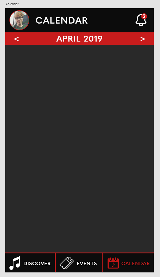
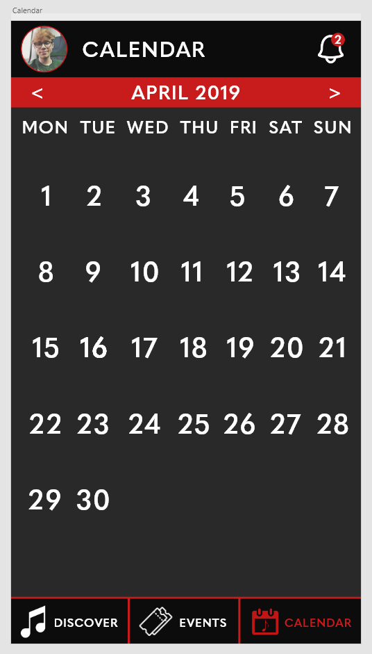
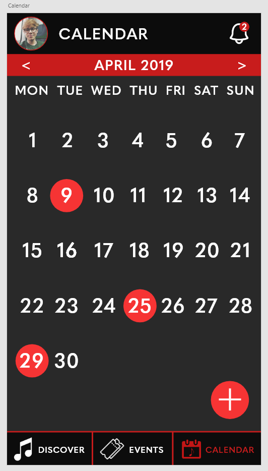
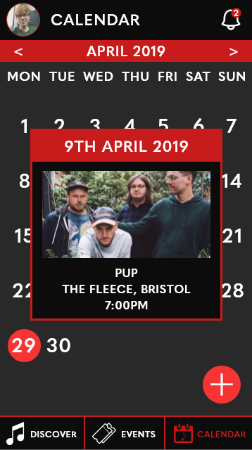
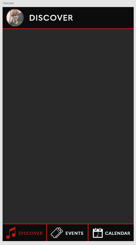
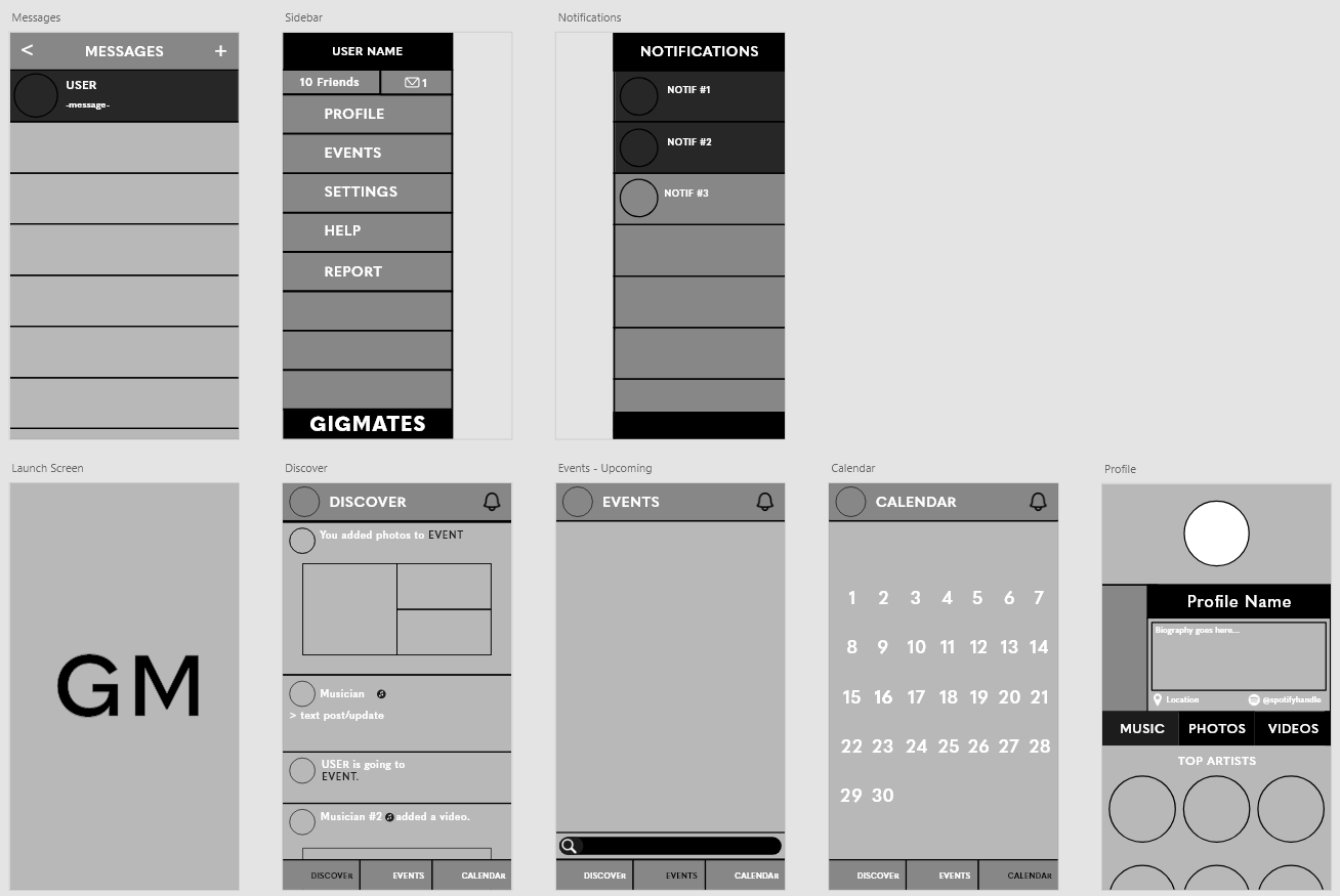
To finalise my prototype application, I took the advice from the user testing into Adobe XD and began creating a sidebar that would allow the user to access their profile and a messaging hub, as well as adding a notifications bar and a launch screen.

Sidebar

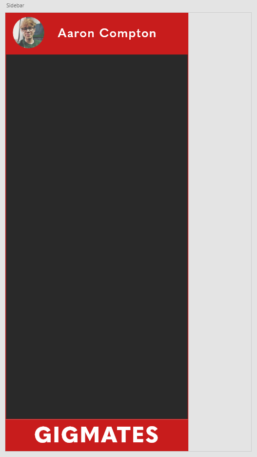
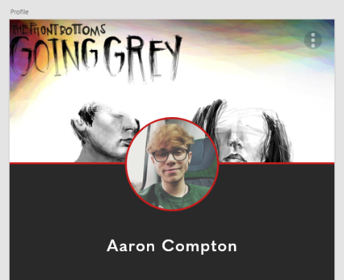
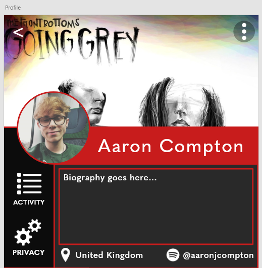
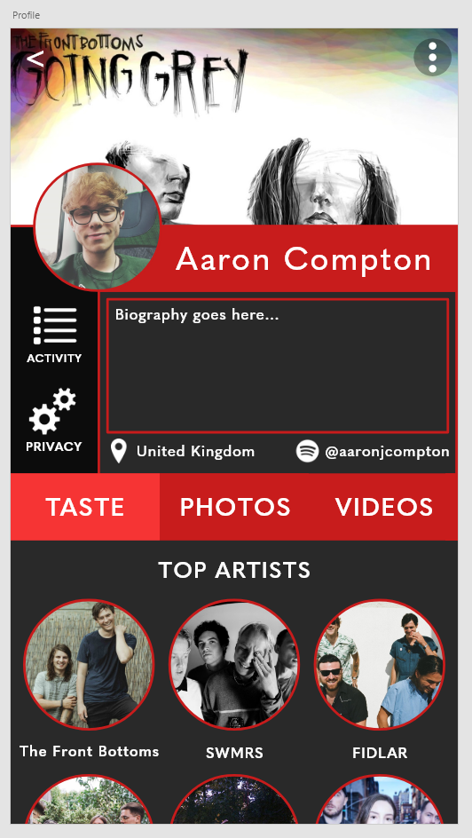
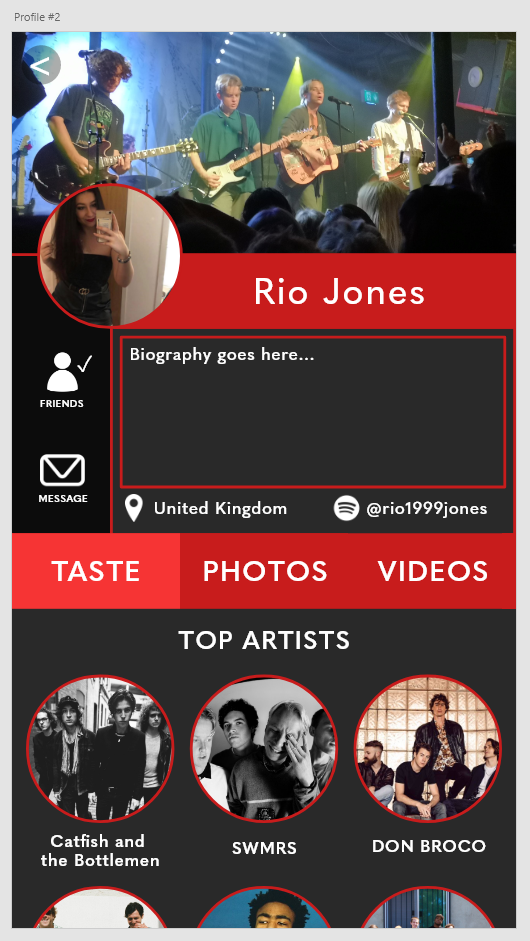
I started creating the sidebar by dividing the screen into three quarters and creating a fill. I decided to put the user’s name and profile picture in the sidebar’s header for quick and easy access to the user’s profile, and put the logo of the app in the footer.

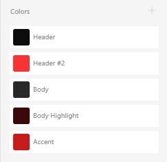
I then divided the sidebar into several different sections, adding a friends and messages counter (which would direct to the messaging hub). Each section would in practice link to their own screens, but for the sake of the prototype I only linked the messages, profile and events section. I also changed the colour of the sidecar to a darker grey to contrast against the lighter grey in the rest of the app, highlighting the sidebar as a sidebar and reducing user confusion.

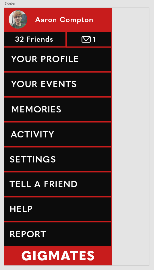
I then finalised the sidebar by adding some iconography relating to each of the labels, sticking to the principles of UX/UI as discussed in an earlier post.
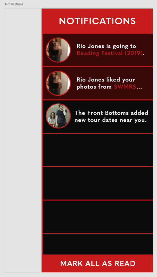
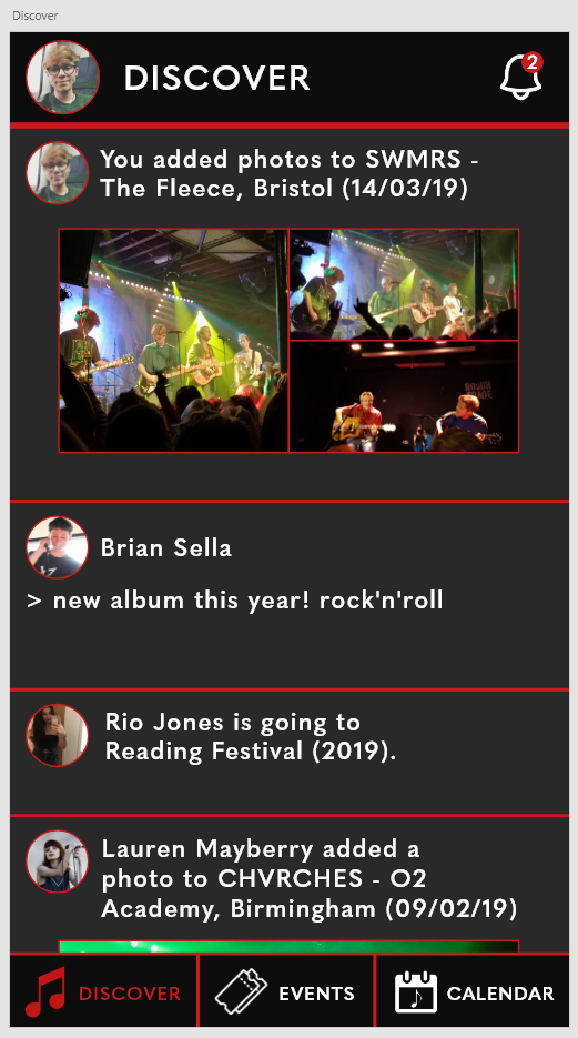
Notifications

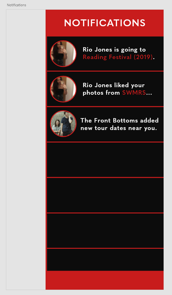
I followed the same design principles as the sidebar when creating the notification menu, accessed by tapping the notification bell within the main app. Upon initial glance though, I felt as though unread notifications would need to stand out against those already viewed, and adjusted the colour palette accordingly. I also decided to add a “Mark All As Read” button to allow the user to clear notifications without clicking on each one independently.
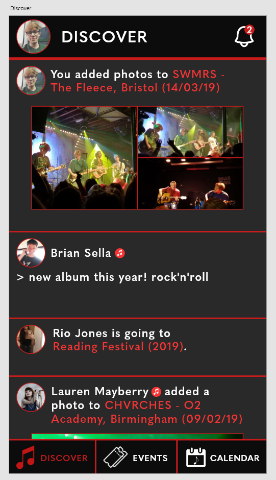
Messages

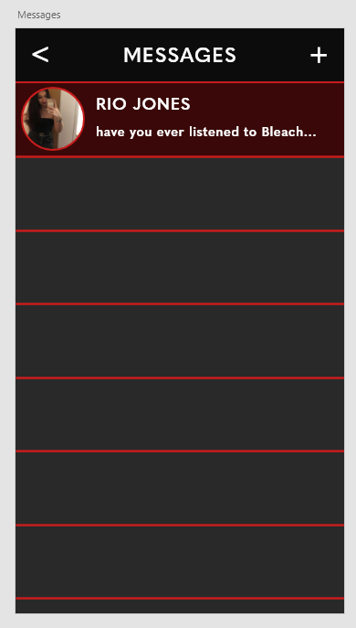
Once again, I followed the same principles as abo

ve when creating the messaging hub – using a darker red for unseen messages and linking the user’s profile photo to their profile. This messaging hub would be accessed from the messaging icon on the sidebar created above.

Finalised Application – Video

https://vimeo.com/340545886

APPlying APPtitude – User Testing on a Prototype Build

At this stage, I had developed the user profile, discover, event and calendar screens and decided to test the app with a small handful of real-life users to get a sense of whether the user interface was working effectively, and whether the overall user experience was positive. Before testing, I had to prototype the app and create transitions for between the pages so far. I decided to use fade transitions with a quick transition time (0.3s), connecting the user profiles to the rest of the app via tapping on the respective profile pictures on the discovery screen.

Before testing the app with users, I explained that the app was a prototype and a visual project made to examine user interface and experience as opposed to a functioning social media application. As I gathered feedback from the users, I noticed a common comment was the lack of flow between the user profiles and the rest of the app, as well as the longevity of going to a user profile to message a user. These two processes could be sped up effectively with the addition of a sidebar, creating a dedicated messaging hub and a quick link to your own profile. As I move onto creating these final few pages, I will incorporate these refinements into the prototype and test once again before finalising the app.

APPlying APPtitude – Developing the User Profile

To create the user profile, I started by placing areas for the profile and cover photos. These would dominate the header of the screen but still provide enough room for information. I was a little wary on placement of certain elements, such as the user’s name and their information.

Ultimately I decided to experiment a little bit and use placement that I hadn’t seen used before. The placement below is what I ended up settling on, leaving plenty of room for the user’s information and some quick shortcuts to privacy and activity settings. I also decided to add a Spotify handle feature, which would theoretically allow users to share their Spotify activity within the app.

To finish the user profile, I decided to opt for a more visual approach rather than listing information like other social media apps tend to do. I started with a music taste related section, allowing the user to choose their top artists and display them on their profile, followed by a photos and videos tab that would allow users to share their concert photos and videos.

I also decided to create a second user profile to later implement a messaging screen for the app. This was done by copying the first user profile and changing the personalised elements below, including replacing the activity and privacy settings with a message indicator.

APPlying APPtitude – Developing the ‘Events’ and ‘Calendar’ Pages

My next step after establishing the discover page and design direction was to create two of the other main pages accessible from the navigational menu in the footer – the ‘Events’ and ‘Calendar’ pages.

Events

To start off the events page, I copied over what I had done with the Discover page and removed most of the elements there, rebranding it to an events page.

I then added a search bar above the footer, theoretically allowing the user to search for events they had in mind. Similarly, I added an ‘Upcoming’ and ‘Nearby’ section to the header, allowing the user to view their upcoming events and events that were nearby to their location.

I then added the first event to the page – a real gig in Cardiff that showed the event’s name, venue and date, as well as the option to respond to the event, listen to the artist’s music and buy tickets to the event.

Calendar

Once again, I copied an unedited version of the Discover page and altered the iconography colour and label to identify the calendar screen. I also added the month and year underneath the header to allow the user to select which month they wish to view events for.

I then added the days of the week and the dates correlating to them in a typical calendar format, inspired by the simplistic nature of many in-built calendar apps on iOS and Android.

I then added a few visual elements to indicate events – highlighting days with events with red dots. I also added a visual indicator to invite the user to create their own event and add it to the calendar.

I decided to go a little further on this step and add a small event window that would pop-up once a day with an event was clicked on, appearing as an overlay over the top of the calendar app detailing some key information about the event.

APPlying APPtitude – Developing the ‘Discover’ Page

The first page I decided to develop was the ‘Discover’ page, as it is the main page within the app that users will use to engage with their connections and other content.

I began by narrowing down a colour scheme that I felt reflected the themes of the app. I decided against creating a light and dark mode due to time constraints. I decided against blue and yellow to stray away from other popular social media apps – such as Twitter, Facebook and Snapchat – and opted against green as it’s used dominantly by Spotify. I decided to go for a dark grey body colour with a near-black header, using a red for accents and highlights.

I set up an Adobe XD document with the Android Mobile preset (360x640px), allowing for easier testing as I use an Android phone.

My first decisions and processes involved the fixed navigation bars. Based on the fundamentals and principles I previously discussed, I added the user’s profile photo alongside a label to the header of the page which would later be used to access the user’s profile. I used the bold, sans serif font Quasimoda to attain a modern look suitable for lists and menus. In the footer, I added the three main sections of the app – the discover, events and calendar pages – as well as labelled iconography to stay true to the principles of user interface/experience. These icons were first sketched then rendered in Photoshop, overlayed to white to match the colour scheme of the app.

The next stage was to add some content to the Discover page. This information was based on my own gig history due to the nature of the app being a simple prototype. Twitter was my main inspiration for these choices, displaying photos for each user’s post as well as including a variety of media – a text post, two photographic posts and an ‘event’ post. I also added a notification bell to the header, which would later be used to open the notification sidebar.

I decided to highlight key information to add some colour balance to the page and reduce user confusion. To do this, I highlighted various elements in each post, such as event names, and added a small symbol next to the two musicians to denote their status as musicians as opposed to casual users.

The final touches I added to the Discover page was additional elements that would allow the user to interact with posts – the ‘like’ hearts. In theory, a user would be able to tap on a heart to like or unlike a post (denoted by a full heart and an empty heart respectively). I also added timestamps to each post to reduce user confusion and remain true to the fundamentals.

APPlying APPtitude – Examining Other Social Apps

Before tackling the finer details of my own app, I decided to do further research and look at pages from other social media apps, examining how and why they are successful and what design elements they use.

The first page I decided to examine was a discovery/news feed page – ultimately, one of the most-used pages in most social apps. I took a look at Facebook (left), Twitter, (central) and Spotify (right).

Discover Page

Facebook presents its app in a blue and white colour scheme that isn’t alterable with (label-less) iconography redirecting the user to groups, videos, notifications and a marketplace with a scroll-locked action bar, as well as allowing the user to search for content and check their messages. Following the header UI, Facebook presents ‘stories’ to the user (a feature I don’t intend to include within my app) followed by a feed of posts that display the user/page who posted it, a comments section and the ability to react and share the post. There are also privacy settings embedded within a hamburger menu cornered in each post.

Twitter presents the app in an alterable colour scheme (a light and dark mode) with iconography that isn’t labelled, redirecting users to their feed, a discovery page, a notification page and a message page. The header of the screen allows the user to access their personal profile and settings, whilst the rest of the page is used to feature the user’s feed. Each post allows the user to engage with it with a ‘tweet’, a ‘retweet’ or a ‘like’, as well as the ability to share and alter privacy settings.

Spotify presents its app in a colour scheme that isn’t alterable with labelled iconography, allowing users to search for music and access their personal library. There are no posts to interact with on Spotify, rather, it presents to the user relevant music through playlist suggestions. The settings menu is accessible only from this screen in the top-right of the app.

Fundamentals of a ‘Discover’ page:

  • A variety of media (text, photos, videos)
  • Labelled, scroll-fixed iconography allowing the user to get where they need to go
  • The ability to engage posts with a ‘like’
  • A timestamp on each post

Profile Page

Facebook’s profile page gives the user a profile and cover photo to personalise, framing the profile picture large and centre with the cover photo in the background. The user’s name and biography is clearly visible underneath this, as well as any information the user has decided to make public. The ability to edit your profile, change your privacy settings and view your activity is also readily available here. Featured photos and the user’s content is viewable underneath this information.

Twitter’s profile page is similar to Facebook, allowing the user to customise a profile and cover photo, write a bio, edit their profile display certain information all in the top section of their profile. Underneath this is the user’s profile feed which is filterable. The main difference with Twitter is positioning – the profile and cover photos are a lot less dominant within this app, allowing more room for the user’s content below.

Spotify’s profile page is clean and simple, displaying only a profile photo and the user’s followers/following, as well as any playlists they have decided to make public. There is little information available to share about the user within this app due to its focus on music over socialising.

Fundamentals of a ‘Profile’ page:

  • A profile and cover photo that are contextually sized
  • A feed of information pertaining to the user
  • The ability to edit profile and privacy settings

APPlying APPtitude – Creating a Rough Wireframe

With initial user feedback and concepts in place, I took to the next stage of the development process – creating a rough wireframe to get a sense of what application screens I would need to research and develop.

From initial brainstorming, I came up with five main pages that the app would be centred on –

  • a ‘Discover’ page, where the user can post content and engage with their connections – essentially a news feed or timeline
  • an ‘Events’ page, where the user can search for events, view upcoming and nearby events, purchase tickets or connect with other people attending the same event as them
  • a ‘Calendar’ page, where the user can view all of their scheduled events in one place and share them with their connections
  • a ‘Profile’ page, where the user can view their content, share their musical interests and talk about themselves
  • a ‘Messages’ page, where the user can directly talk to other users and connections they make on the app.

On top of these, I created a launch page which would display the logo of the app and load it upon launching the app for the first time, and two overlay menus – one sidebar, which would provide the user with a call to action and a fast way to get to where they need, and a notifications menu which would alert the user of any updates they may be expecting within the app.

I now intend to narrow down on these pages and work on designing and prototyping the finer details, working out layouts, colour schemes and the best way for these pages to connect in order to ensure a clean and efficient user interface and a strong user experience.

APPlying APPtitude – User Survey

To further meet the APPlying APPtitude brief, I created a short survey to get an idea of the type of users that would be interested in the GigMates app and ideally what features they would like to see within the app. The survey received 18 responses over a week and the responses are as follows:

The purpose of this question was to gauge how often my userbase actually go to concerts and events. The majority (55.55%) go more than once a year, with a mere 22.22% going less than once a year. These results indicate that the event section of the application should take a strong prominence.
This question was used to determine how prominent the discovery of other people going to the same events should be – whilst most people go to events with the same people, there is a small niche (22.22%) of people who don’t, which I could capitalise on within the app.
Again, this question was used to determine how prominent the discovery features should be. The majority of responses (72.22%) never attended a concert on their own, and a small group (22.22%) did. I can draw the same conclusion from this question – the discovery feature can capitalise on this small group.
The vast majority of responses indicated that they would be interested in downloading this app for it’s primary feature – meeting other people going to the same concerts as you.
The same conclusion can be drawn from the responses from this question – the connection between users should be the primary feature of the app.
This question was used to gauge what economic model the app should take. Realistically, I wasn’t going to set a price for it, but in a real-world context these answers were to be expected – a small amount would, but the vast majority wouldn’t (or would depending on the price, which I imagine would have to be quite cheap). This indicates I should leave the app completely free to download, with potential in-app advertising (though nothing too intrusive!)
The final question was used to indicate what my focus should be whilst developing the app. Half of the responses voted for how easy it was to use, whilst the other half were split between how it looks, how much it costs and (stated by the ‘other’ response) how useful it will be. This indicates my focus should be on ease of access, though I need to make sure it’s actually useful and that it looks and performs well on a mobile device. I don’t need to worry about how much it costs as said above.

Overall, these responses have given me a solid direction in which to take the further development process of my app. From what I’ve gathered, I need to focus on the social aspects of the app – in particular, connecting music lovers – and suggesting relevant events to them. I don’t need to worry about a strong economic model as this app is just a prototype, but the responses indicated no price-tag would be best. Finally, my focus should be on the ease of use of the app, but the app should also look and perform well.

APPlying APPtitude – Initial Concepts

The APPlying APPtitude brief requires us to conceive of and create a new smartphone application that uses appropriate design methods – such as paper prototyping, user testing and design simulation. The development process will involve working with Adobe XD, an application I’m not all too familiar with at the moment, but an application I’m excited to learn that I’m sure will be useful for many projects to come. To begin approaching this brief, I looked at three initial concepts that could meet the brief’s requirements, outlining their goals and features.

Concept #1 – Drug safety

This concept would be focused on an app that taught the user about the effects, risks and laws surrounding drugs in order to ensure safety and deter potential use of illegal substances. The app would have an A-Z of common drugs, allowing the user to quickly search up a substance to view the effects, risks and laws surrounding it. There would be a built-in helpline to help potential users or those worried about a friend or family member.

Concept #2 – A social media app focused on music and concerts

This concept would consist of an app focused around concerts and music lovers, allowing them to connect with each other, share concert photos and videos, view upcoming and nearby events, and meet new people. The app would allow the user to create a profile, share their music taste, upload photos and videos and connect with artists and other music lovers.

Concept #3 – A digital photobook

This concept would involve an app that would allow a user to create and manage a photobook on their phone or laptop. The app would be in the form of a calendar, and the user would be able to select a day and upload photos, videos and notes to it. Towards the end of each day, the app would send a push notification asking the user if they would like to add today’s photos to the app (if the user had taken any), and the user would then be able to select which photos to upload. The user would be able to share their photobook with friends or keep it for memories.

APPlying APPtitude – Deconstructing An Existing App (Spotify Wireframe)

To begin the research stage of the APPlying APPtitude project, I deconstructed an existing app – Spotify – and created a wireframe to explore how it utilises user interface to create a strong user experience.

  • 1 – Home – the first screen upon launching the app whilst logged in, this screen presents the user with quick links to music they may be interested in, such as the user’s recently played tracks, curated playlists based on the user’s music taste and other artist and album recommendations.
  • 1a – Settings – currently only accessible from the home menu, allows the user to change their settings and preferences with ease.
  • 2 – Search – allows the user to search for tracks, artists, albums and various other media based on an entered search term or from various genres.
  • 3 – Search bar – shows the users recent searches and allows them to enter a search term.
  • 3a – Artist screen – can be accessed from various points in the app such as the search menu, displays an artists most popular tracks, their latest releases, and their available discography, merchandise and events.
  • 3b – Album screen – displays all the songs within an album and allows the user to listen to them, as well as the album art.
  • 3c – Merchandise screen – Spotify pushes the user from the app to the web as most merchandise websites are ran by the artist rather than Spotify.
  • 4 – Genre screen – displays popular Spotify-made playlists based on the selected genre, allowing the user to discover new songs and listen to old favourites.
  • 4a – Playlist screen – displays all the songs within a playlists and allows the user to listen to them.
  • 5 – Library – shows the user’s collection of music, such as their saved tracks, favourite artists and their created playlists as well as their recently played media.
  • 5a – ‘Made For You’ – shows the user Spotify-curated playlists based on their music taste, recommending new songs and allowing them to rediscover old favourites.
  • 5b – All playlists – displays the user’s created and saved playlists.
  • 5c – Stations – displays radio stations based on the user’s listening preferences, creating a seamless and unique playlists each time it used.
  • 5d – All songs – displays all of the user’s saved songs.
  • 5e – All albums – displays all of the user’s saved albums.
  • 5f – All artists – displays all of the user’s saved artists.
  • 5g – All podcasts – displays all of the user’s saved podcasts.
  • 5h – All videos – displays all of the user’s saved videos.
  • 6 – Currently playing – displays the song the user is currently listening to, as well as it’s album art. Can be accessed from anywhere within the app, allowing an easy way to turn music on/off.
  • 6a – Devices – allows the user to view all connected devices, such as a laptop, video game console or smart TV, and change which device to output their music to with a press of a button.
  • 6b – Queue – shows the user their queued music, allowing them to control which music they wish to listen to after their current song.

Spotify maintains a consistent UI throughout the entirety of the app – a dark grey/black with green accents that perfectly accommodates for the huge variety of album art available on the application. The iconography is labelled and no confusing jargon is present, reducing any possible frustrations. There are seamless push/slide transitions between each screen that maintain a good flow for the user – the only negative here is when the app pushes the user to the web for merchandise, and as these sites aren’t created by Spotify, the overall design and layout is different which breaks the flow. However, the Spotify web and desktop applications maintain the same theming as the mobile app.

Design a site like this with WordPress.com
Get started