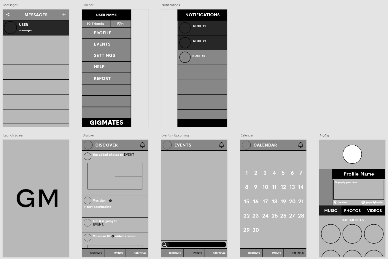
Before tackling the finer details of my own app, I decided to do further research and look at pages from other social media apps, examining how and why they are successful and what design elements they use.
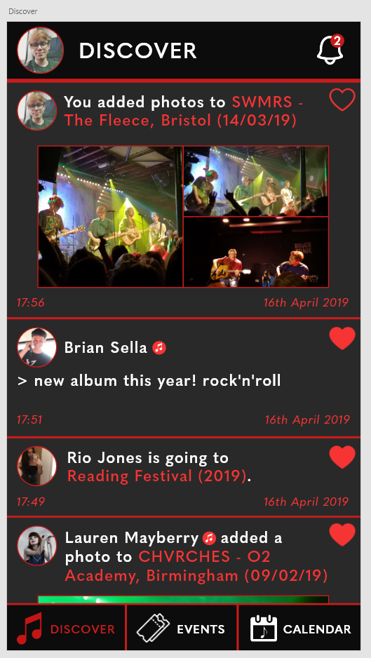
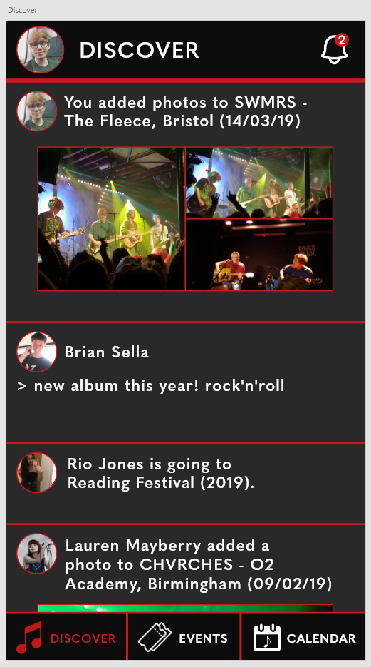
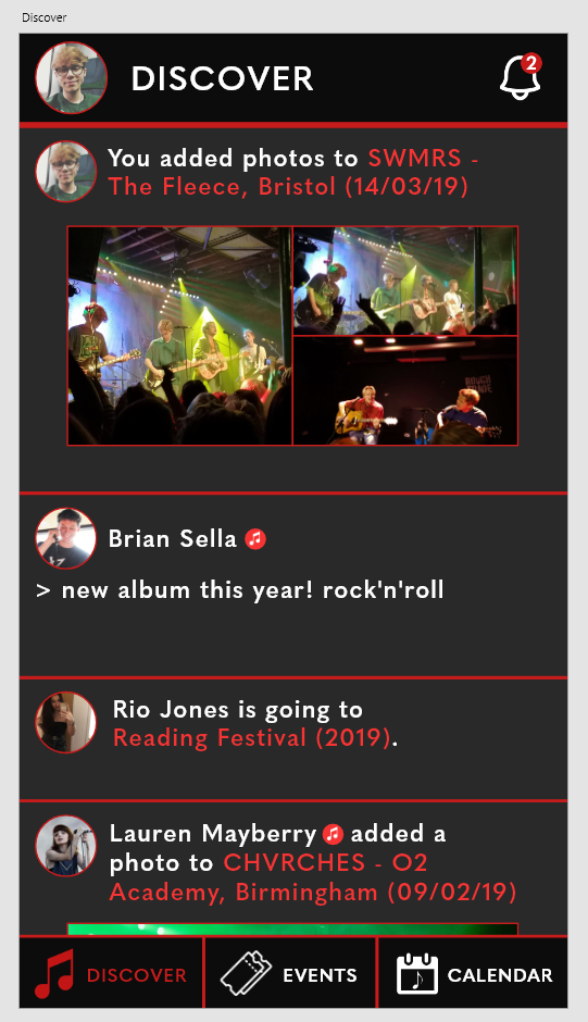
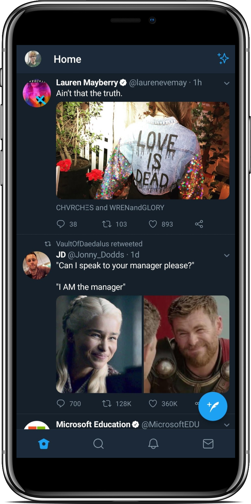
The first page I decided to examine was a discovery/news feed page – ultimately, one of the most-used pages in most social apps. I took a look at Facebook (left), Twitter, (central) and Spotify (right).
Discover Page
Facebook presents its app in a blue and white colour scheme that isn’t alterable with (label-less) iconography redirecting the user to groups, videos, notifications and a marketplace with a scroll-locked action bar, as well as allowing the user to search for content and check their messages. Following the header UI, Facebook presents ‘stories’ to the user (a feature I don’t intend to include within my app) followed by a feed of posts that display the user/page who posted it, a comments section and the ability to react and share the post. There are also privacy settings embedded within a hamburger menu cornered in each post.
Twitter presents the app in an alterable colour scheme (a light and dark mode) with iconography that isn’t labelled, redirecting users to their feed, a discovery page, a notification page and a message page. The header of the screen allows the user to access their personal profile and settings, whilst the rest of the page is used to feature the user’s feed. Each post allows the user to engage with it with a ‘tweet’, a ‘retweet’ or a ‘like’, as well as the ability to share and alter privacy settings.
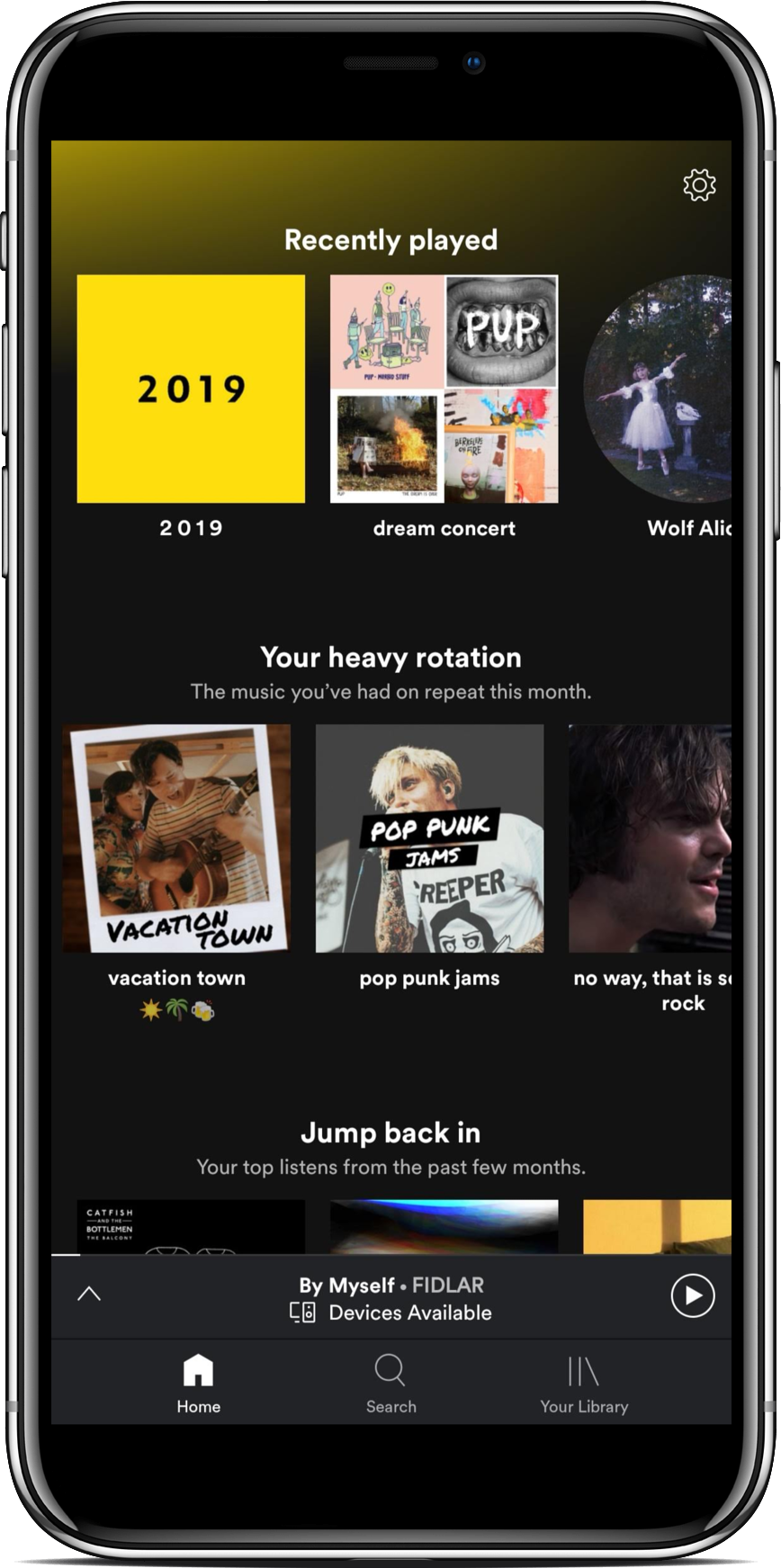
Spotify presents its app in a colour scheme that isn’t alterable with labelled iconography, allowing users to search for music and access their personal library. There are no posts to interact with on Spotify, rather, it presents to the user relevant music through playlist suggestions. The settings menu is accessible only from this screen in the top-right of the app.
Fundamentals of a ‘Discover’ page:
- A variety of media (text, photos, videos)
- Labelled, scroll-fixed iconography allowing the user to get where they need to go
- The ability to engage posts with a ‘like’
- A timestamp on each post
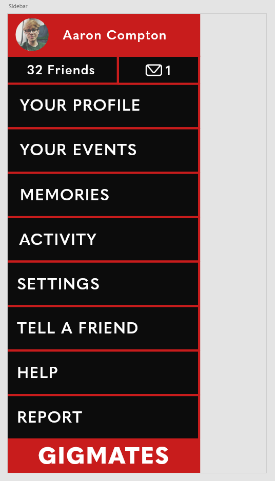
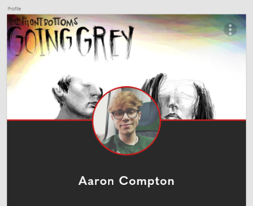
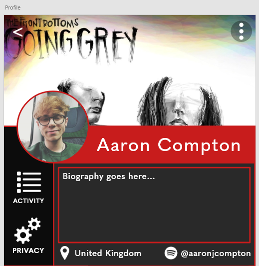
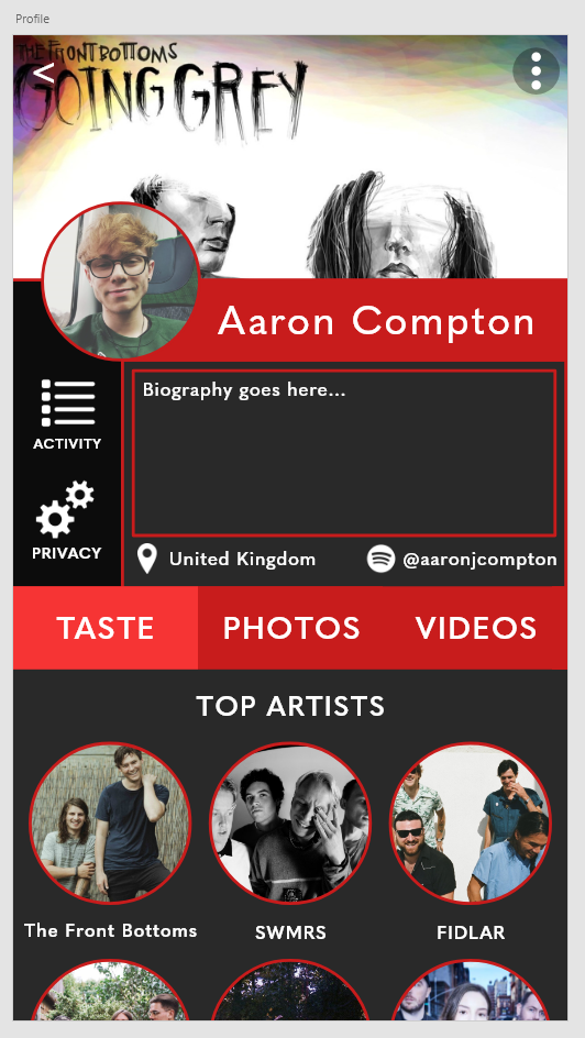
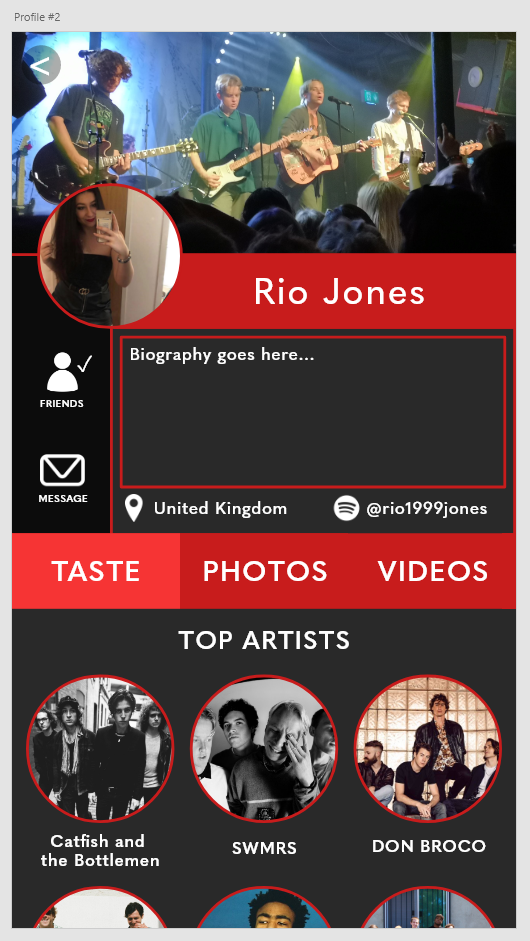
Profile Page
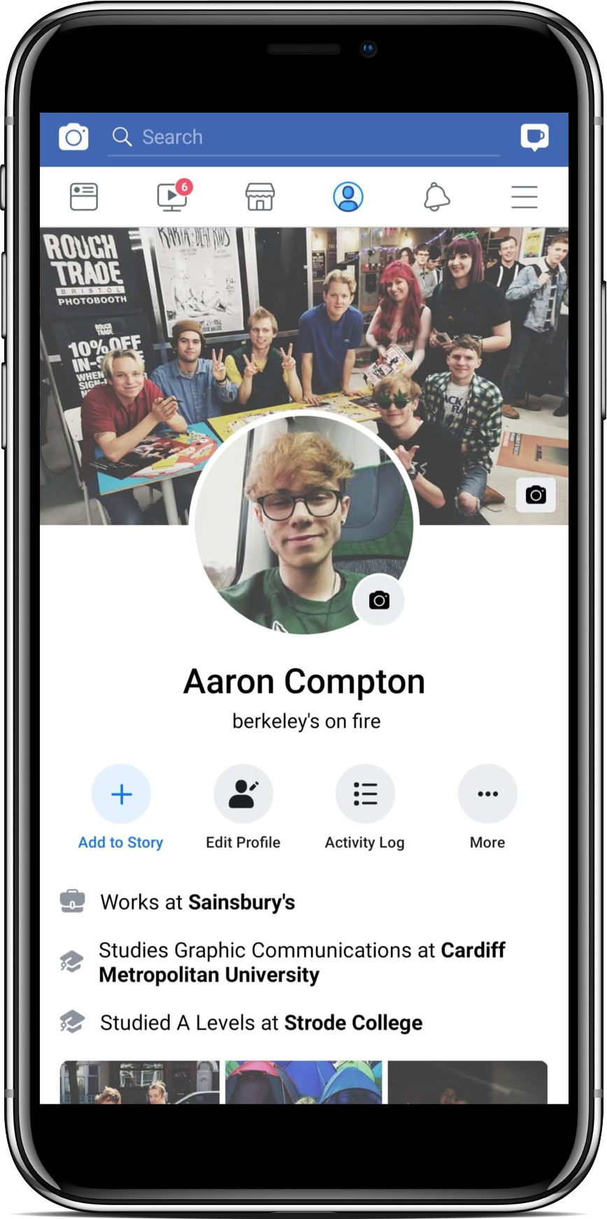
Facebook’s profile page gives the user a profile and cover photo to personalise, framing the profile picture large and centre with the cover photo in the background. The user’s name and biography is clearly visible underneath this, as well as any information the user has decided to make public. The ability to edit your profile, change your privacy settings and view your activity is also readily available here. Featured photos and the user’s content is viewable underneath this information.
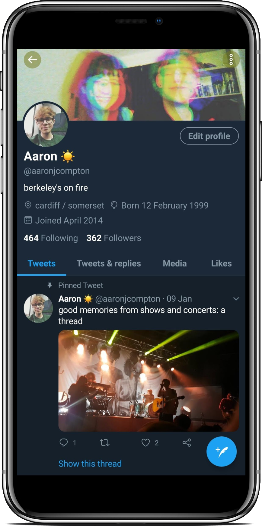
Twitter’s profile page is similar to Facebook, allowing the user to customise a profile and cover photo, write a bio, edit their profile display certain information all in the top section of their profile. Underneath this is the user’s profile feed which is filterable. The main difference with Twitter is positioning – the profile and cover photos are a lot less dominant within this app, allowing more room for the user’s content below.
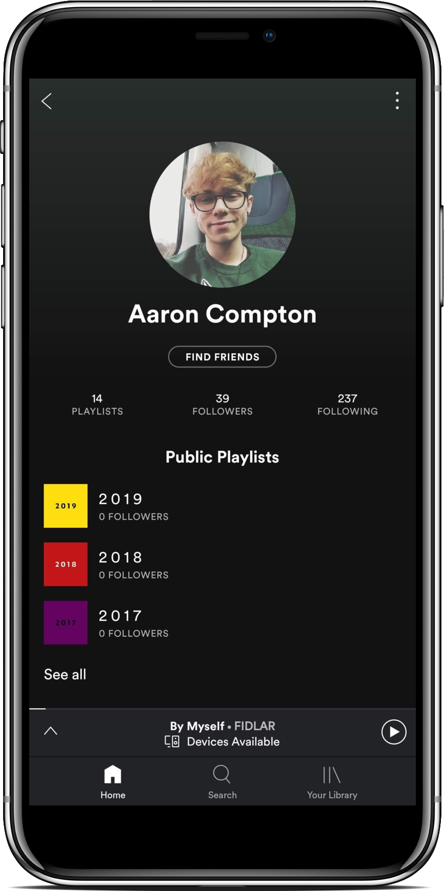
Spotify’s profile page is clean and simple, displaying only a profile photo and the user’s followers/following, as well as any playlists they have decided to make public. There is little information available to share about the user within this app due to its focus on music over socialising.
Fundamentals of a ‘Profile’ page:
- A profile and cover photo that are contextually sized
- A feed of information pertaining to the user
- The ability to edit profile and privacy settings