With a firm understanding of the Art Deco movement and several initial ideas on how to design a poster to celebrate it, I concluded the research stage of the project and moved onto some preliminary sketches. Within these sketches, I aimed to complete several objectives:
- Decide upon the poster’s layout, deciding between symmetrical and asymmetrical designs, working out a grid system that would be suitable for the three paragraphs, and figuring out the best visual hierarchy in order to create an aesthetically pleasing poster that properly celebrated the movement.
- What illustrative image to use, how it can best celebrate the movement through metaphor, and the best way to fit that within the poster so that it dominates the main space yet maintains a sound visual hierarchy.
- The style of typography to use to best celebrate the Art Deco movement.
Layout
I began my preliminary sketches focusing on layout, creating two symmetrical and two asymmetrical designs (one portrait and one landscape for each.) Whilst I’ve established that the majority of traditional Art Deco posters are symmetrical, I decided to experiment and see whether any new ideas could stem from some asymmetrical designs.
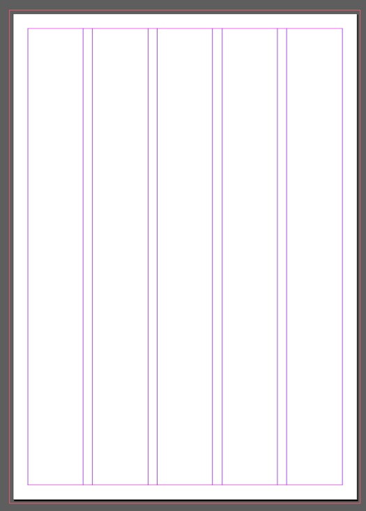
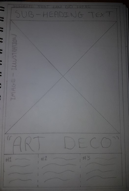 Symmetrical (Portrait) – the most traditional layout for Art Deco posters, I used a grid system with three columns and aimed to create a visual hierarchy that would first draw attention to the Art Deco title, then the image, then the paragraphs. This left room for a quote or subheading at the top as well as some discrete text within the outer border (a common feature within the majority of Art Deco posters), and thus I feel like this may be the strongest layout – it will best celebrate the movement best because of its inclusion of traditional features.
 Symmetrical (Landscape) – a variation on the traditional symmetrical layout, I used a grid system of five columns and aimed to create a visual hierarchy that would draw attention to the image first. This would work well as my research proved the image should dominate the main body of the poster, however, I don’t think there is enough attention drawn to the titular text and paragraphs.
 Asymmetrical (Portrait) – whilst not strictly asymmetrical (like posters within movements such as Constructivism or Dada), I aimed to create a layout that would still be effective for advertisement, as that is the key focus for traditional Art Deco posters – hence a loose symmetry within the above design. I used a grid system of four columns here, with the titular text overlapping the image. Whilst the visual hierarchy is strong, there are certain areas of the poster that are left empty, such as the bottom left and the header around the quotation. I believe this empty space would weaken the overall design, and if I am to develop this further, I would need to fill it.
 Asymmetrical (Landscape) – more asymmetrical than the portrait variation, I decided to experiment by adding an extra image overlapping the first. There is a good path of the eye here over a grid system with four columns – the eye is drawn to the title first, then the image, then the paragraphs. Whilst incorporating most of the traditional features, this idea has its weaknesses – such as some empty space, and not being suitable for advertising due to its slightly more confusing layout.
Overall, I feel the symmetrical portrait layout is the strongest idea (though a few tweaks can be made during the development stage), followed by the symmetrical landscape and then the asymmetrical portrait and landscape designs. Each design has their own strengths and weaknesses which I’ve done my best to identify here, and will take the various strengths into further development in order to create the best layout.
Typography
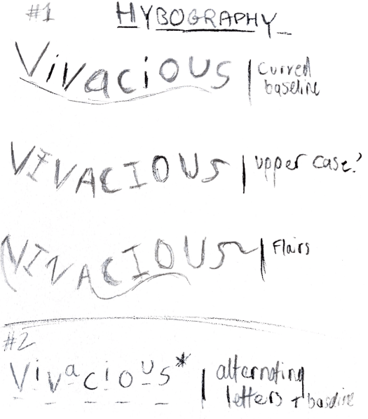
I continued with the initial ideas with some typographical sketches. As established within research, titular text within traditional Art Deco posters is typically majuscule and grand in style. Subtitles and smaller text depends entirely on the product being sold – and as I am not selling a product within my own poster, instead celebrating the movement, I believe it would be best to use a typeface that reflects the modernity of the movement for my paragraphs.
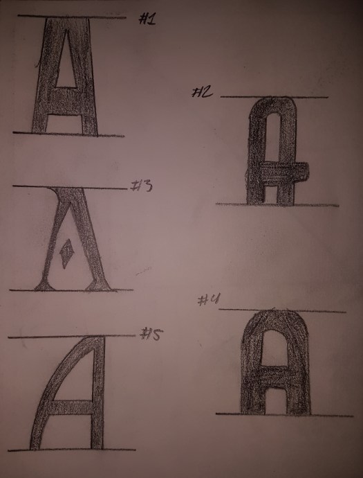
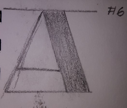
#1 – A fairly simple majuscule letterform that conforms to the traditional typography used within the movement, but perhaps could be made a little more exciting and decorative for the poster in order to create a stronger aesthetic appeal.
#2 – A Broadway influenced letterform that celebrates the Art Deco movement rather well (one could draw a comparison between the typography used in Broadway advertisements and traditional Art Deco posters.) A strong contender for the titular typeface.
#3 – A decorative letterform that generally reflects the style of Art Deco, but perhaps is a little too complex for the poster celebrating the movement due to its lack of a crossbar – this might not translate well across other letterforms either.
#4 – A majuscule, geometric letterform that reflects traditional typography within Art Deco posters very well due to its simple, bold and angular form – something that draws attention extremely well, which is necessary within this poster. Another strong contender for the titular typeface.
#5 – An angular, majuscule letterform, similar to the fourth idea but slightly more decorative. This would probably work equally as well, but I’m drawn more to the above idea due to its geometric conformity.
#6 – Another Broadway influenced letterform that is more reflective of the late years of the movement, especially within America. Whilst effective, I believe this style of typeface to be quite cliche and used thoroughly throughout posters other than ones that celebrate the Art Deco movement, and thus may not be as effective as other concepts.
Upon careful reflection of these letter forms and with the opinion of peers, I decided to develop the fourth idea further into titular text due to its geometric and majuscule style, as well as being effective for commercial advertisement – perfectly celebrating the Art Deco movement.

Regarding the typeface I’ll be using for the paragraphs, I decided upon Futura – a sans serif geometric typeface that reflects the modernity of the era and the geometry used within Art Deco posters. I initially thought about using Times New Roman or Myriad Pro, however, I do not feel these typefaces celebrate the Art Deco movement as well as a sans serif, geometric typeface.
Image
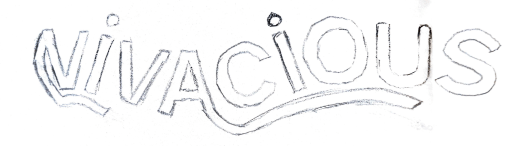
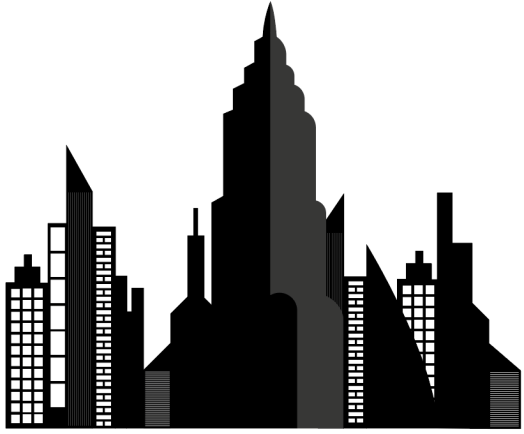
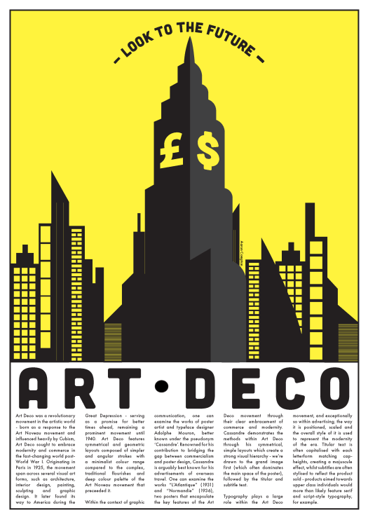
My initial ideas ended with what image I could use within my poster. From my research, I understand I need to create an image that is a metaphor for the movement – thus, an image that reflects the embracing of modernity and commerce. Fairly early on, I decided the image of a city skyline would reflect this rather well, as skyscrapers and taller buildings reflect modernity – the only thing I needed to further incorporate was commerce.
Instead of sketching these ideas, I decided to use the pen tool within Adobe Illustrator to create some vector images (creating a far more accurate portrayal of a skyline than my own sketches.)
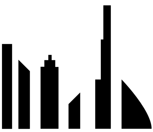
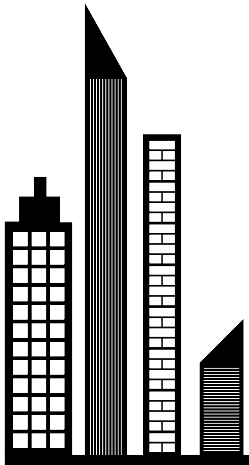
I focused on creating some sharper vectors as well as angular ones that would create a sense of geometry within the overall poster, adding some finer details (such as windows and decals on the buildings) to add more depth to the image.
To compose the overall skyline, I used an image I created for the screenprinting workshop. This was a larger skyscraper that appeared three-dimensional through its shading of colour.
To add this to the overall image, I changed the red to black and orange to grey to match the greyscale theme so far (though colour would later be added to the poster within further developments.) I also decided to change some of the sharper strokes to angular ones, reflecting the angular strokes used within traditional Art Deco posters.
Once these final tweaks were done, I put all of the vector images together to create the final skyline used within the poster.
Development of Initial Ideas
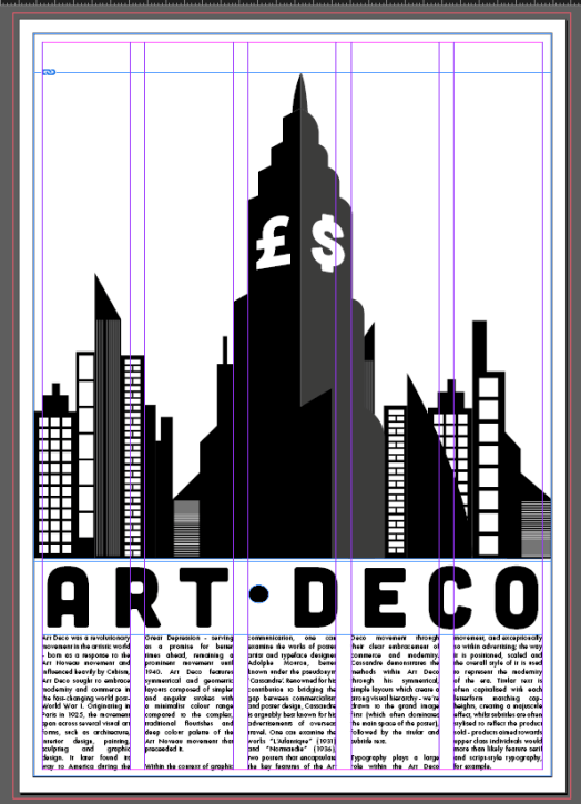
With a sufficient layout, typography and image decided upon, I began to approach the digital poster. Within Adobe InDesign, I created an A3 portrait document with a grid system of five columns. I decided upon five columns to better spread the paragraphs across the poster, as I feel three or four columns would not be enough to provide sufficient information on the Art Deco movement.
I then set to work on creating the titular piece of text. I used the typeface Cubano, an Adobe TypeKit font which best reflected the idea I settled upon within my typographical sketches. In order to best fill the empty space, I decided to use the polygon tool as I felt this would match the geometric style of the poster (though this would soon change.)
I then added the skyline image to the document, positioning it above the titular text in order to create a strong hierarchy. It was here I also decided to replace the polygons with a simple circular shape, increasing the tracking of the title to spread it across the A3 spread and filling the remaining space. I felt this was simply visually stronger than the polygons.
I then added the paragraphs to the grid system within the document, using the Futura typeface as decided upon earlier. I used an 11pt. font size, 20pt. tracking and justified text in order to create the smoothest visual distribution for the paragraphs:
Paragraph #1:
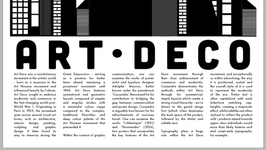
Art Deco was a revolutionary movement in the artistic world – born as a response to the Art Noveau movement and influenced heavily by Cubism, Art Deco sought to embrace modernity and commerce in the fast-changing world post-World War I. Originating in Paris in 1925, the movement span across several visual art forms, such as architecture, interior design, painting, sculpting and graphic design. It later found its way to America during the Great Depression – serving as a promise for better times ahead, remaining a prominent movement until 1940. Art Deco features symmetrical and geometric layouts composed of simpler and angular strokes with a minimalist colour range compared to the complex, traditional flourishes and deep colour palette of the Art Noveau movement that preceeded it.
Paragraph #2:
Within the context of graphic communication, one can examine the works of poster artist and typeface designer Adolphe Mouron, better known under the pseudonym ‘Cassandre’. Renowned for his contribution to bridging the gap between commercialism and poster design, Cassandre is arguably best known for his advertisements of overseas travel. One can examine the works “L’Atlantique” (1931) and “Normandie” (1936), two posters that encapsulate the key features of the Art Deco movement through their clear embracement of commerce and modernity. Cassandre demonstrates the methods within Art Deco through his symmetrical, simple layouts which create a strong visual hierarchy – we’re drawn to the grand image first (which often dominates the main space of the poster), followed by the titular and subtitle text.
Paragraph #3:
Typography plays a large role within the Art Deco movement, and exceptionally so within advertising; the way it is positioned, scaled and the overall style of it is used to represent the modernity of the era. Titular text is often capitalised with each letterform matching cap-heights, creating a majuscule effect, whilst subtitles are often stylised to reflect the product sold – products aimed towards upper class individuals would more than likely feature serif and script-style typography, for example.
Sources:
- Owen, Antoinette. “Treatment and Mounting of a Poster ‘Angleterre’ by A.M. Cassandre.” Journal of the American Institute for Conservation, vol. 24, no. 1, 1984, pp. 23–32.
- Anonymous, 2011. Art Deco for a modern age. 1st ed. Cork, Ireland: Post Publications Ltd.
- The Art Story. 2018. Art Deco Movement, Artists and Major Works | The Art Story. [ONLINE] Available at: https://www.theartstory.org/movement-art-deco.htm. [Accessed 8 October 2018].
Reflecting upon the poster at this point, I noticed there was quite a lot of empty space at the top of the poster. I decided to increase the scale of the central skyscraper in order to create a stronger presence for the image, as well as visually represent commerce – something which I had struggled to incorporate up until now. I began by adding a simple dollar sign to the central building, but felt this was a little jarring to the path of the eye as it did not match well with the three dimensional effect I had created. To rectify this, I added two currency symbols – the pound and dollar sign – to each face of the skyscraper.
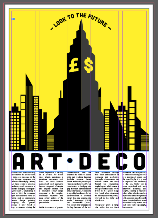
With most of the key features incorporated into the poster, I was left to focus on a subtitle/quotation and colour. This actually proved to be one of the most challenging parts of the design process, as it was hard to represent colour distribution through my initial sketches.
Using an arced line and the type on a path tool, I used a simple slogan “Look To The Future” as I felt this neatly summed up the ideologies of the Art Deco movement. I added hyphens to either side of the text to create a slightly more grandeur aesthetic.

One of the final steps before the final outcome was to add colour to the otherwise greyscale poster. Traditionally, Art Deco posters are fairly minimalist and use a small palette of colours. I was limited to two, however, and those colours would be the black shade of the image/text and the solid colour background. I tried a small range of CMYK colours suitable for print – a red, yellow and blue – and the choice became fairly clear. Red was very quickly ruled out as its connotations did not align with that of Art Deco. The decision between blue and yellow was fairly difficult, as I felt both provided that sense of modernity and hope for the future – though I eventually settled with yellow, due to its connotations of hope, grandeur and reliability.
A small finishing touch I added to the poster was a black frame, in order to create the white border effect seen in many traditional Art Deco posters.
Final Outcome
PDF:
Re-Imagining Design Histories – Art Deco – Final Outcome [Aaron Compton]


")
")
")
")
")
")
")
")
")
")
")
")
")