
In preparation for the Movement module, I looked at five title sequences within film and television and examined their use of typography, image and sound and how they come together to create movement. My goal in this effort was to discover how movement can be used to create a strong identity for a piece of media, whilst also forging a lasting impression on a viewer.
#1: Game of Thrones (TV Series, 2011)
![]()
HBO’s Game of Thrones’ lengthy title sequence is used to reveal the cast of the show whilst establishing the episode’s narrative. The leading cast members are revealed through a capitalised typeface with loose serifs and slight bevels to create a strong medieval style that matches the show’s themes. We are introduced to the episode’s narrative as the camera pans across an illustration of a map – the world of Westeros from the show – with medieval colouration present through soft greens, deep blues and bold golds. Three-dimensional models are animated to extend from the map in a clockwork-like manner, contributing to the establishment of the narrative by revealing locations from the show. These animations are accompanied by typographical illustrations on the map which further denote the show’s setting. The show’s theme song, a grand orchestral piece, creates a strong lasting impression as it builds up excitement as the sequence progresses, climaxing when the show’s title is displayed. This title is very similar to the subtitle text used to reveal the cast members – a capitalised typeface featuring superior letters to reaffirm the sense of grandeur built up throughout the sequence. In effect, movement is used vigorously within this title sequence to establish the epic, fantastical narrative the show is built on.


#2: Superbad (Movie, 2007)
![]()
Columbia Pictures’ Superbad features a short and simple titular sequence that serves to introduce the cast and production company, whilst infusing the viewers with a sense of what the rest of the movie will be about. Following the iconic Columbia Pictures logo, a simple colour range of bold primary colours is used alongside very limited imagery and simple typography. Imagery is used through the single-colour silhouettes of the human body that are placed against a contrasting background and is combined with movement. Movement is used effectively within this sequence in the form of the human body dancing, portraying a sense of casual fun and comedic elements that are prominent throughout the rest of the movie. Simple sans serif typography serves only to introduce the cast and production company – this is an effective use as it doesn’t detract away from the main focus of the sequence, that being the dancing silhouettes. The song “Too Hot To Stop” by The Bar-Kays is the musical piece that accompanies the sequence – a funky piece that emphasises the fun and comedic themes created by the moving images on-screen. Overall, Superbad’s title sequence is simple yet effective, using movement to introduce the movie’s cast whilst portraying the themes of the movie in a manner that creates a lasting impact on the viewers.
#3: Stranger Things (TV Series, 2016)
![]()
Netflix’s Stranger Things has a very simple title sequence featuring only two colours, simple typographical images composed against a plain background, and a short sci-fi-influenced piece of music. The sequence begins with darkness before the camera slowly zooms and pans to reveal glowing red outlines of letterforms. As the music builds up, the letterforms slowly glide across the screen – creating a sense of hypnosis – before coming together to reveal the series’ logo as the music climaxes. The typography and soundtrack slowly fade out to close the sequence. The typography used within the sequence is capitalised serif, majuscule in effect, and features superior letters to create an apprehensive tone ready for the upcoming episode. The sequence is very reminiscent of Stephen King’s book covers, as well as title sequences from Star Trek – works of horror and sci-fi respectively, which the show is entirely themed around. Movement is used very delicately and slowly to infuse the viewer with the sense of mystery that the show is heavily based on.


Source: 2017. Radio Times. [Online]. [Accessed 28 October 2018]. Available from: https://www.radiotimes.com/news/2017-10-28/whats-the-story-behind-the-nostalgic-80s-style-stranger-things-opening-titles/
#4: Enter The Void (Movie, 2009)
![]()
Gaspar Noe’s Enter The Void features an incredibly rapid, vivid title sequence that is composed almost entirely of typographical elements. The first half serves to introduce the crew members behind the film, whilst the latter introduces the cast. Each individual typographical piece is designed to invoke the nature of the character or crew member. The first half features typographical elements that are sans serif, bold and majuscule in style that, combined with their large scale, invade the screen and create a strong lasting impression on the viewer – especially when considering the use of colour; rapidly changing and blinking between two or three different colours that are similar to a strobe light effect. The movement and pacing of each typographical piece is especially note-worthy, with each piece remaining on screen for less than a second yet still creating a strong impact on each viewer. A mixture of languages are used and are reflected within the typographical elements. The latter half of the sequence features a huge variety of different typographical styles – some lower-case and sans serif, others entirely upper-case and serifed, featuring a huge range of typographical techniques such as superior letters, ligature and bifurcated letterforms. Each typographical piece in this latter half serves to reflect the nature of the cast member and the character they portray within the movie. Overall, movement is used at an incredible pace within this title sequence to shock the viewer into remembering it – and with such a unique portrayal of a huge variety of typographical elements, it’s incredibly hard to forget it once a viewer has seen it.
#5: Bojack Horseman (TV Series, 2014)
![]()
Netflix’s Bojack Horseman features a short opening sequence that serves to introduce the themes and narrative of the show. It’s unique in the sense that throughout most of the sequence – excluding the beginning and end – the character Bojack is consistently positioned in the centre of the screen. His positioning and presence in the foreground establishes him as the main protagonist of the show, whilst supporting characters are seen in the background. We are introduced to the narrative and key themes of the show in the background – the lifestyle of a declining celebrity, their struggle to hold onto fame and their experiences with a normal lifestyle. The sequence features a vivid and bold palette of colours that is reminiscent of the show’s setting – a fictional interpretation of Hollywood, highly glamourised. A jazz-style soundtrack accompanies the sequence which furthers this embracing of Hollywood. The typographical elements used are sans serif and comical in style, reflecting the context of the show – a cartoon. Overall, movement is used to establish key narrative elements and characters whilst portraying a good sense of the show’s themes, creating an instantly recognisable piece that is bound to stick within the viewer’s mind.
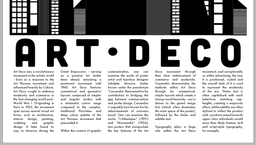
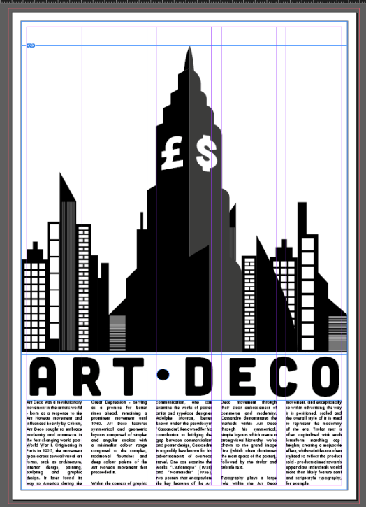
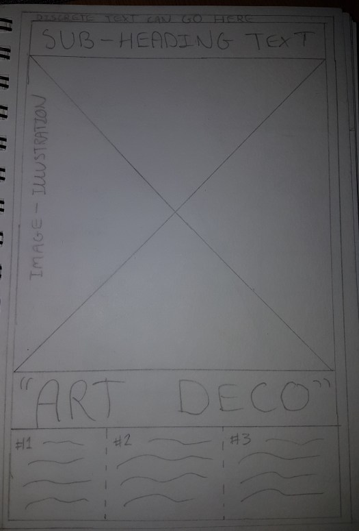 Symmetrical (Portrait) – the most traditional layout for Art Deco posters, I used a grid system with three columns and aimed to create a visual hierarchy that would first draw attention to the Art Deco title, then the image, then the paragraphs. This left room for a quote or subheading at the top as well as some discrete text within the outer border (a common feature within the majority of Art Deco posters), and thus I feel like this may be the strongest layout – it will best celebrate the movement best because of its inclusion of traditional features.
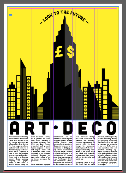
 Symmetrical (Landscape) – a variation on the traditional symmetrical layout, I used a grid system of five columns and aimed to create a visual hierarchy that would draw attention to the image first. This would work well as my research proved the image should dominate the main body of the poster, however, I don’t think there is enough attention drawn to the titular text and paragraphs.
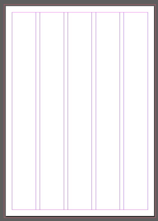
 Asymmetrical (Portrait) – whilst not strictly asymmetrical (like posters within movements such as Constructivism or Dada), I aimed to create a layout that would still be effective for advertisement, as that is the key focus for traditional Art Deco posters – hence a loose symmetry within the above design. I used a grid system of four columns here, with the titular text overlapping the image. Whilst the visual hierarchy is strong, there are certain areas of the poster that are left empty, such as the bottom left and the header around the quotation. I believe this empty space would weaken the overall design, and if I am to develop this further, I would need to fill it.
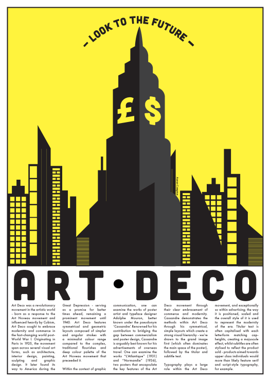
 Asymmetrical (Landscape) – more asymmetrical than the portrait variation, I decided to experiment by adding an extra image overlapping the first. There is a good path of the eye here over a grid system with four columns – the eye is drawn to the title first, then the image, then the paragraphs. Whilst incorporating most of the traditional features, this idea has its weaknesses – such as some empty space, and not being suitable for advertising due to its slightly more confusing layout.
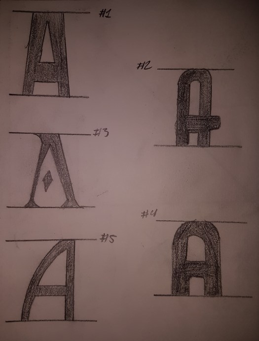

")
")
")
")
")
")
")
")
")
")

")
")
")


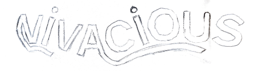


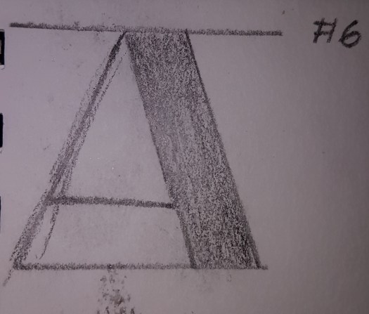
 Bifurcated and Trifurcated Serifs


